How to create a bar chart in Excel
A bar or column chart is a chart in which you can represent your data with horizontal bars or stripes. Bar charts are used to compare sets of numbers and display their rankings side by side.
Table of Contents
Types of bar charts

There are 3 types of bar charts in Microsoft Excel: Clustered Bar (clustered bar chart), Stacked Bar (stacked bar chart) and 100% Stacked Bar (100% stacked bar chart).
- Clustered Bar : This is a basic column chart and each number represents a horizontal bar.
- Stacked Bar : This chart extends the Clustered Bar to represent more than one set of numbers in a bar, stacking data along a horizontal line.
- 100% Stacked Bar : Same as Stacked Bar, except that the sections in the same bar add up to 100%. Therefore, instead of numbers, their percentages are displayed.
How to create a bar chart in Excel
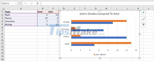
To create a bar chart in Excel, you need to add data to your spreadsheet first. Let's start with a simple example: Suppose you want to compare the scores of two students in different subjects. The scores are as below:TopicAmirJohnMath1418Physics1916Chemistry1717Biology1514
Import these sample data into your Excel spreadsheet. Once that's done, you can start creating the bar chart.
Step 1. Select the cells that contain the data you want to display in your chart. (Cells A1 through C5 in this example).
Step 2. From the ribbon, navigate to the Insert tab .
Step 3. In the Charts section , click Insert Column or Bar Chart . This will open a menu of available bar and column charts.
Step 4. Select the bar chart you want. This will instantly create a bar chart. Note that 3-D and 2-D bar charts are practically the same and differ only visually.
Step 5. In the bar chart, click Chart Title and enter a title for your chart.
Step 6. To make adjustments to the size of each area in the chart, click on the area and then resize it using the handles.
Hope you are succesful.
Was this article helpful?
Your feedback helps us improve.
Related Articles
 Steps to use Pareto chart in Excel2 minutes read
 8 types of Excel charts and when you should use them9 minutes read
 How to create a pie chart in Microsoft Excel10 minutes read
 How to create a pie chart in Excel3 minutes read
 How to create a frequency chart in Excel2 minutes read
 How to create an effect for an Excel chart in PowerPoint9 minutes read
Reader Comments 0
Sign in with email or Google to join the discussion.