Steps to reset chart in Excel
The following article shows you the steps to reset the chart in Excel 2013. After creating the chart, if you do not like the selected chart style, you can do the following to change the chart type The simplest and fastest way: Step 1: Sign
The following article guides you through the steps to reset the chart in Excel 2013.

After creating the chart, if you are not satisfied with the selected chart type, you can do the following to change the chart style in the simplest and fastest way:
Step 1: Click on the chart you want to set -> Design -> Change Chart Type:

Step 2: The Change Chart Type dialog box appears -> click on the All Charts tab -> select the chart groups on the left hand side of the dialog box:
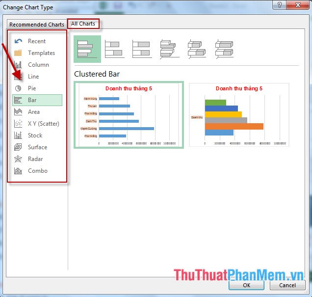
Some groups of frequently used charts:
- Column: Group bar chart.
- Line: Group a line chart
- Pie: Group pie chart.
- Bar: Group horizontal charts.
- Area: Group chart by area type.
- XY: Group chart according to coordinates x, y.
Step 3: After selecting the chart groups -> select the chart you want to reset to the old chart -> click OK:

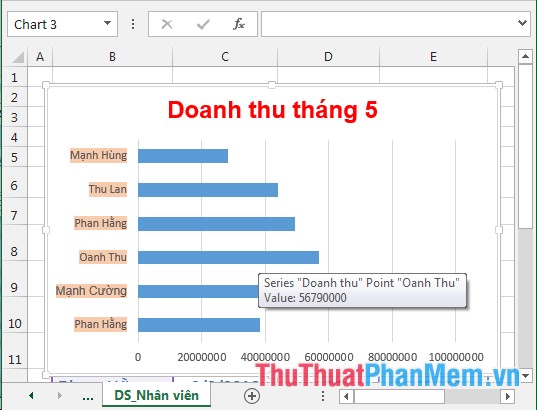
- After selecting the chart type you want to reset -> the new chart is replaced:
The above is a detailed guide of steps to reset the chart in Excel 2013.
Good luck!
Was this article helpful?
Your feedback helps us improve.
Related Articles
 Steps to use Pareto chart in Excel2 minutes read
 8 types of Excel charts and when you should use them9 minutes read
 Steps to create graphs (charts) in Excel2 minutes read
 Create Excel charts that automatically update data with these three simple steps4 minutes read
 How to use pictures as Excel chart columns2 minutes read
 How to create a bar chart in Excel3 minutes read
Reader Comments 0
Sign in with email or Google to join the discussion.