Create Excel charts that automatically update data with these three simple steps
Excel charts help shorten the decision-making process, because we can immediately see the results and things to change. However, the difficulty in processing data and charts is that users must constantly return to the chart and update new data. Yes, this problem will be gone when you follow these three simple steps to create an Excel chart that automatically updates data.
Table of Contents
Excel charts help shorten the decision-making process, because we can immediately see the results and things to change. However, the difficulty in processing data and charts is that users must constantly return to the chart and update new data. Yes, this problem will be gone when you follow these three simple steps to create an Excel chart that automatically updates data. All you need to do is add data to the spreadsheet and the graph will automatically graph.
1. Set up a spreadsheet
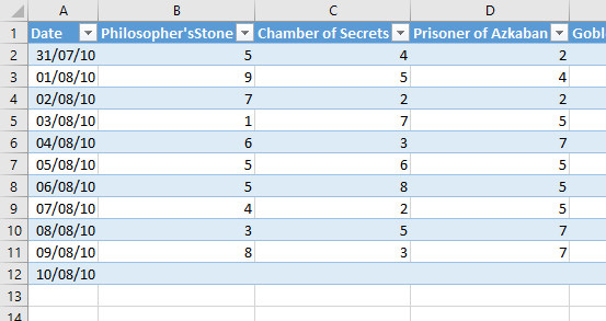
To create an automatic data update chart, you first need to set up a spreadsheet that provides the required data. The format of this document is very important because you will need to add more data to this spreadsheet. Fill in the information and make sure that each column has a title. In this example is a chart that tracks the sales of each Harry Potter novel at a bookstore.
- MS Excel - Lesson 2: Format spreadsheet data
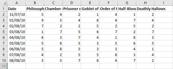
This type of chart is best when expanding new items into the rows below. In this example, when new sales data is recorded, the user will add it to the spreadsheet starting from row 11.

2. Create a table
In Office 2016 , the table has been enhanced, instead of just making data look neater, they also help group information together. The ultimate goal here is to create a data table for the chart. Linking these two elements together allows a new data check chart to be added to the table.
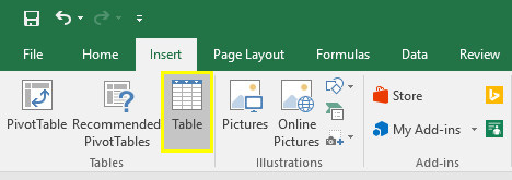
To create a table, select all the data you want to turn into a chart. Then go to Insert tab and select Table or use Ctrl + T shortcut.
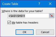
In the Create Table dialog box, edit the cells in the table. Check the My table box that has the headers then click OK .
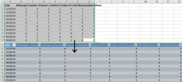
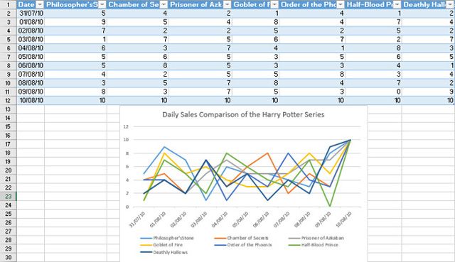
The data added to the table looks like the following:
3. Insert the chart and add data
Select the entire table and go to Insert > Charts to select the type of chart you want to use. The type of chart will depend on the type of data you are working on. In this example use a line chart, which helps compare many different columns and works very well with automatic updates.
- MS Excel - Lesson 6: Four steps to create an Excel chart

Now is a good time to make any format or image tweaking. Next we will add more data to the spreadsheet, simply add another line at the end of the existing worksheet.
Now you can use the chart indefinitely, simply by adding multiple rows to the table. However, it may be necessary to adjust the size and format to display all the correct data, depending on the additional quantity.
I wish you all success!
Was this article helpful?
Your feedback helps us improve.
Related Articles
 How to draw charts and graphs in Excel simply and quickly2 minutes read
 Instructions on how to create charts in Excel professional7 minutes read
 How to draw a pie chart in Excel 20163 minutes read
 Instructions for creating interactive charts in Excel with INDEX function6 minutes read
 How to draw a map chart on Excel4 minutes read
 How to create 2 Excel charts on the same image4 minutes read
Reader Comments 0
Sign in with email or Google to join the discussion.