You are the manager often have to manage projects with many jobs, so you want to use the Gantt chart in Excel to better manage projects. If you do not know how to draw Gantt chart in Excel, please refer to the following article.

The following article TipsMake.vn will guide you how to draw Gantt charts in Excel, please follow along.
Gantt chart in Excel?
Gantt chart (English is Gantt chart ) is a form of showing the most classical project progress, invented by Henry Gantt in 1910. Although this chart is long time ago but due to its simple nature, it is easy to understand. Currently Gantt charts are still widely used in project management, even improved in modern project management software.
How to draw a Gantt chart in Excel
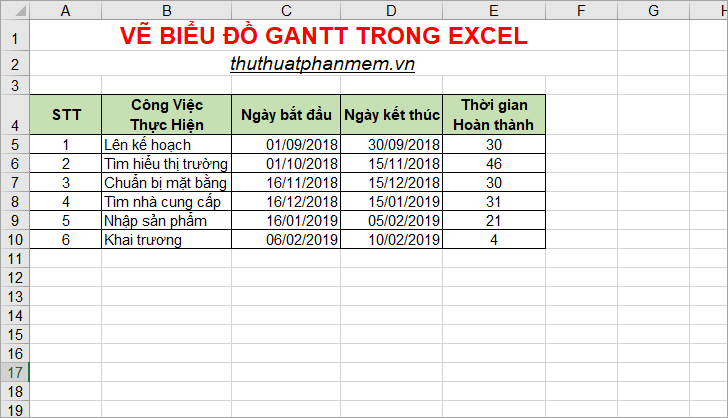
To draw a Gantt chart your data needs a start date, an end date, and a time period to complete each job.
Suppose you have a data table to draw a Gantt chart like this:
Based on the above data table, you can start drawing Gantt chart in Excel with the following steps:
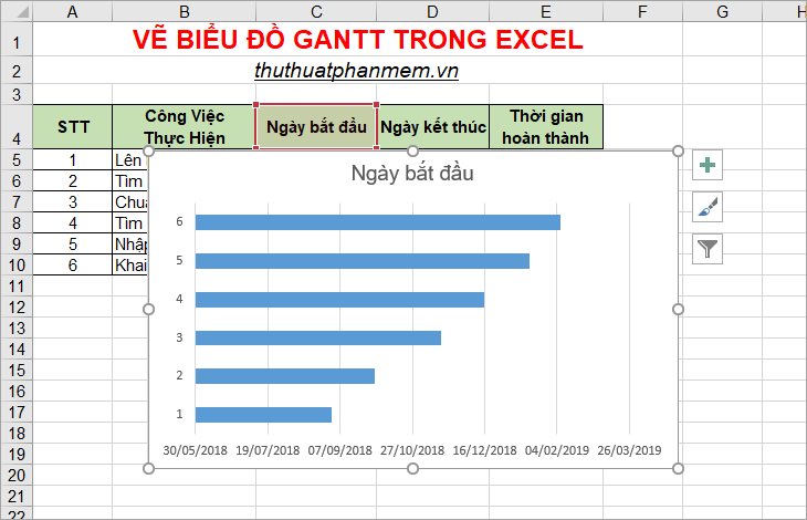
Step 1: Create a stacked bar chart based on 'Start date'
Select the range from C4 to C10 ( Start date column ), then select the Insert tab , in the Charts you select the column chart and select the stacked bar chart as shown below.

So you've drawn the bar chart.
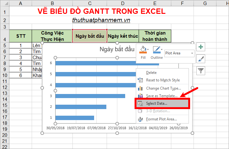
Step 2: Add data in the Time Completion column to the stacked bar chart.
1. On the chart, right click and select Select Data.
2. Select Select Data Source window appears , click Add to open Edit Series.
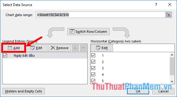
3. Appear to Edit Series, you need to enter a name or choose a name in the Series name section (for example, enter Interval or select the title box in the Time to complete table ). Next in the Series values section, select the symbol as shown below.
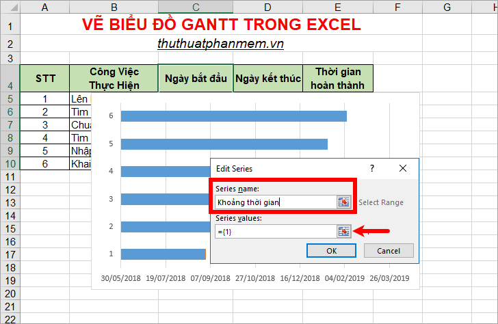
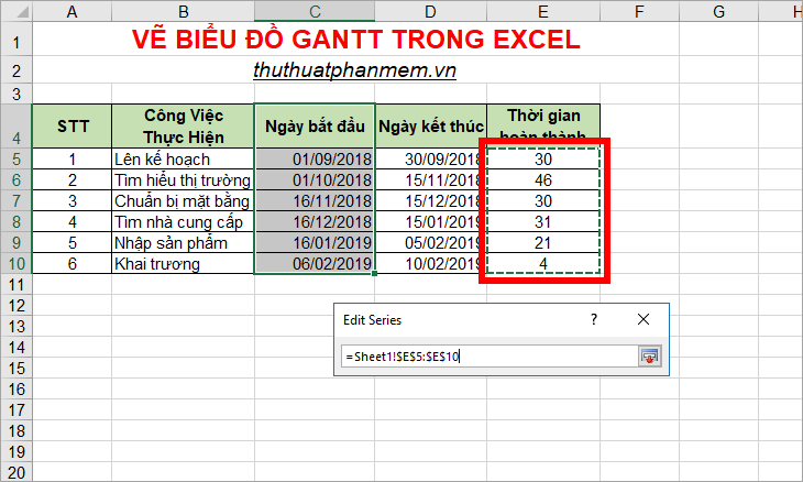
4. Click and hold and select the data area in Completed Time column (E5: E10).
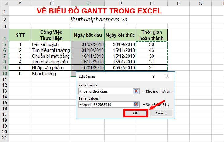
5. Next to return to the previous interface you press Enter , then click OK -> OK to close Edit Series and Select Data Source.
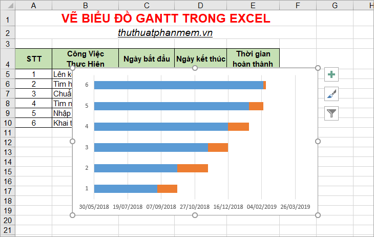
So you will see the chart adds a new section as follows:
Step 3: Add a job description
1. Open the Select Data Source window again by right-clicking the chart and selecting Select Data.
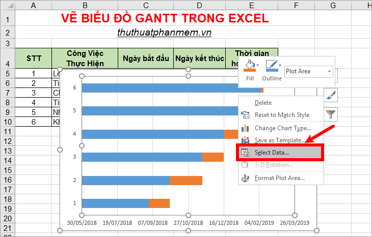
2. The Select Data Source window appears, click Edit in the Horizontal section .

3. On the dialog box Axis Labels you click the data in the column Work done (B5: B10). Then click OK -> OK to close the Axis Labels and Select Data Source dialog boxes .
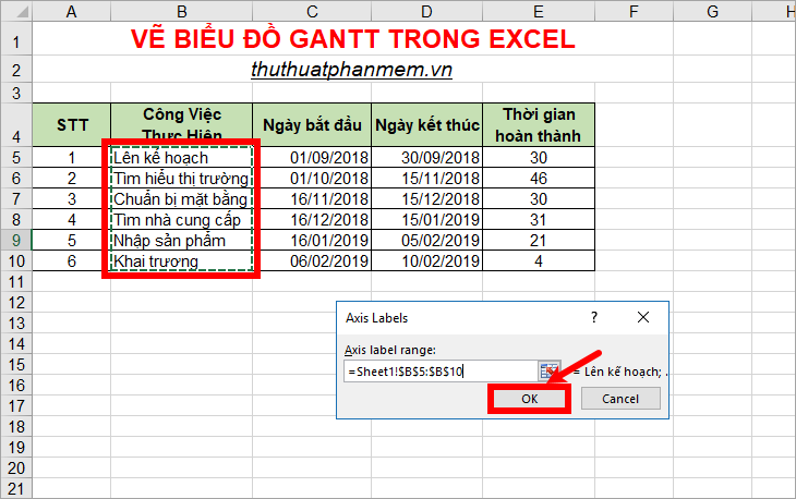
You will see the job done on the chart.
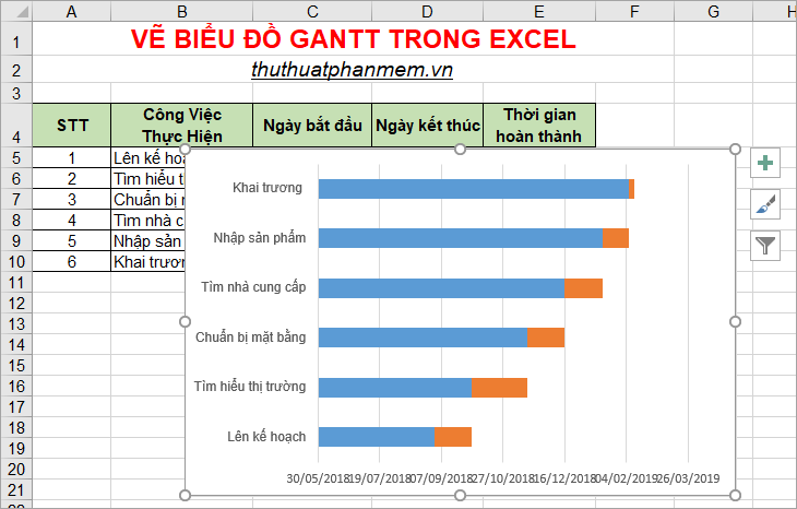
Step 4: Hide the green column to make a Gantt chart.
1. On the chart, left click on any blue bar so all blue bars are selected, right click and choose Format Data Series.
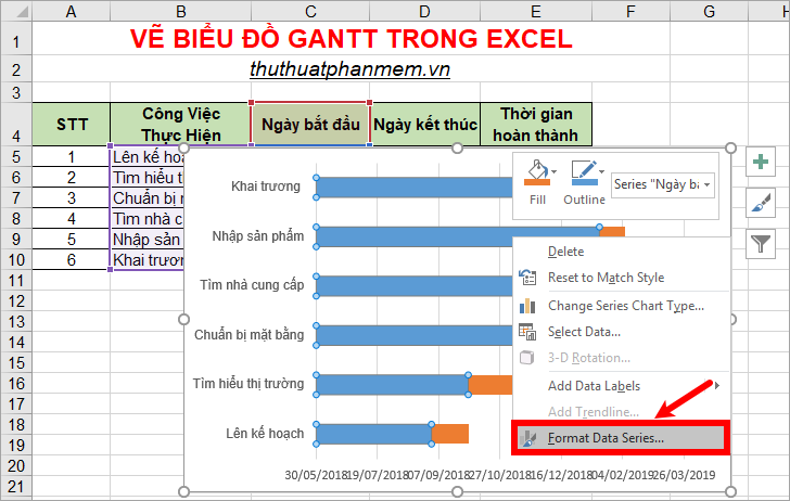
2. Now the Format Data Series section appears on the right, in the Fill & Line section select No fill and No line as shown below.
So your chart is as follows:
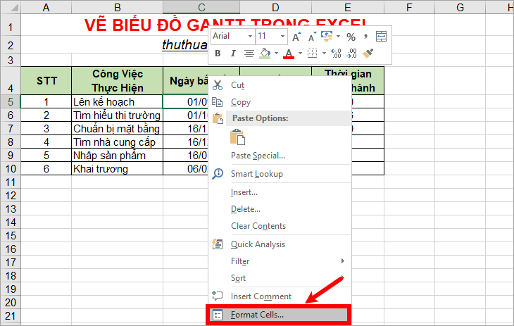
Step 5: Remove the space before.
The part you just hidden still leaves a space, you can remove this space by:
1. On the data sheet, right-click the first cell in the Start Date -> Format Cells.
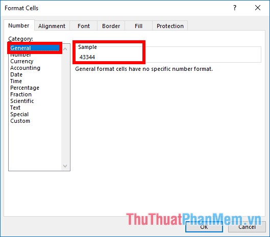
2. In the Number tab of Format Cells, select the General format, see how to store the date you choose in Excel in the Sample section .
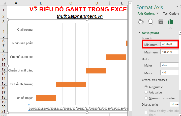
3. Next, on the chart, right click on the date, and choose Format Axis (or double click on the date).
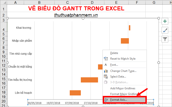
4. In the Format Axis section on the right, at the Axis Options section enter the numbers in the Sample section that you saw above into the Minumum box . So you will see the whitespace has been removed.
Step 6: Clear the space between horizontal bars.
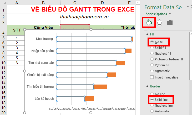
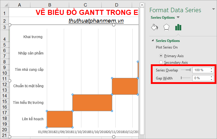
1. On the chart, click on any orange bar to select all orange bars, right-click on it and select Format Data Series.
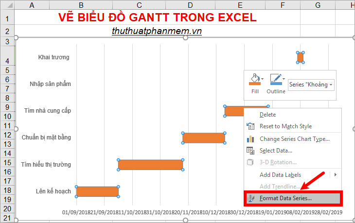
2. The Format Data Series section on the right appears, in the Series Options you set in the Series Overlap you to 100%, your Gap Width to 0%. So you'll see the space between the horizontal bars will be gone.
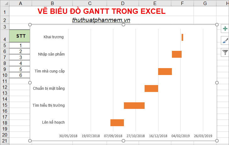
You can shrink the height of the chart to make the Gantt chart more beautiful as shown below.
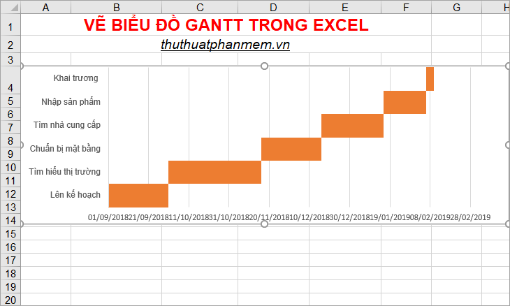
Step 7: Reorder the data in accordance with the Work done
You also see on the chart, the work order has been reversed, so you need to rearrange the data in the right order, the right steps to do by:
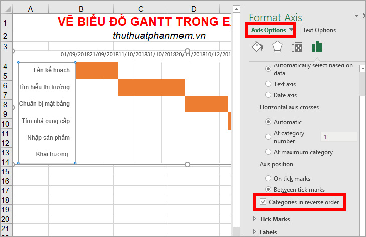
1. Right-click on the Tasks section and select Format Axis or double-click on the Tasks section on the chart.
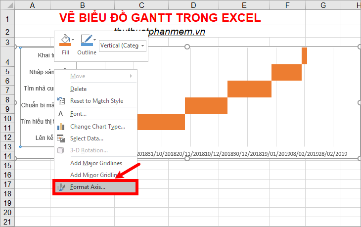
2. The Format Axis section appears on the right side of Excel. Check the box in the box before the Categories in reverse order box and close Format Axis .
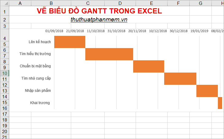
You will get the Gantt chart as follows:
Above is how to draw Gantt charts in Excel, hope through this article you will better understand Gantt charts and know how to draw Gantt charts in Excel. Good luck!


 Instructions on how to edit and delete chart data in PowerPoint
 How to show or hide chart axes in Excel
 PowerPoint 2016: Working with Charts
 JavaScript code to create a zoomable chart with Zoom & Pan functionality.
 Excel 2019 (Part 22): Charts
 How to create a spreadsheet chart in Canva Sheets