How to draw a map chart on Excel
In Excel 2019, there is a map diagram, showing the names of countries in the world.
Table of Contents
The chart types on Excel will be used to represent data tables, such as column diagrams, pie charts, cone charts, etc. And in the recent Excel 2019 version, users have to add the map chart form to Country locations displayed in the map. This map chart type can be used to compare data between geographic areas such as countries in the world, provinces in a region, etc. The following article will guide you how to create a chart. map on Excel. Note to readers, to create a map chart, the computer needs to connect to the network. After creating, you can still see the map without a network connection.
- Create Excel charts that automatically update data with these three simple steps
- How to draw charts in Excel
- How to draw a straight line, draw an arrow in Excel
Instructions for drawing map charts on Excel
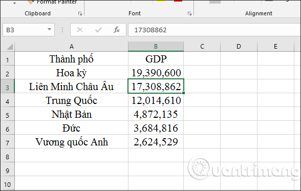
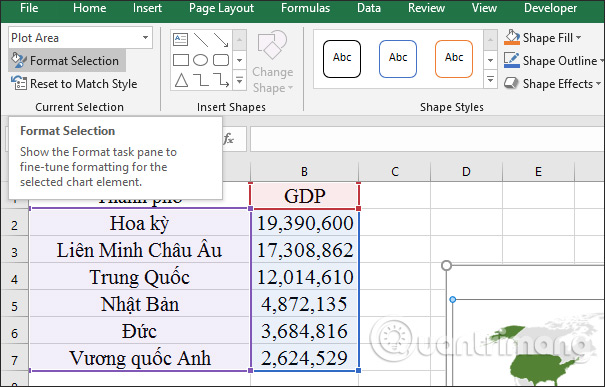
We have a GDP chart between different regions as shown below.
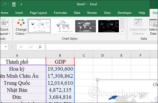
Step 1:
Users click on any cell in the data table on Excel. Then click on the Insert tab and then select the Maps item . Click on the map image as shown below.

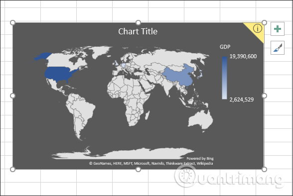
Step 2:
It will then display the map chart as shown below. The chart automatically adjusts colors based on data from high to low.

Step 3:
After obtaining the chart the user can edit the design for the chart. At the Format tab of the Chart Styles we will have different types of charts. Click on a new chart type.
Map chart will be changed as below.
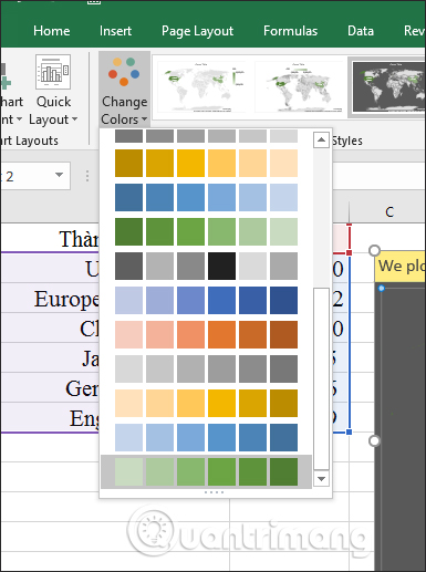
Step 4:
In the Change Colors section we can choose the colors displayed for the areas on the map.
The color of the area will change according to the color we have chosen.

Step 5:
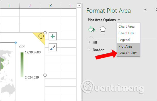
After editing the new format and design for the map, users need to display the names of the features on the map. Click on the Format tab and then click on Format Selection .
Right after that on the right of the interface displays the Format Plot Area frame, click on the triangle icon and select Series GDP .
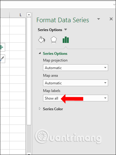
Step 6:
Click on the column chart icon to edit the map.

Display options at Series Options . Click on the Map labels item and select Show all .
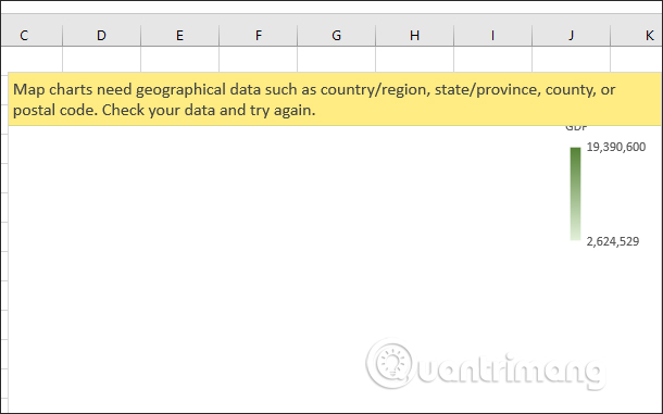
In case of displaying yellow notification Map charts need geographical data such as country / region, state / province, county, or postal code. Check your data and try again as shown, the features in the data table will not be created. This error may be because your geographic location is too small like a district or a commune, .
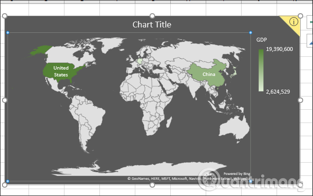
The result will display the map with the location name as shown below.
Above is how to create a map chart in Excel version 2019. With this type of map chart, the data table will be more intuitive, more vivid when displaying geographical locations according to the data table of user.
See more:
- Word 2013 Complete Guide (Part 17): Drawings and how to create effects for drawings
- Tutorial for Word 2016 (Part 18): How to add Shape shapes
- Word 2013 Complete Guide (Part 3): How to store and share documents
I wish you all success!
Was this article helpful?
Your feedback helps us improve.
Related Articles
 Steps to use Pareto chart in Excel2 minutes read
 How to draw a line chart in Excel7 minutes read
 How to draw a bar chart in Excel5 minutes read
 How to make a thermometer template in Excel7 minutes read
 How to create 2 Excel charts on the same image4 minutes read
 8 types of Excel charts and when you should use them9 minutes read
Reader Comments 0
Sign in with email or Google to join the discussion.