8 types of Excel charts and when you should use them
You have a presentation about to come and really want to impress the boss. You want to display data in a way that is easy to understand, but also intuitive and impressive. The only way to do that is to choose the right chart for the data.
You have a presentation about to come and really want to impress the boss. You want to display data in a way that is easy to understand, but also intuitive and impressive. The only way to do that is to choose the right chart for the data .
There are many different tools for creating charts and graphs , but Microsoft Excel is still one of the most powerful and functional tools. It allows visualization of data in any format and style. In this article, we will learn about 8 types of charts in Microsoft Excel and when you should use them.
1. Column chart
One of the most popular charts is used in presentations and dashboards, column charts are used to compare values with each other. The most common data for column charts is a data set divided into categories.
In this example is the problem of tenants divided by area. Once you've selected the data, just click Insert , and you'll see the chart types in the menu. In this case, you can choose to draw a 2-D or 3-D column chart.

Below data is shown on the 3D column chart.

However, the default charts don't have vertical or horizontal labels, so you need to add them so people know what this number means. To do that, simply click the " + " button in the upper right corner of the chart, select Axis Titles and then select Primary Vertical only .

You should now see an editable vertical label.

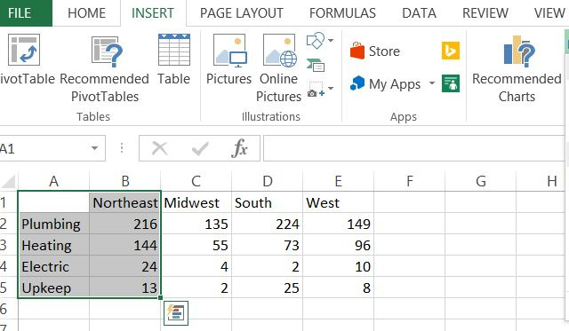
Using column charts to visualize classified data makes the problem clear. Here people in the Northeast have plumbing and heating problems. But how to compare with other regions? To show this, add data and use bar charts instead. The bar chart is the same as the column chart, but appears horizontally rather than vertically.
This time, select all data.
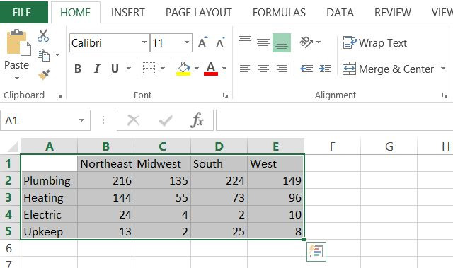
Now click Insert in the menu just like you did before and this time click on the drop-down chart menu, right of the column chart.

You now have a bar chart comparing the issues of tenants in different geographical areas.

Thus, bar charts and bar charts are a great way to compare classified data for a data set or compare classified data across multiple datasets.
2. Circle chart
As the name implies, the pie chart is shaped like a cake and is best used when displaying a divided data into multiple sub-sections. If you want to compare multiple data sets, it's best to use them on a bar or column chart.

3. Line chart
Switching to line charts requires a new set of data because line charts and other similar chart types tend to be time-dependent. For a line chart, you only need one X and Y value. In the example below, X will be time and Y will be a population. The census data set used in this example is the US population change from 2010 to 2015.

Black out the year and the total number of population columns, then click Insert from the menu and select the line chart. Right-click on the chart and select Select Data Source and do not select Year .

Now it does not use the Year column as Y and will use it as X and attach the correct horizontal axis.

At a glance, you can see that the US population has increased steadily at a rate of about 0.76% per year.
4. Area chart
The area chart is similar to the line chart, but the area under the road is filled. While line charts still focus on changing values over time, the focus of an area chart is to highlight the magnitude of the values over time. The difference is not so obvious, but when you need to show things like the number of trees removed from 1990 to 1995 compared to 2000 to 2005, the area chart really shines.
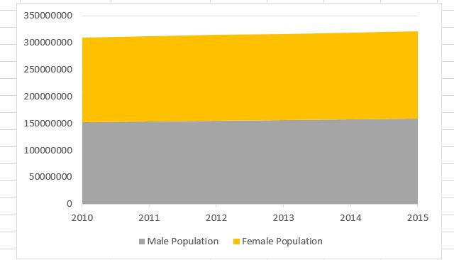
Similar to the population data above, you can compare the population growth between men and women from 2010 to 2015.

In addition, with this data you can also use stacked area chart (available in the chart section under the Insert menu).
This chart can be thought of as a line chart and a pie chart combined into one. You can see the percentage analysis of classified data when data changes over time.
5. Scatter chart (XY)
One of the charts is loved by scientists and statisticians, a scatter chart draws data points (usually a group of similarly measured data points), aimed at displaying correlations. or patterns in data are not clear when only looking at personal data points.
For example, planning the success rate of cancer recovery compared to the time at the hospital may show the correlation between the duration of cancer treatment and its success.
Below is a scatter chart of asthma hospitalizations in Chicago from 2000 to 2011, categorized by zip code.

This XY dispersion chart (also known as the "cluster" chart) shows that the 60628 zip code is more years of asthma than all other areas, and the code 60655 goes on to become one of the zones. The best area to live if you want to avoid asthma.
6. Bubble chart
The above data can also be expressed (even better) in the form of a bubble chart. This is a funny image to create three-dimensional space for data.
This is an XY data point that is typical of two values (a "bubble"), with an additional combined value that determines the size of the bubble. For example, with this chart type, you can show how many teenagers go to the movies, but the size of each data point (bubble) can show how many women make up the data set. there.

It is a fun way to express two sets of data on a chart. In the example above, if you add a movie name column on the X axis, you can identify all the movies that teens go to and which ones attract more women.
7. Surface chart
This three-dimensional chart allows drawing two ranges of data points across multiple spaces. It may be a bit complicated, but with the right data points, the image created will impress the viewers.

The 3-D version of the chart looks like a topographic map. Similarly, you can use this map to make a chart of disease outbreaks according to the age and time of the sick person.
8. Donut style chart
Donut-style chart is another complex image that allows you to draw a series of data in a pie chart format, but also has additional data series in "layers", forming "multicolored donuts". . This chart is best used when two data series are sub-data of a larger data type.
A good example of this chart is the data sets used earlier in this paper, the male and female populations each year.

As shown in the diagram, each series (2010 to 2015) contains segments of nearly identical size, showing how the change from year to year is.
There are many types of charts selected but it depends on the type of data and exactly what users want to display (or prove) to that data. Knowing which chart to use is half the battle. The other half is to find out exactly how to organize the data and format the chart as you like.
The truth is that the graph creates a huge impact in any presentation. Now that you know everything that is available in Microsoft Excel, select the graph that fits your needs.
- Instructions on how to create charts in Excel professional
- How to draw a map chart on Excel
- How to draw charts and graphs in Excel simply and quickly
- How to create 2 Excel charts on the same image
- How to draw a pie chart in Excel 2016
- Excel 2019 (Part 22): Charts
- Instructions for creating interactive charts in Excel with INDEX function
- How to draw a bar chart in Excel
- How to fix chart position in Excel
- How to draw flow charts in Excel
- How to change dots into commas on Google Sheets
- How to backup and restore the Office license key for all versions
- How to delete dots in a series of numbers on Excel
- How to convert A4 size prints to A3 size in Word
- How to fix Office error 'The function you are attempting to run contains macros'
- How to align 2-sided printing in Word is symmetrical
- How to Convert Excel to Dat
- How to adjust line spacing and line spacing in Excel
- How to block ads on WPS Office
- How to create an Excel formula in Notepad ++
 Instructions on how to edit and delete chart data in PowerPoint
 How to show or hide chart axes in Excel
 PowerPoint 2016: Working with Charts
 JavaScript code to create a zoomable chart with Zoom & Pan functionality.
 Excel 2019 (Part 22): Charts
 How to create a spreadsheet chart in Canva Sheets
-
 Free Tools
-
Application
-
Web Email
-
Website - Blog
-
Web browser
-
Support Download - Upload
-
Software conversion
-
Social Network
-
Simulator software
-
Online payment
-
Office information
-
Music Software
-
Map and Positioning
-
Installation - Uninstall
-
Graphic design
-
Free - Discount
-
Email reader
-
Edit video
-
Edit photo
-
Compress and Decompress
-
Chat, Text, Call
-
Archive - Share
-
-
System
-
Mac OS X
-
Hardware
-
Game
-
Tech info
-
Technology
-
Science
-
Life
-
Electric
-
Program
-
Mobile