How to create an effect for an Excel chart in PowerPoint
Excel makes it easy to aggregate multiple streams of data and convert them into easy-to-understand visual charts. When you pair your data with PowerPoint, you can create Excel chart effects to make presentations more attractive.
Table of Contents
PowerPoint presentations with lots of data will never be boring to viewers. Excel makes it easy to aggregate multiple streams of data and convert them into easy-to-understand visual charts. When you pair your data with PowerPoint, you can create Excel chart effects to make presentations more attractive.
Today's article will guide you step by step to make your data more vivid.
Create a chart
The first step is to create an Excel chart with the data you have compiled. If you're not sure which type of chart is suitable for your data, see the tutorial: 8 types of Excel charts and when you should use them to select the Excel chart that suits you.
For example, if your data changes often and you have to give a monthly presentation for example, you can create self-updating Excel charts and convert them to PowerPoint, then create effects for them. .
If you are creating a single-use chart, you don't even have to open Excel on your computer. You can start right in PowerPoint by going to Insert > Chart, you can select the chart type and add data with a little bit of Excel features that appear right in the program.
If you don't have a lot of data, you can actually design a pie chart right in PowerPoint, using the application's Shapes feature.
PowerPoint's Animation menu
When you're ready to create an effect for your chart, you can copy the chart into PowerPoint to create an effect for that chart. Click the pie chart or column chart you created and use the keyboard shortcut Ctrl + C to copy it. Open an empty canvas in PowerPoint and use the Ctrl + V shortcut to paste the chart into it.
In PowerPoint, you'll spend all your time in the Animation tab . This is where you will find all the tools you need to create a chart effect in PowerPoint.
You will see a series of animations in the menu at the top of the screen. Click the arrow at the bottom of the animation to see all animations available for PowerPoint users.
Create effects for column charts
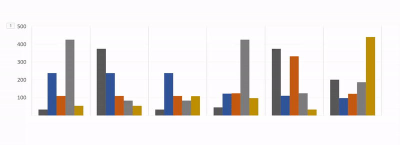
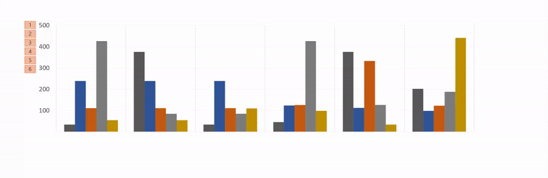
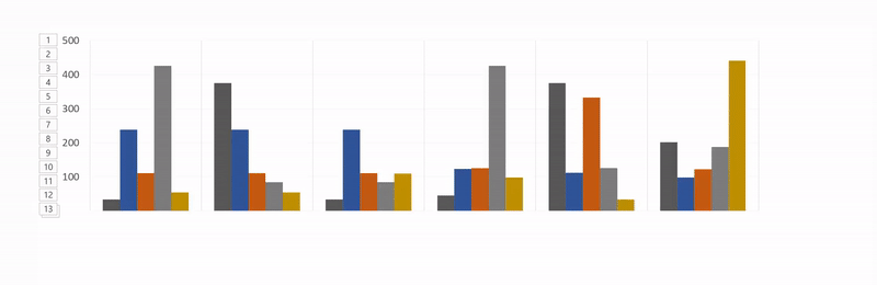
In the example in this article, the author is using data from the Expense Trends Budget spreadsheet template, including a column chart.
The best option for a column chart is to have it appear from the bottom of the screen and face up.Wipe animation is the right choice for this type of motion.
To apply animation, do the following:
- Click to select chart.
- Click the Wipe animation button .
- Animation will be applied to the entire chart.
Next, you'll want to change the advanced settings for your animation, so that it appears gradually instead of just appearing once.
These settings are found in Effect Options.
With Effect Options, you can choose the direction of the animation. It may appear from the top, bottom, left or right. You can also specify how to create an effect for your chart, by category or by sequence.
So what do these options really mean?
- By category : This will effect your data by each category on the X axis of the created column chart. If each category consists of a column, each column will be created individually. If there are multiple columns in each category, all of them will be created at the same time.

- By series : This option will dynamically populate your data by individual colors in a category on the X axis of the column chart. Each color column group will be animated together.
- By element in category ( By element in category ): This option will dynamically populate your data by category on the X axis, but will significantly slow down the speed of animation.
Each column will in turn be assigned dynamic effects. So if you have a chart like the one below, this option will simply create an effect for each column in the order that appears in the chart.
- By element in series : Each string (or set of columns of the same color) will be animated separately. Each group of columns with the same color will be in effect.

For each of these options, you can also check Start animation by drawing the chart background . This will allow the background to gradually appear before the elements of the chart appear.
If you don't like this animation, you can check other options by clicking on the animation name in the tab. The effects you apply will be maintained with the new animation type.
To better understand the entire process, see the video below:
Select the appropriate animation for the chart
As the article mentioned, there are many different types of charts available in Excel. The graph used depends on the nature of the data you have and the animation you use for that chart depends on the type of chart you have chosen.
In addition to the default chart animations visible in the menu, you can view more animations in the Entrance, Exit and Emphasis sections , by clicking on the arrow at the end of the animation list.

You can view more animations by clicking More Entrance Effects in that panel.
- Column chart : For column charts such as the chart in the example above, Wipe, Peek In and Fade all work well.
- Round chart : For pie charts, try the following animations: Wheel, Zoom and Fade. In the GIF image below, you can see an example of a pie chart animated with the Wheel effect .

- Domain chart : For domain charts, try the following animations: Fade, Appear and Wipe. In the GIF image below, you can see an example of a domain chart with the Fade effect .

- Line chart : A suitable option for a line chart is Wipe, but remember to choose the animation direction from the left.

There are many other ways you can customize your animation to match the type of chart you are using. Open the Animation Panel and in the menu, click Timing. In the Timing panel , you can control the appearance of the animation, determine whether you need to click to an animation to appear and whether to repeat the animation.
You should experiment with different animations and options to see what works best for your data type, chart, and presentation. Checking the different options and speeds will ensure that you find the setting that best suits you.
After many implementations, the process of animating Excel charts is much faster.
What kind of chart do you use for your Excel data? Is there another program or tool you want to use to create an animation of your chart? Let us know in the comment section below!
See more:
- How to create text effects in PowerPoint
- How to create charts, graphs in Excel
- How to create motion effects on PowerPoint
Was this article helpful?
Your feedback helps us improve.
Related Articles
 How to create a bar chart in Excel3 minutes read
 Instructions for creating charts on PowerPoint5 minutes read
 Steps to use Pareto chart in Excel2 minutes read
 How to create a Timeline chart in PowerPoint2 minutes read
 8 types of Excel charts and when you should use them9 minutes read
 How to create a loop effect on PowerPoint2 minutes read
Reader Comments 0
Sign in with email or Google to join the discussion.