How to create 2 Excel charts on the same image
The combination of 2 charts on the same Excel image helps users easily show the data..
Drawing charts on Excel or drawing charts on Word is a simple and basic operation when drafting office content. The graph will show more intuitive data, easier to track and compare than just pointing the table on Word or drawing tables on Excel. And users can completely create 2 types of charts in the same image, if they want to display 2 different data contents in the data table. The operation to create and insert 2 charts on the same Excel interface is very simple. Users can still enter data for each chart they want. The following article will guide you how to create 2 charts on the same Excel interface.
- 8 types of Excel charts and when you should use them
- How to create an effect for an Excel chart in PowerPoint
- How to create a pie chart in Microsoft Excel
- Create Excel charts that automatically update data with these three simple steps
Instructions for creating 2 Excel charts at the same time
Step 1:
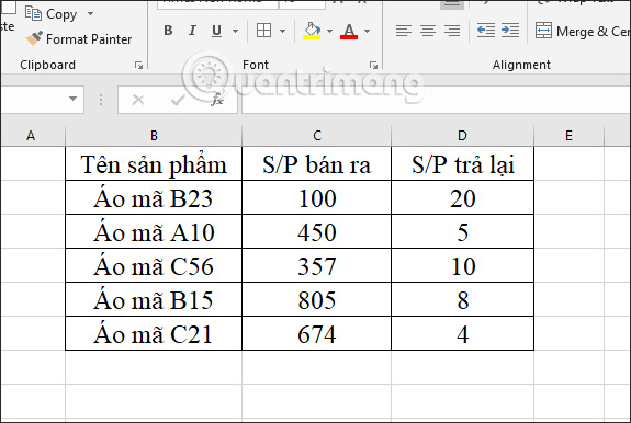
First of all, you also need a data sheet to create a chart from there.
Step 2:
Black out the data area then go to the Insert tab and select Column to draw a column chart in section 2-D Column.

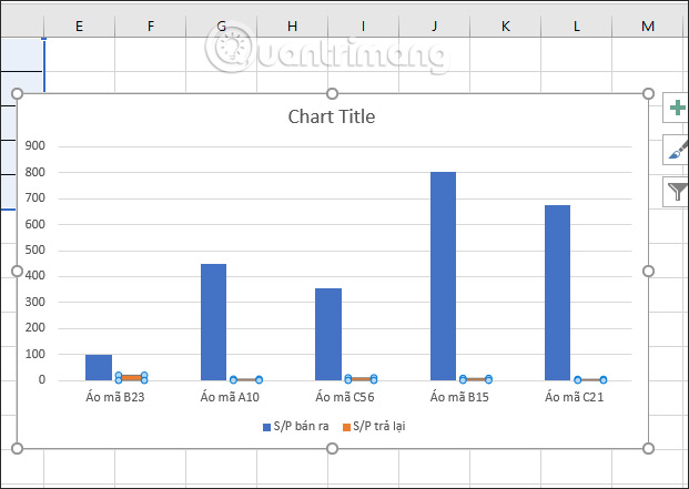
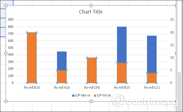
The result will display the column chart with the data for S / P column sold. To add a graph showing the returned S / P data, click on the yellow horizontal symbol representing the S / P sold in the column chart as shown below.
Step 3:
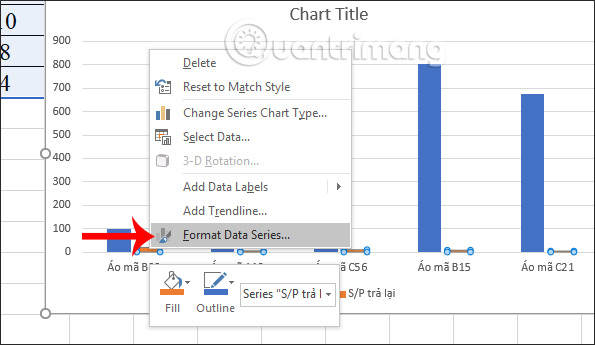
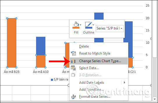
Right-click and choose Format Data Series to adjust the other data in the table on Excel.
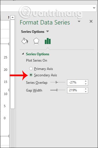
Display the Format Data Series interface for data options. In the Plot Series section, users select the Secondary Axis to select the data column number 2 in the data table.
The result of the chart will have the data section in the S / P column returned and indicated by color other than the S / P data column sold.
Step 4:
To plot a graph of the returned S / P data, we left-click the returned S / P on all yellow columns. Next, right-click the user and select Change Series Chart Type .
Step 5:
Display interface changes chart style. You look down to the section Choose the chart type and axist for your data series , choose the type of chart for the returned S / P column is the type of line chart .

Immediately the chart type will be changed as shown below. Click OK to exit the interface.

Chart results in Excel have been combined between two types of bar charts and line charts, representing two different data columns.

Step 6:
To customize the chart again, click on the Design tab to add the right, left, and data headers on the columns . depending on the requirements you need to perform.

For example, switch to the black background chart interface as shown below.

Often, the combination of two charts in Excel is a type of column chart and a line chart type to represent two different figures in the same statistics table. After creating the chart you proceed to change the format for the chart as usual.
I wish you all success!