How to create a Gantt chart for project management in Excel
Gantt chart is a form of chart commonly used for project management, which is one of the most popular and useful ways to present activities. The following article The network administrator will show you how to create a Gantt chart in Excel.
Table of Contents
For complex projects that involve a lot of work to be done, the Gantt chart is one of the smart choices. Excel does not support creating Gantt charts, but you can create a Gantt chart in Excel . The following article will show you how to create a Gantt chart in Excel.
1. What is a Gantt chart?
The Gantt chart is a graph that is often used to manage projects smartly, which is one of the common ways to present time-based activities (tasks or events). Each activity is denoted by a long bar, with a Start Date, a Time (Duration) and an end date (End Date).
More reference: Instructions for creating charts in Excel 2007 or 2010
2. How to create a Gantt chart in Excel
1. Create a work breakdown table
Each activity in your project has a start date, time, and end date. In the table illustrate a project below the items including the activity names, start date, time and end date.

2. Insert bar chart
On the Menu , select Insert , then click the Bar chat icon (bar chart).
A Menu appears, select Stacked Bar Chart ( stacked bar chart).

Add start date data (Start Date Data):
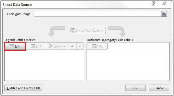
1. Right click on the blank chart location. Then click on Select Data . A Select Data Source window appears.
2. Under Legend Entries (Series) , click on Add to open the Edit Series window.
3. Click on the first field in the Series name section, then click on the boxes on the start date table.

4. Click the icon at the bottom of the Series values field (the red arrow icon is in a table) to open the Edit Series window .
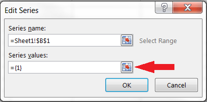
5. Click on the first line and drag down the last line in the Start Date section.
After the item is blacked out. Next, click on the red arrow icon in the table at the end of Edit Series . The current window will close and open a previous window. You just need to click OK.

So the first day data was created in the Gantt chart
See also: How to keep the cells fixed in Excel?
Add data to the Duration Data:
The steps are similar to adding data to the start date entry.
1. Under Legend Entries (Series) , click Add.
2. Click on the first field in the Series name section, then click on the cells in the time table.
3. Click the icon at the bottom of the Series values field (the red arrow icon is in a table) to open the Edit Series window .
Click on the first time box, drag the mouse down to the last time box in the timeline. After the item is selected, next click on the red arrow icon in the table at the end of Edit Series . The current window will close and open the previous window. You choose OK.
Your time data has been added on the Gantt chart.
You can change the date on the left side of the chart
1. Click on any bar on the chart, then right-click, open Select Data.
2. Click Edit under the Horizontal (Category) Axis Labels.
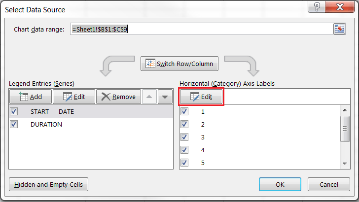
3. Black out the names of the jobs in your chart. Note, do not black out the job list field (Task).
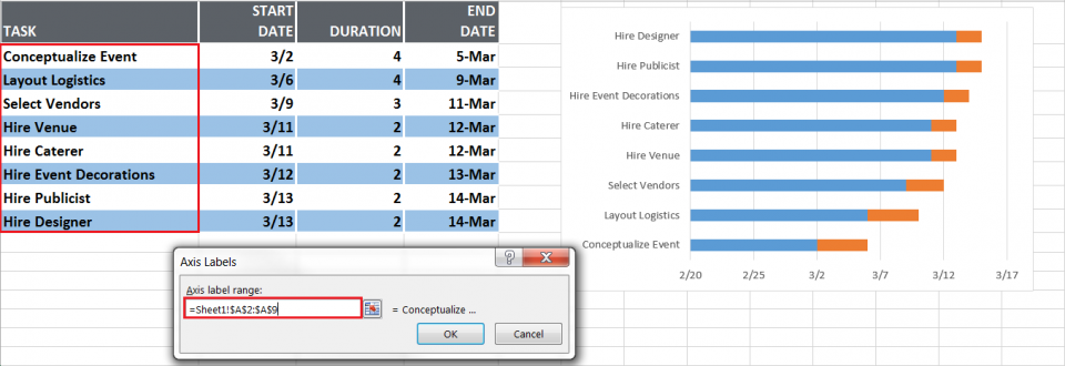
4. Click OK , then click OK
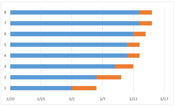
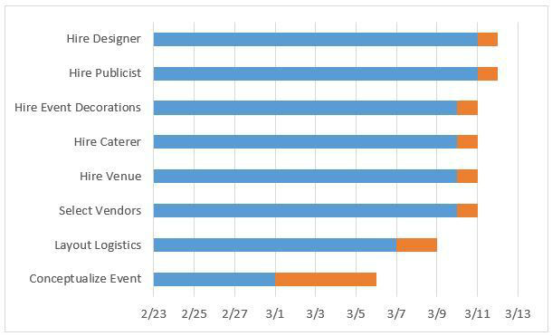
Your Gannt chart will look similar to the illustration below.
3. Gantt chart format
You can customize the created Gantt chart by adding grid lines, labels, or changing the bar color or the way the values or text display with the chart tool.
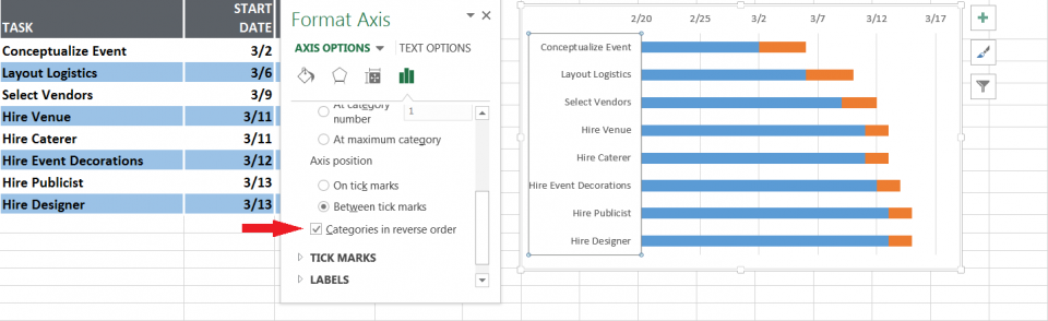
- Note, the work in your chart is arranged in reverse order. To fix this, simply click to select the task list then right-click, choose Format Axis and select Categories in reverse order, then select Close.
- To hide the green color on each bar, right click on the blue bar, choose Format Data Series , then select Fill and select No fill.
Click on Border to select No Line.
- To delete empty spaces at the beginning of the Gantt chart:
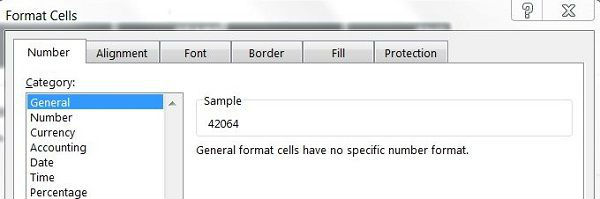
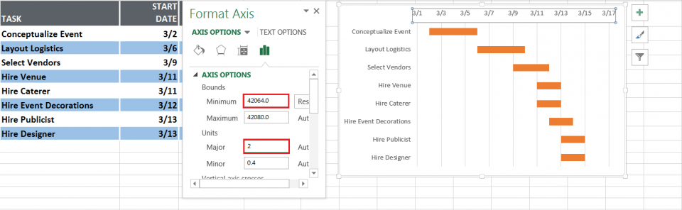
- Click on the first line in the Start date section in the data table. Hold and drag to the last line to select it, then right-click and choose Format Cells, then choose General . Remember to note the number line you see in the Sample section.
- On the Gantt chart , select the date on the chart bar and then right-click and choose Format Axis.
- In the Minimum section, enter the number you noted in the previous section.
- Section Major you should choose the unit of 2.
- Then select Close to complete the editing process.
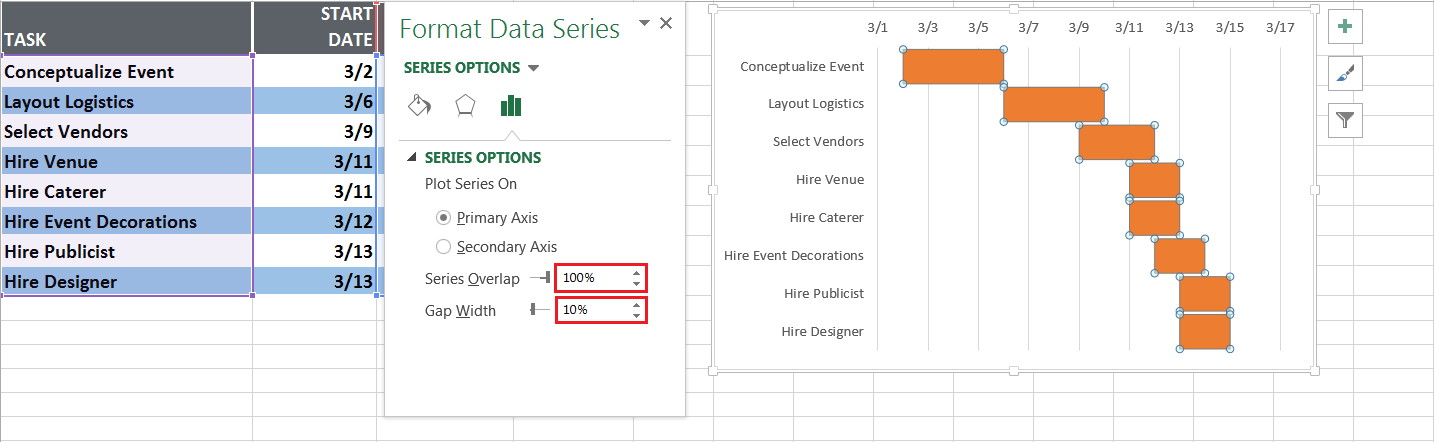
- If you want the Gantt chart to look better, you can delete the white spaces between the bars:
- Click on the first orange chart bar.
- Right-click then select Format Data Series.
- Separated 100% and Gap Width settings are 10%.
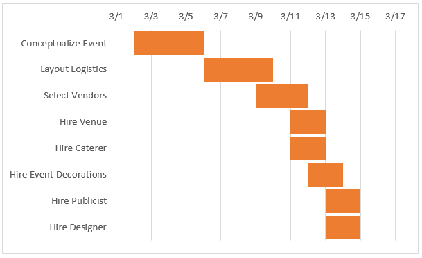
Once completed, your Gantt chart will look like the following illustration:
Good luck!
Was this article helpful?
Your feedback helps us improve.
Related Articles
 How to Create a Gantt Chart4 minutes read
 How to draw a Gantt chart in PowerPoint4 minutes read
 Gantt chart in Excel, how to create, how to draw Gantt chart in Excel6 minutes read
 How to create a bar chart in Excel3 minutes read
 Steps to use Pareto chart in Excel2 minutes read
 8 types of Excel charts and when you should use them9 minutes read
Reader Comments 0
Sign in with email or Google to join the discussion.