How to create a pie chart in Microsoft Excel
Pie charts are a great tool for visualizing information. It allows users to see the partial relationship with the entire data.
Table of Contents
Creating charts in Excel is a great way to display visual information. In particular, the pie chart allows users to see the relationship of each part with the entire data. Especially if using Excel to monitor, edit, share data, creating a circular chart will be very reasonable.
By using a simple spreadsheet, today's article will show you how to create this useful round chart. And once you understand it, you can explore more data usage options.
Insert information
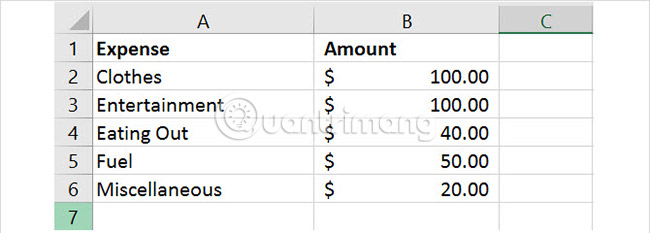
The most important aspect of the pie chart is data. Whether you import an existing spreadsheet or create a completely new spreadsheet, the exact format for the chart is still needed. The pie chart in Excel can convert a row or column of data.
Microsoft suggests a pie chart works best when:
- You only have one data series.
- No data value equal to 0 or less than 0.
- There are no more than 7 categories because too many items will make the chart difficult to read.
Remember that when a user changes the pie chart data, it will automatically update.
Create basic pie chart
You can create pie charts in two different ways and both start by selecting cells. Be sure to select only the cells you want to convert into a chart.
Method 1
Select the cells, right-click the selected group and select Quick Analysis from the context menu. In the Charts, select Pie and can see the preview by hovering over this option before clicking on it. Then, the pie chart will be inserted into the spreadsheet.

Method 2
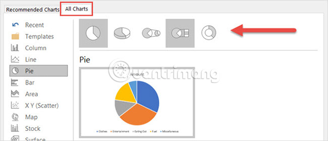
Select the cells, click the Insert tab and click the small arrow in the Chart section on the ribbon to open it. You can see the pie chart in the Recommended Charts tab , and if not, click the All Charts tab and select Pie.

Before clicking OK to insert your chart, there are several style options for it. You can choose a basic pie chart, 3-D, pie of pie (sub-pie chart of a large pie chart part), bar of pie (sub-chart chart of a large pie chart part) or shape donut. After selecting the type, click OK and the chart will appear in the spreadsheet.
Round chart format
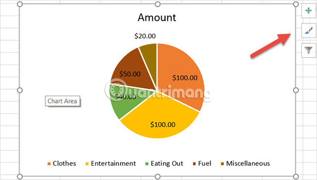
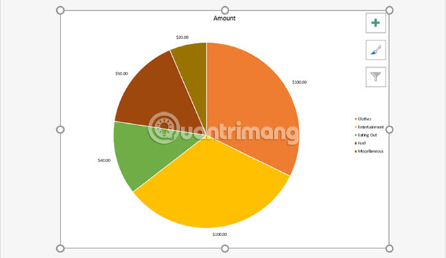
When there is a pie chart in the spreadsheet, you can change the elements like title, label and caption. You can also adjust colors, styles and formats easily or apply filters.
To start any changes, click the pie chart to display the menu of three squares on the right.
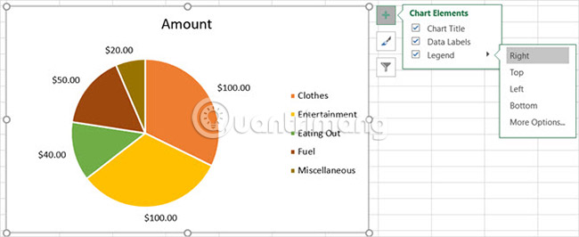
Adjust the elements of the chart
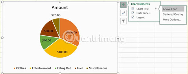
With the first menu option, you can adjust the chart title, data label and caption with various options for each option. You can also decide whether or not to display these items with checkboxes.
To access each of the following elements, click on the chart, select Chart Elements, then make a selection.

Chart Title ( Chart title)
If you want to adjust the title, select the arrow next to Chart Title in the menu. You can choose to place the title above the chart or in the center.
Data Labels
To change a label, select the arrow next to Data Labels in the menu. Then, you can choose from 5 different positions on the chart to display the label.

Legend (Note)
As with other factors, you can change where the annotations are displayed. Select the arrow next to Legend in the menu. Then, the user can choose to display the annotation on any side of the chart.
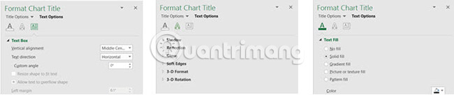
More Options (Other options)
If you select More Options for any of the above elements, a sidebar will open so users can add colors, borders, shadows, glowing effects or other text options. Users can also format chart areas in the sidebar by clicking the arrow below the Format Chart Area heading .
Change the chart type
You can change the style and color of your chart with many options.
To access the following items, click on the chart, select Chart Styles, then make a selection.
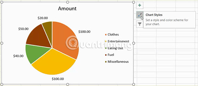
Chart type
Users can add templates to each part of the chart, change the background color or have a simple two-tone chart. With Excel, users can choose from 12 different pie chart types. Hover over each type for a quick preview.

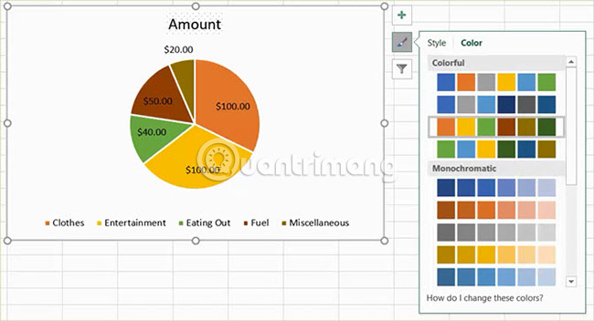
Color
Users can also choose from multiple color palettes for their pie charts. The Chart Style menu displays colorful or monochrome options in the Color section . Again, use the mouse to preview each option.
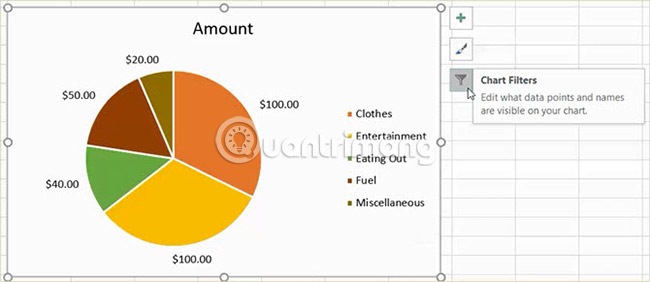
Apply chart filter
Sometimes users just want to see specific parts in the chart or hide names in the data series. This is when the chart filters work.
To access each option, click on the chart, select Chart Filters, then make a selection.
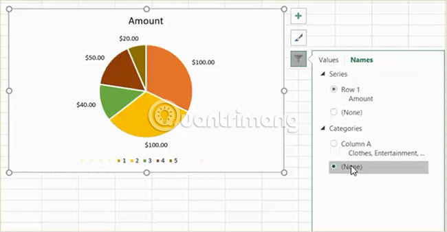
Value
Go to the Values section and then select or deselect the boxes for the categories you want to display. When done, click Apply.

Name
If you want to change the display name, click the Names section . Then, check the series and categories. Finally click Apply when done.
Resize, drag or move charts
When creating the chart, Excel will set the size and put the chart on the worksheet. However, users can resize the chart, drag it to another place or move to another worksheet.
Resize chart
Click on the pie chart and when the circular dots appear on the outline of the chart, drag to resize. When changing, note that the arrow appears on the dot to change into a two-way arrow.
Drag the chart
Again, click on the newly created circular chart and when the arrow displays four-way, drag it to a new position on the spreadsheet.

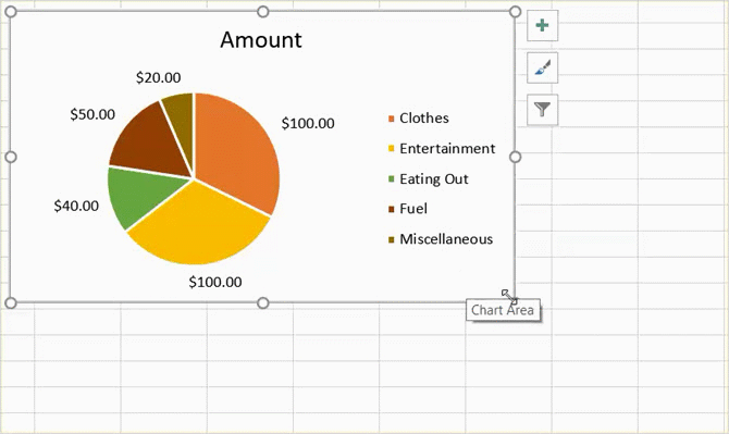
Move chart
Users can move the chart to another spreadsheet easily. Right-click on the chart and select Move Chart from the context menu. Then select the Print object and sheet in the pop-up window.
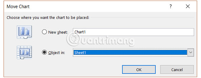
You can also create a new worksheet for the chart, so that it displays nicely without rows and columns in the spreadsheet. Select New sheet and enter the name in the window for it in the pop-up window.
Add a chart to the presentation
Placing an Excel pie chart into a PowerPoint presentation is done quite easily by copying and pasting.
Copy chart
In Excel, select the chart and then click Copy from the Home tab or right-click and select Copy from the context menu.

Paste chart
Next, open PowerPoint and navigate to the slide where you want to place the chart. Click that slide and select Paste from the Home tab or right-click and select Paste from the context menu.
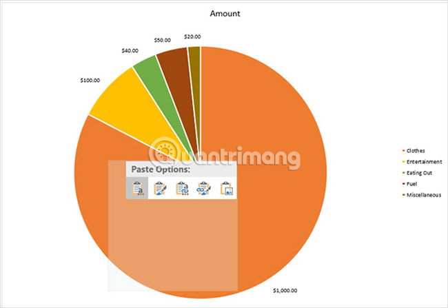
Remember that there are many different paste options in Microsoft Office applications. You can paste with source or destination format, each embedded or linked format. Or simply paste it as an image.

Creating a pie chart in Excel is simpler than you imagine. And it's easy to experiment with different styles, styles and colors to suit each specific purpose. Excel offers many options for users to create pie charts that match their needs and preferences.
Have you ever created a pie chart in Excel? What is the favorite feature to perfect your chart? Let us know your thoughts in the comment section below!
Good luck!
See more:
- 8 types of Excel charts and when you should use them
- How to create an effect for an Excel chart in PowerPoint
- Create Excel charts that automatically update data with these three simple steps
Was this article helpful?
Your feedback helps us improve.
Related Articles
 How to create a bar chart in Excel3 minutes read
 Steps to use Pareto chart in Excel2 minutes read
 8 types of Excel charts and when you should use them9 minutes read
 How to Make a Pie Chart in Excel4 minutes read
 How to make a thermometer template in Excel7 minutes read
 How to Add a Second Y Axis to a Microsoft Excel Chart2 minutes read
Reader Comments 0
Sign in with email or Google to join the discussion.