How to fix chart position in Excel
When you position the chart in Excel, users can easily change the size of the column in the worksheet without affecting the position and size of the chart.
Table of Contents
By manipulating the position of the chart in Excel, users can easily change the size of the column in the worksheet without affecting the position and size of the chart. When we insert a chart in Excel, the default chart is automatically moved and resized depending on the resizing and adjustment in the Excel table. However, many people who present a presentation to report an Excel document or in some cases want to freeze the Excel table. In Excel there is the option to fix the position of the Excel table in a very simple way, similar to the way to fix an image inserted in Excel that TipsMake.com has guided before.
Instructions for fixing tables in Excel
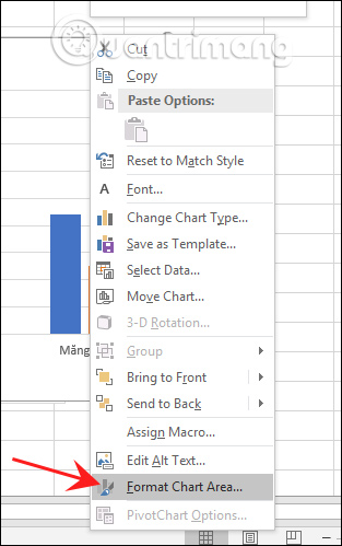
Step 1:
At the chart interface in Excel, right-click and then select Format Chart Area in the menu displayed.
If you do not see this option, then right click on the border surrounding the table.
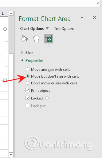
Step 2:
Now display the setting interface on the right side of the screen, click the Size & Properties icon as shown below.

Step 3:
Continue to click on Properties to expand the list of options. Here users will see two different options: Don't Move Or Size With Cells and Move But Don't Size With Cells.
With the Don't Move Or Size With Cells option , we will lock the chart completely , without changing the size or position when any of the table cells are changed. If you want to move the chart but keep the size, click Move But Don't Size With Cells.
Depending on your needs, we fixed the chart accordingly. For normal move and resize mode, press Move and size with cells.
Was this article helpful?
Your feedback helps us improve.
Related Articles
 8 types of Excel charts and when you should use them9 minutes read
 Steps to use Pareto chart in Excel2 minutes read
 How to use pictures as Excel chart columns2 minutes read
 How to create a bar chart in Excel3 minutes read
 Steps to reset chart in Excel2 minutes read
 How to make a thermometer template in Excel7 minutes read
Reader Comments 0
Sign in with email or Google to join the discussion.