How to create a frequency chart in Excel

Charts give you an overview of numbers and figures. You only need to look at the chart without looking at the original data to determine the necessary statistical criteria. Especially with the frequency chart you can determine the frequency of occurrence of the event, the variability . The following article gives detailed instructions on how to create frequency charts in excel.

Example: The following data sheet is available:

How to create a frequency chart in Excel Picture 1

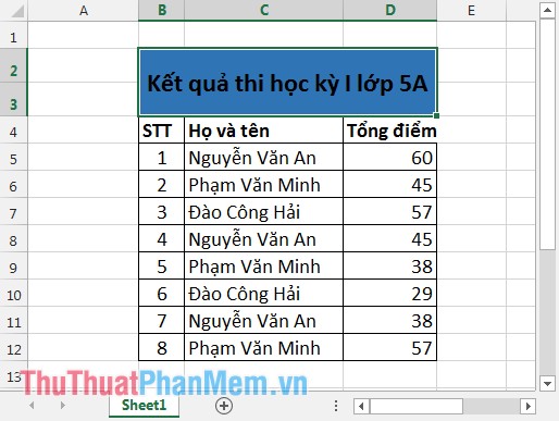
Draw a histogram to show the total score.

Step 1: Go to DATA tab -> Data Analysis .

How to create a frequency chart in Excel Picture 2

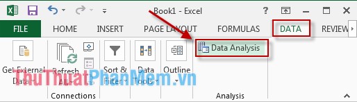
Step 2: A dialog box appears, select Histogram -> OK .

How to create a frequency chart in Excel Picture 3

Step 3: The dialog box appears:

- Input Range : Select the data area you want to show on the chart.

- Output Range : Select the position you want to show the chart.

- Tick 2 selected Cumulative Percentage and Chart Output items .
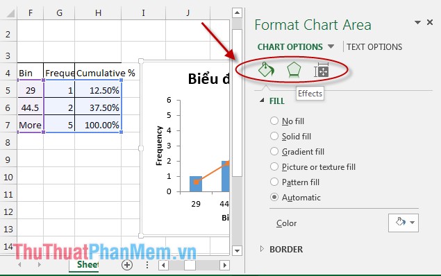
How to create a frequency chart in Excel Picture 4

Result:

How to create a frequency chart in Excel Picture 5

You can edit the chart on your own. Right-click on the chart, select Format Chart Area -> The dialog box appears, select the chart color, font, chart style, effects .

How to create a frequency chart in Excel Picture 6

Above is how to draw the frequency chart hoping to help you. Good luck!

3.6 ★ | 5 Vote

May be interested

  • Steps to create graphs (charts) in ExcelSteps to create graphs (charts) in Excel
    the following article shows you the steps to create a chart (chart) in excel 2013. step 1: select the data to create a chart (for example, here you want to create a sales chart of employees - click employee name column and sales) - insert - select the type of table
  • How to create a Gantt chart for project management in ExcelHow to create a Gantt chart for project management in Excel
    gantt chart is a form of chart commonly used for project management, which is one of the most popular and useful ways to present activities. the following article the network administrator will show you how to create a gantt chart in excel.
  • Create Excel charts that automatically update data with these three simple stepsCreate Excel charts that automatically update data with these three simple steps
    excel charts help shorten the decision-making process, because we can immediately see the results and things to change. however, the difficulty in processing data and charts is that users must constantly return to the chart and update new data. yes, this problem will be gone when you follow these three simple steps to create an excel chart that automatically updates data.
  • How to Create a Probability Distribution Graph in ExcelHow to Create a Probability Distribution Graph in Excel
    tipsmake today will show you how to create a column histogram on microsoft excel. a probability distribution chart is a column graph that displays frequency data that allows you to calculate numbers.
  • How to use pictures as Excel chart columnsHow to use pictures as Excel chart columns
    excel offers a variety of chart types. however, you don't have to use columns; you can use images instead to make your charts more appealing.
  • How to Create a Bar Chart in ExcelHow to Create a Bar Chart in Excel
    wikihow will show you how to present data in microsoft excel more eye-catching and attractive with bar charts.
  • Instructions for inserting, drawing and creating charts in Word 2007Instructions for inserting, drawing and creating charts in Word 2007
    in addition to the fact that we often work and create charts on excel, sometimes you will have to conduct charting in word content.
  • How to Make a Pie Chart in ExcelHow to Make a Pie Chart in Excel
    this wikihow teaches you how to create a visual representation of your data in microsoft excel using a pie chart. open microsoft excel. it resembles a white 'e' on a green background.
  • Steps to reset chart in ExcelSteps to reset chart in Excel
    the following article shows you the steps to reset the chart in excel 2013. after creating the chart, if you do not like the selected chart style, you can do the following to change the chart type the simplest and fastest way: step 1: sign
  • Gantt chart in Excel, how to create, how to draw Gantt chart in ExcelGantt chart in Excel, how to create, how to draw Gantt chart in Excel
    gantt chart in excel, how to create, how to draw gantt chart in excel. you are the manager often have to manage projects with many jobs, so you want to use the gantt chart in excel to better manage projects. if you haven't