How to create a pie chart in Excel
Pie charts are a regular way to show things through data, which help your paper be scientific and attract readers. The following article details how to create a pie chart in Excel.
Table of Contents
Pie charts are a regular way to show things through data, which help your paper be scientific and attract readers. The following article details how to create a pie chart in Excel.
You should first learn how to use a pie chart when:
- Your data is a string.
- There is no 0 or less value in the data table.
- To represent data by circles, you should not use more than 7 data fields on a circle.
How to create a pie chart: For example, with a sales table, draw a pie chart that represents sales.
- Draw a chart:
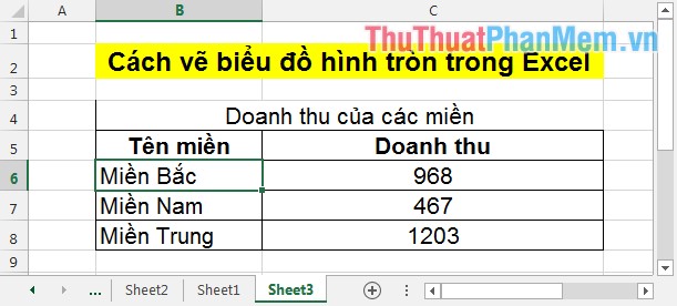
Step 1: Highlight the data to chart.

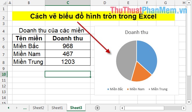
Step 2: In INSERT -> select the icon of the pie chart -> choose the type of chart to draw, in this example, select the pie chart 2 - D Pie.

Step 3: After selecting the chart type, the pie chart is drawn as shown:
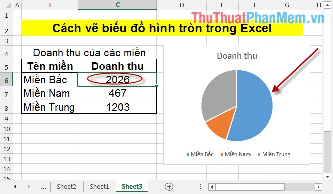
- In case you want to change the data on a spreadsheet -> the chart updates itself with that change. For example, the North increased its sales to 2026 -> the chart changes.
So with 3 simple steps, you have drawn a pie chart.
- Edit chart:
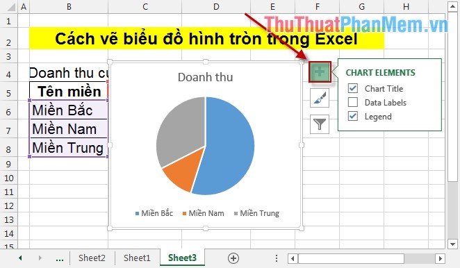
1. Add other components to the chart:
Click on the CHART ELEMENTS icon with the following properties:
- Add title to the chart: Check Chart Title .
- Add data labels to the chart: Tick Data Labels .
- Add notes to the chart: Select Legend .
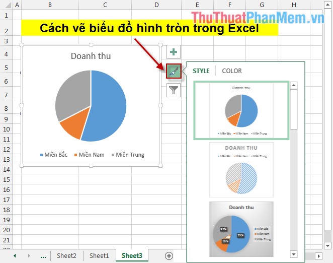
2. Change chart colors and styles
To change chart colors and shapes, click on the Chart Styles icon according to your preferences and post requirements, you can choose the chart style and color accordingly.
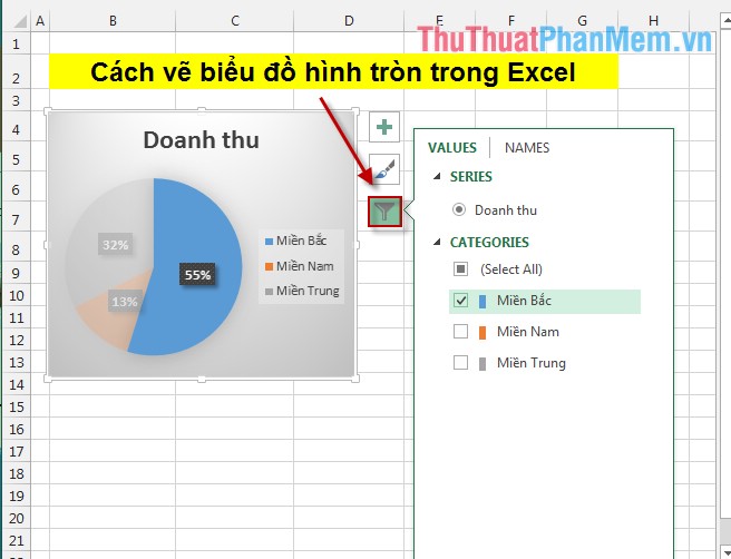
3. The feature to filter or display the data section need to be emphasized
For example, if you want to obscure the data of the Central and Southern regions, the largest part of the North is visible -> click on the Chart Filters icon -> select the data to be displayed and the data you need. blur.
Above is how to draw a pie chart and how to change the chart after drawing.
Good luck!
Was this article helpful?
Your feedback helps us improve.
Related Articles
 How to create a bar chart in Excel3 minutes read
 Steps to use Pareto chart in Excel2 minutes read
 8 types of Excel charts and when you should use them9 minutes read
 How to create a pie chart in Microsoft Excel10 minutes read
 How to create a frequency chart in Excel2 minutes read
 How to create an effect for an Excel chart in PowerPoint9 minutes read
Reader Comments 0
Sign in with email or Google to join the discussion.