How to Create a Multi-Line Chart in Excel
Drawing a multi-line chart in Excel is very simple! If your spreadsheet has multiple groups of data, you can view the data visually by creating a chart with multiple lines. You can create a new chart or add lines to an existing chart. This article will show you how to create a multi-line chart
Table of Contents
Make an Excel spreadsheet
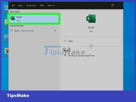
Open Excel. Open Excel by opening the downloaded application on your device or using a browser with a Microsoft Office account. If you don't have the Excel app or a paid Microsoft 365 account, you can purchase or try the program for free on the Microsoft website at https://www.microsoft.com/en-us/microsoft-365/ excel.
Excel is available on Windows, Mac, and Android devices. You can use Excel on your computer, tablet, or phone.
The Microsoft 365 service plan lets you use Excel, Word, Powerpoint, and many other Microsoft apps. Service fee is 69.99 USD/year (about 1.6 million VND) for the individual package, and 99.99 USD/year (about 2.3 million VND) for the family package. Family package allows 6 people to share.

Create a new file. On the main Excel screen, you will click "New blank workbook". This opens a new sheet where you can enter data.
If you already have a spreadsheet with data used to create charts, you can open it on the Excel home page, right below "All" or "My recent".
Right next to the "New blank workbook" option, you'll see "Welcome to Excel". If you're new to Excel, click this option to see basic usage instructions.
Sort data by column. To create a line chart, you need to enter data for two axes. On a line chart, these two axes represent the change of data over time. For example, if you want to see distance information over time, the x-axis represents the time data and the y-axis represents the distance data. Select the leftmost column - column A to enter the time for the x-axis. Enter in column A the time points that you want the x-axis to represent. In the next column, enter the data points for the first row that you want to show over time in column A. Enter the data for the next row and continue until the data points that you want to show on the chart are shown. enter the same column on the spreadsheet. These columns create a graph of time data on the x-axis.
All data points of a line must be entered in the same column.
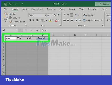
Enter names for the data groups in line 1. Column A will be the time data used to plot the lines in the chart. Name the remaining columns according to the group of data they represent.
For example, if you want to create a chart of sales of Honda models for the past 10 years, column A will be named "Year" and columns B, C, D will be named "CR-V", "Civic", "Accord" ", etc. The lines in the graph will be named CR-V, Civic, Accord and are formed based on the number of years entered in column A.
Use data in a spreadsheet to create a multi-line chart
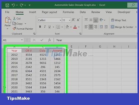
Select the data to use to create the chart. Click and drag the mouse to the data column to create the chart. Drag the mouse from the upper left corner to the lower right corner of the group of data that you want to show on the chart. The selected data will be highlighted in the spreadsheet.
Each column of data that you select will be a line in the chart.
Remember to include the column headers when you select the data group. The names of the data groups will appear in the legend of the chart.
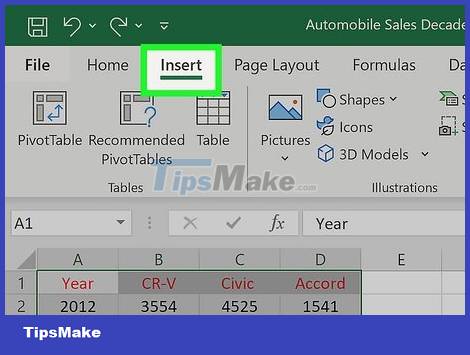
Click "Insert" in the menu at the top of the screen. In the section above the spreadsheet, you'll see a menu with editing options for the spreadsheet. Find and click the "Insert" option in this menu.
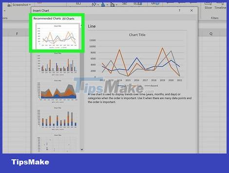
Select the line chart icon under "Recommended Charts". Below the "Insert" option is a new menu with a "Recommended Charts" section. In this section, select the line chart icon to insert a line chart of the data into the spreadsheet. Inserting a line chart automatically creates multiple lines representing the data points. Each column of data is a line on the chart.
If you want to create a chart with only one line, simply select a column of data before inserting the chart.
Creating multiple lines on a chart is a great way to compare groups of data.
If you enter a name for each data group on line 1, the information will show up in the legend at the bottom of the chart, showing what each line represents.
Add lines to existing charts

Enter the new column of data into the spreadsheet. Add data to the column immediately to the right of the last data column of the chart.
Remember to enter the column name in line 1 for that information to show up on the chart.
You can create a new chart with this data by repeating the steps of selecting data and adding lines to the chart. If you want to add a new line to an existing chart, perform the following steps.
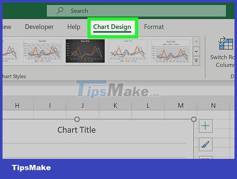
Select the chart and click "Chart" at the top of the spreadsheet. Click once on the line chart in the spreadsheet to select it. Next, navigate to the "Chart" section of the menu in the upper-right corner of the spreadsheet.
In this menu, you can edit many elements of the chart, such as the title and line chart style.
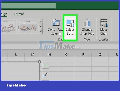
Click the "Select Data" section in the selection pane. Opening the "Chart" section will show you a menu with many chart-related options. Selecting "Select Data" opens a window showing the data area displayed in the line chart.
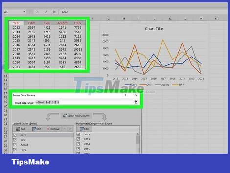
Change the data range to add a new column of data. In the "Select Data" window, you will see the data area. For example, your data range starts from column A - row 1 to column E - row 6 of the spreadsheet. This data area will display as "=Sheet1!$A$1:$E$6". Add new data to this area by changing the second character value of the data area to the character of the rightmost column in which you want to add data to the chart. Updating the data area automatically adds that data to the chart.
If you have plotted a line chart with data from columns A to E and want to add a line for the data in columns F and G, change the second character in the data area to 'G'.
If you want to add a new line of data, you need to change the second numeric value to the number of the new line you want to add to the chart.
Update the data area to add as many new columns of data as you want. Each column of data that you add to the data area creates a new line on the chart.
Was this article helpful?
Your feedback helps us improve.
Related Articles
 8 types of Excel charts and when you should use them9 minutes read
 How to draw a line chart in Excel7 minutes read
 How to create a bar chart in Excel3 minutes read
 Steps to use Pareto chart in Excel2 minutes read
 How to create a pie chart in Microsoft Excel10 minutes read
 How to create a pie chart in Excel3 minutes read
Reader Comments 0
Sign in with email or Google to join the discussion.