Table of Contents
This updated guide explains how to Draw a Chart in Word through clear steps, practical examples, and important checks that help prevent common errors.

In Word, there are many types of diagrams that can be used with different data. this guide shows you how to draw and edit charts in Word 2007, with Word 2010 and 2013 you can do the same thing.
How to Draw the Chart
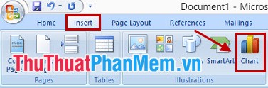
Step 1: Open the Word file, select the position to insert the chart and then select Insert -> Chart .
Step 2: Appear the Insert Chart , in the dialog box there are many types of charts, depending on the data you select the chart accordingly.
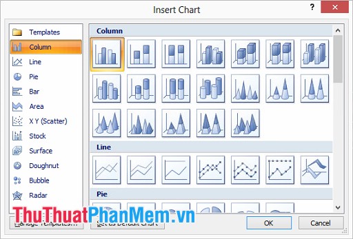
Chart Types:
- Column: a vertical bar graph displays data that changes over time or compares between items. In Column there are different chart types such as 2D column chart, 3D column chart, stacked column chart and 3D stacked column chart.
- Line: a line chart that can show trends over time with markers at each data value. In Line charts, there are many types of charts such as line charts, marked line charts, stacked line charts, 3D line charts, etc.
- Pie: pie chart, representing percent data.
- Bar: horizontal column chart, similar to Column but organized vertically and horizontally.
- Area: the area chart is used to indicate change over time and direct attention to the total value through a trend.
- XY (Scatter): XY scatter chart, used to compare data values one by one.
- Stock: stock chart, often used to illustrate fluctuations of stock prices, in addition this chart also illustrates the fluctuation of other data such as rainfall, temperature.
- Surface: surface chart helps you to combine optimally between data sets, colors will indicate areas belonging to the same value range. You can create a surface chart when both the category and the string are numerical values.
- Donut: donut chart shows the relationship between parts with totals, it can include multiple data series.
- Bubble: Bubble chart is a type of chart xy (tan), this chart is much used in market research, financial analysis.
- Radar: Spider web graph displays multivariate data, often used to identify performance and identify strengths and weaknesses.
After selecting the chart format you click OK .
Step 3: The Excel page appears containing the data table, you enter data for the data table in Excel.
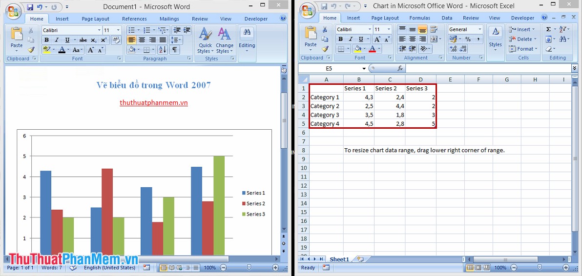
After importing, you just need to turn off Excel, so you have finished drawing the chart in Word 2007.
Edit the Chart
1. Chart Editing Tool (Chart Tools).
When you select the chart you just created, on the toolbar appears Chart Tools with 3 tabs: Design , Layout and Format .
Tab Design , you can choose the chart type, layout, color, change data. for the chart.

Layout tab, you can manage insert pictures, images and documents, labels, titles. for the chart.

Format tab, you can edit the shape, font style and size for the chart.

2. Move the Chart.
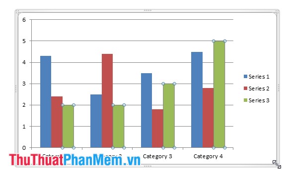
You can choose to chart and align as the text alignment, or if you may need to move the chart to another position, select the chart and press Ctrl + X then place the cursor in the new position and press Ctrl + V . You can place the cursor on the corners of the map to resize the chart.
3. Add Titles and Labels to the Chart.
Select the chart, in Chart Tools, select Layout .
To add a title, select Chart Title and choose a title type, then enter a title on the chart and press Enter .

To add labels and data for columns in the chart, select Data Labels and choose the position you may need to display the labels.
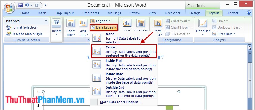
4. Add Comments to the Axes in the Chart.
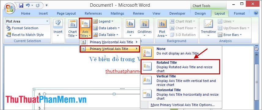
To add a title to the axes in the chart, select Chart Tools -> Layout in Labels, select Axis Titles and select the axis to write comments.
For example, in Axis Titles -> Primary Vertical Axis Title -> Rotated Title , then the frame will appear in the chart for you to enter the comments, you can move to the desired position.
5. Change the Data in the Chart.
Select the chart, in Chart Tools choose Design -> Select Data . Dialog box Select Data Source and Excel file you can change the data in it.

So you can draw a chart in Word, you need to choose a chart to match the data so that the chart shows all the meaning of the data. Good luck!
FAQ
What is the easiest way to Draw a Chart in Word?
Start with the requirements in this guide, then follow each step in order. Check the result after every major change so problems are easier to identify.
Can beginners follow these instructions?
Yes. The process is organized into practical steps, and you can repeat any step before moving forward.
What should I check if the method does not work?
Confirm your software or device version, permissions, settings, file format, and internet connection when the task depends on online services.
Related Articles
 Instructions for Inserting, Drawing and Creating Charts in Word 20074 minutes read
 Instructions on How to Copy Charts from Excel to Word6 minutes read
 How to Create a Chart in Word 20163 minutes read
 How to Create a Pie Chart in Word7 minutes read
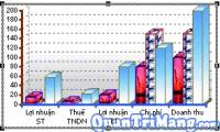 Chart in MS Word8 minutes read
 How to Draw a Bar Chart in Excel6 minutes read
Reader Comments 0
Sign in with email or Google to join the discussion.