How to draw a bar chart in Excel
How to draw a bar chart in Excel. A bar chart is a chart that is used quite a lot, this is a chart that displays many different types of data with a rectangular column, the longer the bar, the greater the value. There are two types of bar charts: vertical and vertical charts
A bar chart is a chart that is used quite a lot, this is a chart that displays many different types of data with a rectangular column, the longer the bar, the greater the value. There are two types of column charts: vertical bar charts and horizontal bar charts. If you are trying to draw a bar chart in Excel but don't know how to do it, please refer to the following tutorial.

The article guides how to create a bar chart in Excel, please follow along and refer.
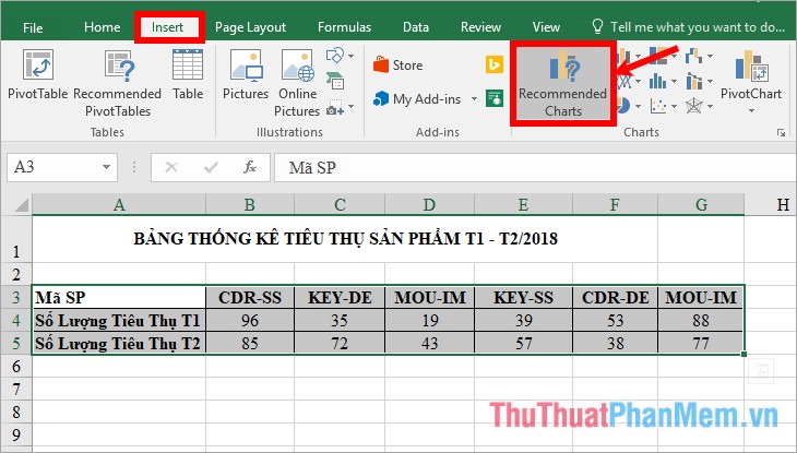
Step 1: Open the Excel file with the data to draw the column chart, select (highlight) the data table to draw and then select Insert -> Recommended Charts.
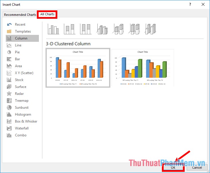
Step 2 : Appear the Insert Chart, select the All Charts tab , here you select the vertical column chart types in the Column section , horizontal bar charts in the Bar section . Excel provides many types of vertical and horizontal column charts for you to choose from: 2D column chart, 2D column chart, 3D column chart, 3D column chart, . Click on the chart. column you want to draw then click OK .
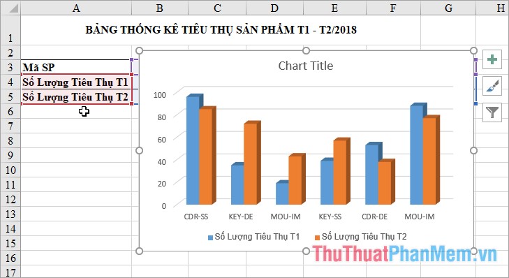
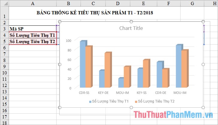
So you have drawn a bar chart in Excel.
Step 3: Edit the column chart.
1. Move and resize the column chart
To move the chart, hold down the mouse cursor on the chart and drag to the position you want to move then release the mouse cursor.
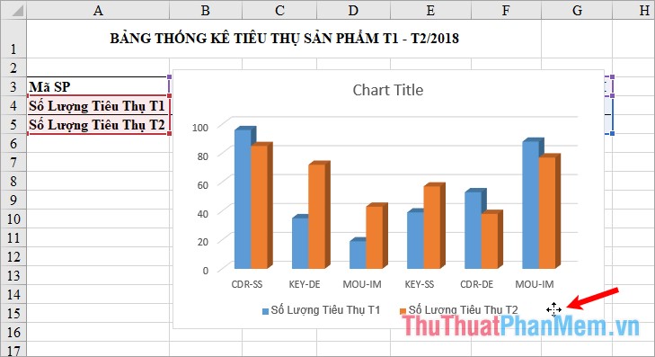
To change the size for the chart, click the chart, next to the grasp buttons at the four corners and between the four sides of the chart, then hold down the mouse and customize the size for the chart.
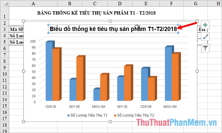
2. Add a title to the bar chart
Double click on the Chart Title and enter a title name for the chart.
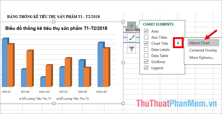
3. Show / Hide some elements in the column chart
Click the + symbol next to the column chart, you will see some components that can be shown or hidden:
- Axes : vertical bar and horizontal bar (vertical axis, horizontal axis).
- Axis Titles : vertical axis title, horizontal axis.
- Chart Title: main title of the bar chart.
- Data Labels : data labels on columns.
- Data Table : The data table used to draw a chart.
- Gridlines : horizontal, vertical gridlines on a chart.
- Legend : annotates the elements on the chart.
Want to display the components, then you tick the box before the component name (if hidden, uncheck the box).
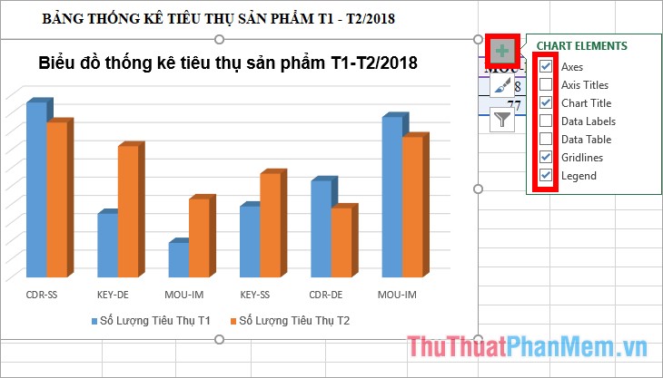
If you want to change the custom of the components, select the black triangle icon next to the component name and custom settings.
4. Change the column chart style
You choose the chart, this time on the menu bar appears Chart Tools containing Design and Format tab , select Design -> select the chart style in the Chart Styles section . Click the More icon to get more choices of the bar chart style.

5. Change the column chart layout
Select the chart -> Design -> Quick Layout -> choose the layout type for your column chart.

6. Change colors for bar charts
Select the chart -> Design -> Change Colors -> select the color set for the columns in the chart.

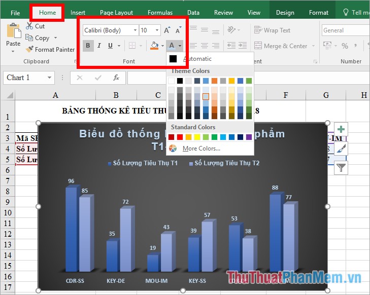
7. Format of font size and type
Select chart -> Home -> edit font, font style, font size, font color . in the Font section .
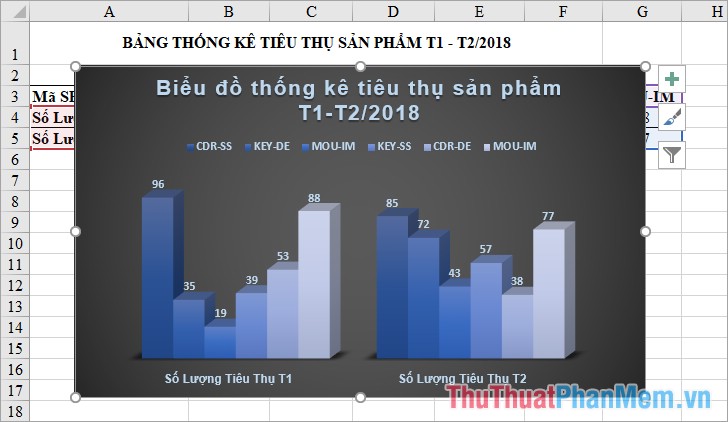
8. Reverse rows and columns position in column chart
To reverse the position of rows and columns in the chart, click the chart -> Design -> Switch Row / Column.
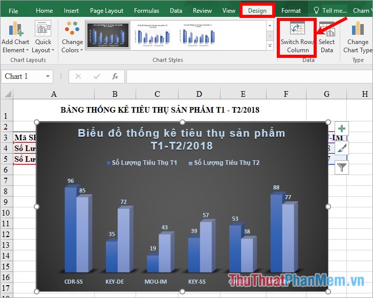
You will get the following:
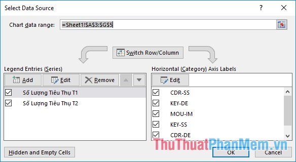
9. Change data for column charts
Select chart -> Design -> Select Data.
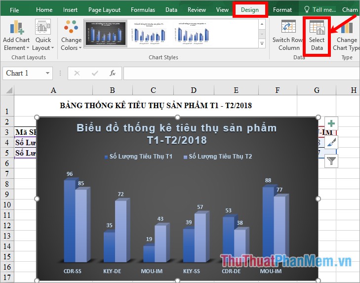
At Select Data Source you can change the data as you like.
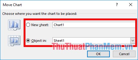
10. Move chart to another Sheet
Select chart -> Design -> Move Chart.

In the dialog box Move Chart you select the location to move the chart:
- New sheet: move to a new sheet, name the new sheet in the white box next to it.
- Object in: move the chart to an existing sheet in the Excel file, select the sheet in the next box.
Then click OK to move the chart.
So, you already know how to create a bar chart in Excel and the customizations needed to have a beautiful and scientific bar chart. Hope the article will help you. Good luck!
Was this article helpful?
Your feedback helps us improve.
Related Articles
 Steps to use Pareto chart in Excel2 minutes read
 How to draw a line chart in Excel7 minutes read
 How to make a thermometer template in Excel7 minutes read
 How to create 2 Excel charts on the same image4 minutes read
 8 types of Excel charts and when you should use them9 minutes read
 Gantt chart in Excel, how to create, how to draw Gantt chart in Excel6 minutes read
Reader Comments 0
Sign in with email or Google to join the discussion.