Chart in MS Word
In some good exercises at the end of the year, the end of the year, ... you may have to draw a chart based on the aggregated data to show the image data for many others to see, QuanTriMang. com instructs you to manipulate charts in MS Word program.
MS Word: In some good exercises at the end of the period, the end of the year, . you may have to draw a chart based on the aggregated data to show the image data for many others to see , QuanTriMang.com instructs you to manipulate some charts in MS Word program:
1- Draw a chart
2- Change the chart type again
3- Edit the content displayed on the chart
4- Rotate & display chart according to 3-D image
5- Change chart format
6. Change the data point format
7. Change chart background color
8- Change the bottom of the chart
1- Draw a chart
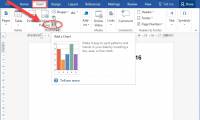
1. To draw a chart that requires a data table, you can enter the data into the previous table and select the chart icon; or you can select the chart icon first and then enter the data into the Data Sheet table.
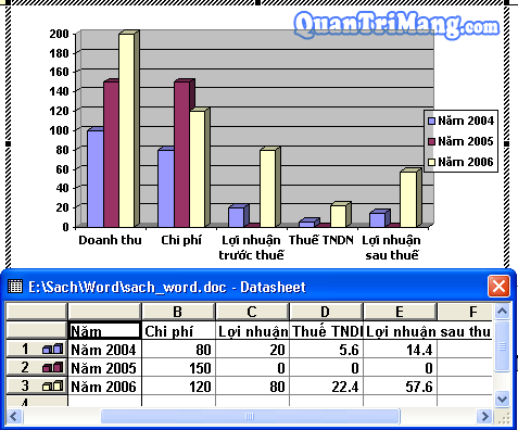
Example chart with the following data table:
Year
Revenue
Cost
Profit before tax
VTC
Profit after tax
2004
100,000
80,000
20,000
5,600
14,400
2005
150,000
150,000
0
0
0
2006
200,000
120,000
80,000
22,400
57,600
2. Select (black out) the data sheet.
3. Click on the icon
on the Standard toolbar (Or go to Insert Object . The Object dialog box appears. On the Create New tab, select the Microsoft Excel Chart program)
4. Appears the chart drawing program window and Data Sheet data entry panel allows to import or edit the table data contents. At this time on the data sheet & chart there may be font errors, you can edit them directly in that data sheet.
5. Double-click on the drafting screen if the chart is complete. At that time, editing the chart almost to edit photos, especially, has a toolbar for editing.
6. Want to edit the content & chart style: Double click on the chart. Or right-click on the chart, select Chart Object Edit:

2- Change the chart type again
1. You are in the graph editing screen, right-click, select Chart Type .

2. Display the Chart Type dialog box, select the Standard Types tab.

- Please select the chart type according to the Chart type list and select the chart image in the Chart sub-type box.
- Select the Set as default chart button if you want to let the selected chart type be used for the following chart drawing.3. You can select the Custom types tab to choose a different type of chart
4. Click the OK button to complete the chart type change
3- Edit the content displayed on the chart
1. You are in the graph editing screen, right-click, select Chart Option .

=> The Chart Option dialog box appears:
2. Tags Titles: The title on the chart

- Chart title: Name of the chart
- Category (X) axis: Title X axis
- Series (Y) axis: Y axis title
- Value (Z) axis: Value displayed on Z axis.3. Axes card: Value displayed by the axis

þ Category (X) axis: Displays the value of the X axis
ž Automatic: Under automatic mode
ž Category: By type
ž Time-scale: According to the time axis.þ Series (Y) axis: Displays the value of the Y axis
þ Value (Z) axis: Displays the value of Z axis.4. Gridlines tab: Change the bottom of the chart.

5. Legend card: Annotation

þ Show legend: Show / Hide comments
Placement: Placement:ž Bottom: Under the chart
ž Corner: In the corner of the chart
ž Top: On the chart
ž Right: on the right of the graph
ž Left: Left of the chart.6. Data Labels tab: Displays data and value labels

- Labe Contains: Labels
- Separator: Separator of numerical value.R Legend key: Show / Hide the legend icon on the data label.
7. Data Table Card: Displays the data table

R Show data table: Show / Hide data table
R Show legend keys: Show / Hide the legend icon in the data table.
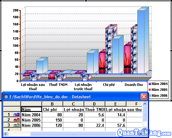
4- Rotate & display chart according to 3-D image
1. You are in the graph editing screen, right-click, select 3-D View .

=> Appear 3-D View dialog box:

- Elevation: Rotate the chart horizontally.
- Rotation: Rotate the chart vertically.
- Perspective: Remote perspective.
You can use the appropriate chart rotation function buttons.
5- Change chart format
1. You are in the chart editing screen, want to change the font in any area, right-click in that area. Next, choose Format Axis . (Format Legend .)

Right-click the data area on the coordinate axis

Right-click the legend area=> Appear the Format Axis dialog box
2. Pattern Cards: Line style

3. Card Scale: Stretch chart

R Categories in reverse order: Reverse the chart
4. Font Card: Change the font

5. Number Card: Types of data formats: number, date, currency, percentage, .

6. Alignment Card: Align

6. Change the data point format (With the example chart in the lesson, data points are columns).
1. You are in the chart editing screen, want to change the format of any data column, right-click the data column, select Format Data Point .

=> The Format Data Series dialog box appears
2. Patterns Card: Change the background color and column border data

You can click on the Fill Effect button . to select the more interesting background colors in a format: dot-dots, use 2 colors, even use images available on your computer to make the column color background material.
3. Card Shape: Shape of data column:

4. Data Labels tab: Data column label of the chart.

5. Options Card: Option to be big and small; tilt column data.

After each change to the data point format, the color points in the legend section will also be changed accordingly.
7. Change the chart bottom format
1. You are in the graph editing screen, right-click on the chart bottom position, select Format walls .

=> A Format walls dialog box appears
2. Choose color according to your preferences (color should be contrasted with the color of the data column for easy viewing).

You can click on the Fill Effect button . to select the more interesting background colors in a format: dot-dots, use 2 colors, even use images available on your computer to make the column color background material.
8- Change the bottom of the chart
1. You are in the graph editing screen, right-click on the bottom of the chart, select Format Gridlines .

=> A Format Gridlines dialog box appears.
2. Card Patterns: Line style

3. Scale Card: Some modes of data column elasticity.

These are some of the features that are frequently used when drawing graphs. In addition, when in the graph editing screen, there is also a toolbar to edit. Anyone who needs to know how to draw a chart in MS Excel can use this article as a reference. The above example has the following result of the chart editing process:
Was this article helpful?
Your feedback helps us improve.
Related Articles
 Instructions for inserting, drawing and creating charts in Word 20073 minutes read
 How to Make a Bar Chart in Word2 minutes read
 How to create a pie chart in Word7 minutes read
 Create and insert Word 2016 charts5 minutes read
 How to create a chart in Word 20162 minutes read
 8 types of Excel charts and when you should use them9 minutes read
Reader Comments 0
Sign in with email or Google to join the discussion.