How to draw a line chart in Excel
How to draw a line chart in Excel. A line chart shows continuous data over time on an evenly divided axis, so a line chart is suitable for representing data trends at equal time periods like months, quarters or years.
A line chart shows continuous data over time on an evenly divided axis, so a line chart is suitable for representing data trends at equal time periods like months, quarters or years. Line charts fit different types of data arranged in columns or rows on a spreadsheet. If you want to draw a line chart for your data but do not know how to draw a line chart, please refer to the following article.
Below is a detailed tutorial on how to draw a line chart in Excel, please refer to it.
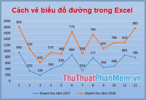
Step 1: Open the Excel file with data to draw a line chart, select (black out) the data table to draw the chart, select both row and column headings to make horizontal axis values and annotations for chart.

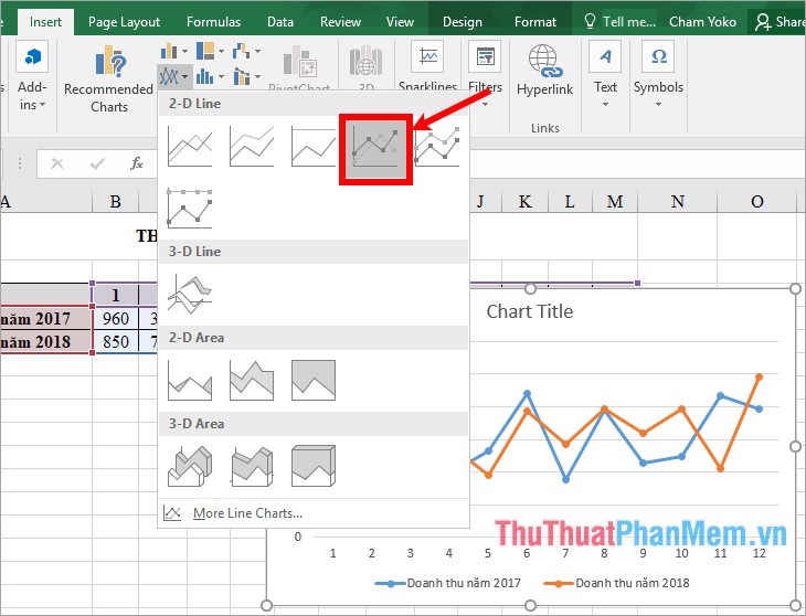
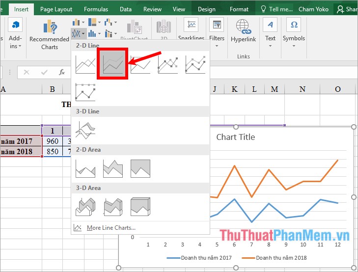
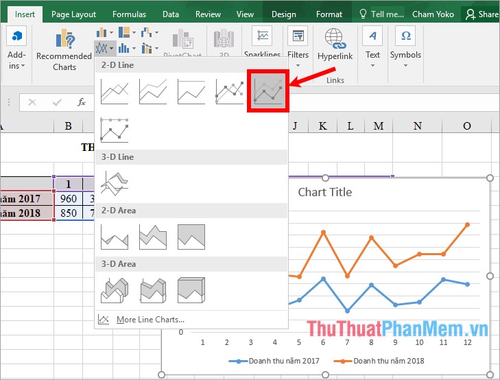
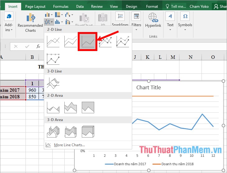
Step 2 : Select the Insert tab , in the Charts you select the line and area chart icon ( Insert Line or Area Chart ) and select the line chart you want to draw. Excel supports you with many types of line charts for you to choose from:
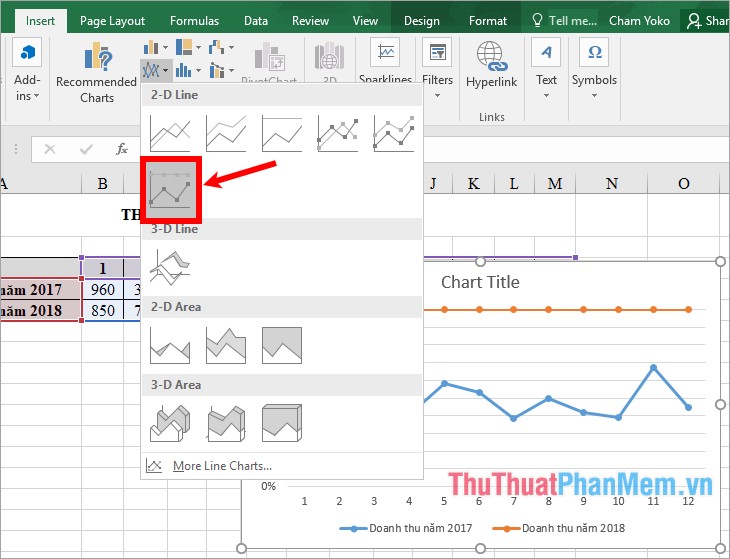
- 2-D Line: regular 2D line chart, including charts: Line (line chart), Stacked Line ( stacked line chart), 100% Stacked Line ( 100% stacked line chart), Line with Markers (line chart with marker), Stacked Line with Markers (line chart with marker), 100% Stacked Line with Markers (line chart with 100% marker marks).
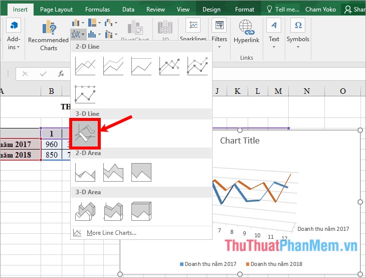
- 3-D Line: 3D line chart.

1. Line and Line with Markers chart
Line charts and line charts with marked markers without or with markers to indicate individual data values, showing trends over time or genres, evenly spaced and in the most orderly manner specified. If there are multiple data types or relative values, you should use a line chart without a marker.
Line graph

Line chart with marker
2. Stacked Line and Stacked Line with Markers chart
Stacked line charts and stacked line graphs are indicated with or without markers to indicate individual data values. Stacked line charts show the trend of the contribution of each value over time or the categories are evenly spaced.
Stacked line chart
Stacked line chart with marker
3. 100% Stacked Line chart and 100% Stacked Line with Markers
100% stacked line charts and 100% stacked line charts have markers that do not include or include markers for their own data values. 100% stacked line charts show the trend of percentage contribution of each value over time or evenly spaced categories.
100% stacked line chart
100% stacking line chart with marker
4. 3-D Line
This is a three-dimensional line chart, making the chart more vivid than regular 2D charts.
Step 3: Edit the line chart
After you have drawn the line chart, you need to make corrections to the chart.
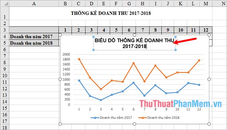
1. Edit the title for the line chart
You double click on the Chart Title in the chart and edit the title appropriately for the chart.
2. Add data labels to the chart
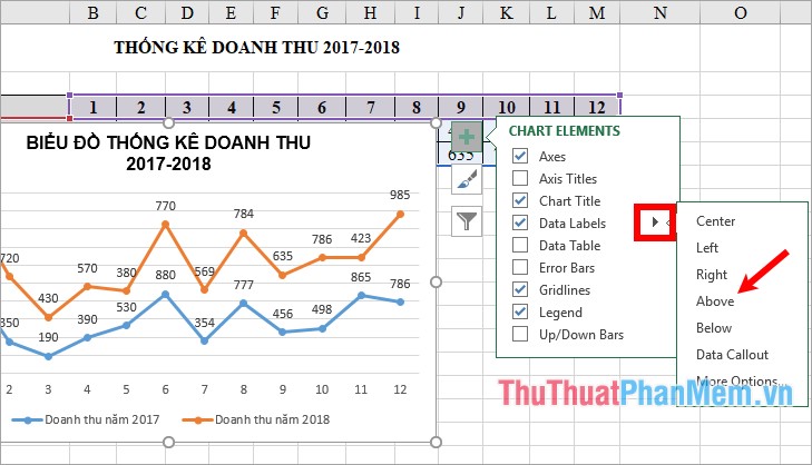
To add data sticker, select the blue + symbol next to the chart, tick the box before Data Labels.
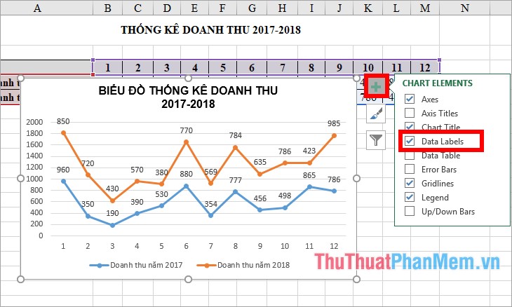
If you want to put the data sticker in a position other than the default position, then you select the black triangle icon next to Data Labels and choose the location for the data sticker.
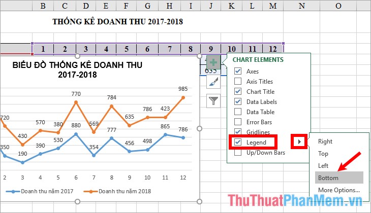
3. Add and edit notes for the chart
Click the green + icon next to the chart, select the check box in the square in front of Legend and click the black triangle icon next to customize the location of the comment.
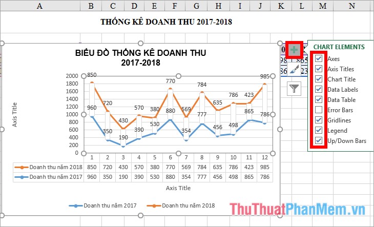
4. Show / Hide some other elements on the chart
Apart from the label data, title, caption for the chart, then you can add some other elements on the chart by selecting the + blue here you will find the components: Axis Titles (pepper Axis Table , Data Table ( grid table), Gridlines (grid lines), Up / Down Bars (connecting bars).
If you want to display the components on the chart, select the check box in the square before the component name, to hide the component, you put a check mark in the square before the component name.
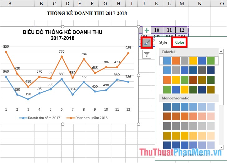
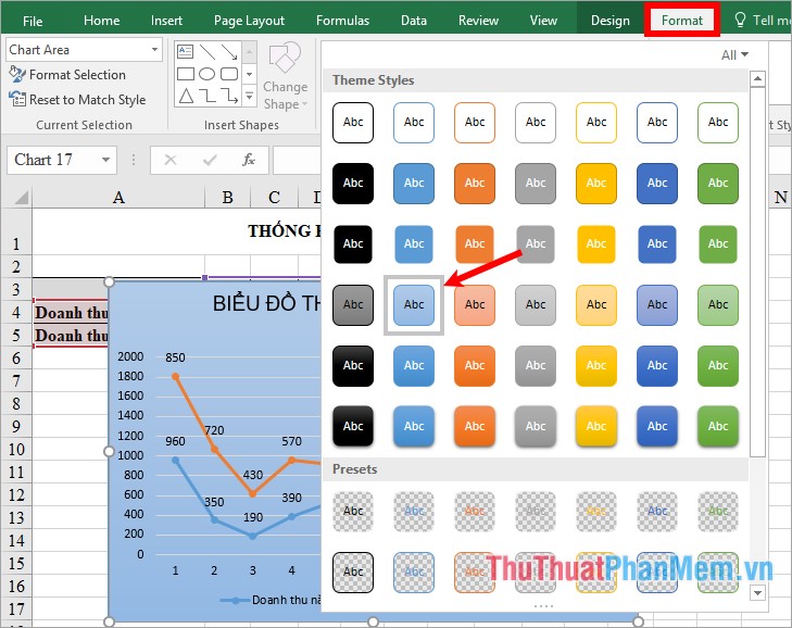
5. Change the style and color for the chart
Click on the brush icon next to the chart, to change the chart type you select the chart style in Style .
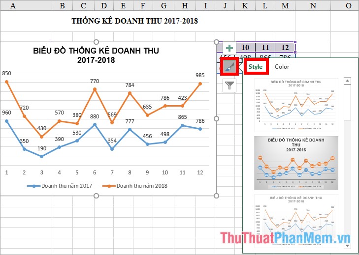
Choose the colors for the lines in the Color section .
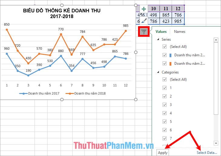
6. Filter data for the chart
Click the funnel icon next to the chart, where you can remove unnecessary data and select the data for the chart.
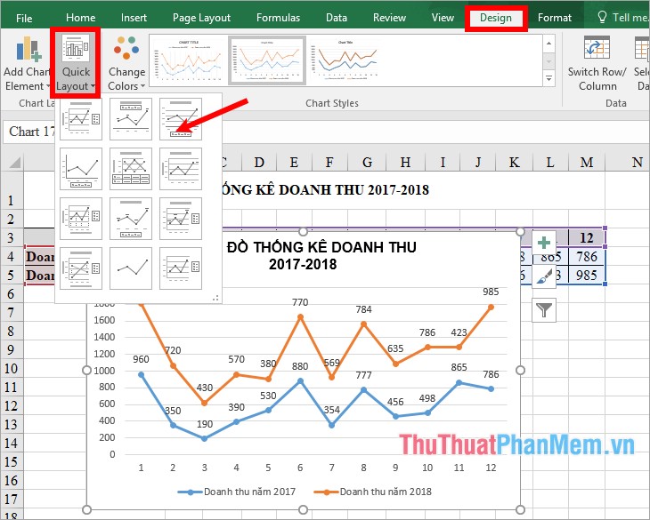
7. Change the layout style for the chart
If you want to change the different layout for the chart you select the chart -> Design -> Quick Layout -> select the layout you want.
8. Change the background for the chart
Select the chart -> Format -> in the Shape Styles section you choose the background color for the chart as you like.
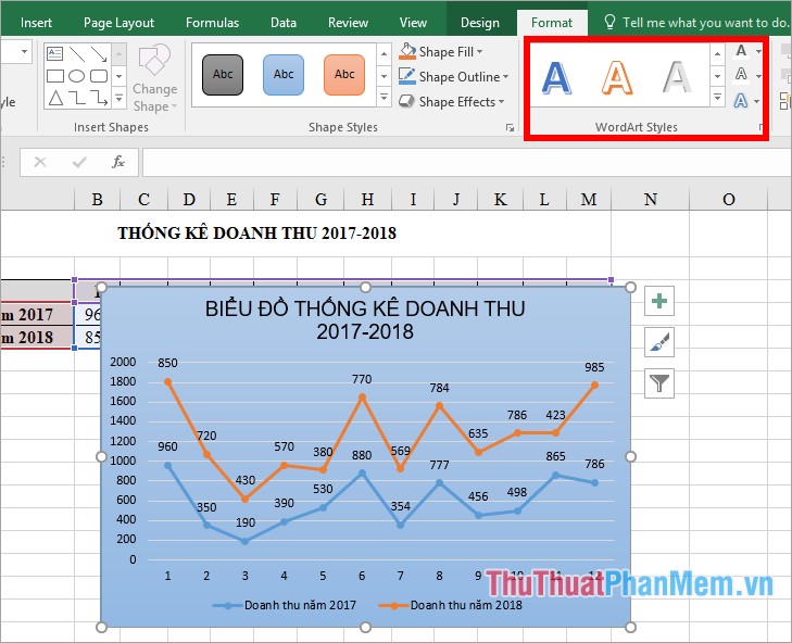
9. Change the art font style, font color, text effect in the chart.
If you do not like the default font color on the chart, you can change the art styles, text effects by selecting the chart -> Format -> choosing the font style in the WordArt Styles section .
Above are the steps to draw and edit line charts in Excel very detailed and clear, hope the article will be helpful for those who want to learn how to draw line charts in Excel. I wish you success and thank you for watching this article!
Was this article helpful?
Your feedback helps us improve.
Related Articles
 Steps to use Pareto chart in Excel2 minutes read
 8 types of Excel charts and when you should use them9 minutes read
 How to draw a bar chart in Excel5 minutes read
 How to make a thermometer template in Excel7 minutes read
 How to create 2 Excel charts on the same image4 minutes read
Reader Comments 0
Sign in with email or Google to join the discussion.