Table of Contents
More Data
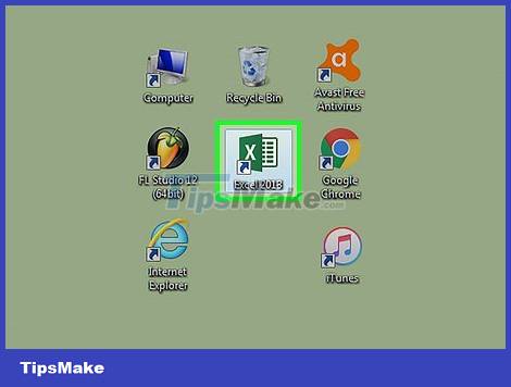
This practical guide explains how to create a chart in excel with clear steps and useful context. It also covers common requirements, potential problems, and the details that can help you get better results.
If you want to create a chart from existing data, double-click the Excel document containing the data to open it and proceed to the next step.
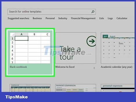
Click on Blank workbook – Blank workbook (for PC) or Excel Workbook (for Mac). This button is located in the upper left of the "Template" window.
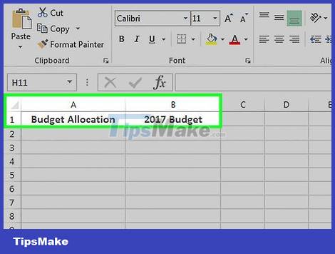
Add a name to the chart. To add a name to the chart, click in cell B1, then enter the name of the chart.
For example, if you create a chart for your budget, cell B1 is titled something similar to "2017 Budget".
You can also enter a label for clarity in cell A1 - for example, "Budget allocation".

Add data to the chart. First enter the label names for the parts of the pie chart in column A and enter the values of those parts in column B.
For the budget example above, you could write "Car expenses" in cell A2 and then enter "1000 USD" in cell B2.
The pie chart templates will automatically determine the percentages for you.

Complete the data entry process. Once you've completed this process, you're ready to chart your data.
Create a Chart
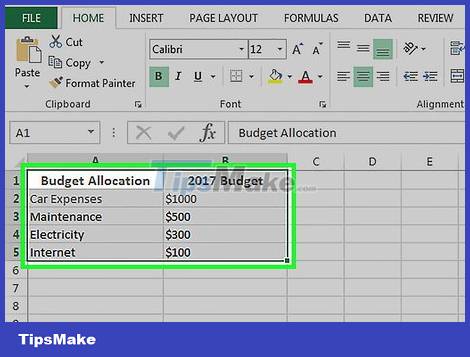
Select all data. To select, click in cell A1, hold down the ⇧ Shift key, and then click the bottom value in column B. You should be able to select all the data.
If your data is in columns marked with letters, numbers, etc. otherwise, click the top left cell in the data group and then click the bottom right cell while holding down the ⇧ Shift key.
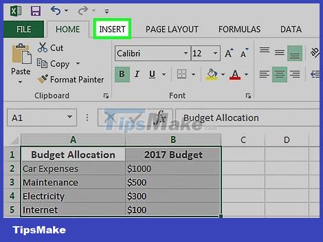
Click the Insert tab. This tab is at the top of the Excel window, just to the right of the Home tab.

Click the "Pie Chart" icon. This icon is the round button in the "Charts" options group, just below and to the right of the Insert tab. You will then see several options appear in the drop-down menu:
2-D Pie - Create a simple pie chart showing color-coded sections of data.
3-D Pie - Uses a three-dimensional pie chart that displays color-coded data.
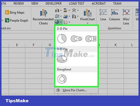
Click an option. This helps create a pie chart based on existing data; you'll see color-coded tags at the bottom of the chart that correspond to the colored parts of the chart.
You can preview the options here by hovering over the different chart patterns.
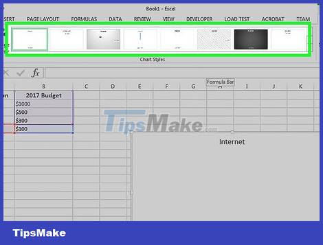
Customize the look and feel of the chart. To customize the look, click the Design tab near the top of the "Excel" window, then click an option in the "Chart Styles" group. This will change the look and feel of your graph, including the colors used, how the text is distributed, and whether or not the percentage is visible.
To view the Design tab, you must select the chart by clicking on it.
Conclusion
Understanding Excel makes it easier to compare options, avoid common mistakes, and apply the information in this guide more effectively. Review the relevant requirements before making changes or choosing a solution.
FAQ
How do you create a chart in excel?
Follow the steps in this guide in order, confirm the required settings or tools, and verify the result before making additional changes.
Is it safe to create a chart in excel?
It is generally safe when you follow the recommended instructions, use trusted tools, and avoid changing settings you do not understand.
What should you do if the process does not work?
Recheck the requirements, restart the device or application when appropriate, and review each step for missed settings or compatibility issues.
Related Articles
 How to Create a Bar Chart in Excel4 minutes read
 Steps to Use Pareto Chart in Excel3 minutes read
 8 Types of Excel Charts and When You Should Use Them9 minutes read
 How to Create a Pie Chart in Microsoft Excel9 minutes read
 How to Create a Pie Chart in Excel3 minutes read
 How to Create a Frequency Chart in Excel: Step-by-Step Guide2 minutes read
Reader Comments 0
Sign in with email or Google to join the discussion.