How to Add a Second Y Axis to a Microsoft Excel Chart
It would be helpful if you knew how to add multiple data lines to an Excel chart. However, with data with many units, you may find it difficult to create the graph you need. Don't worry, not only can you do it, you can do it very easily!.
Add a second Y axis
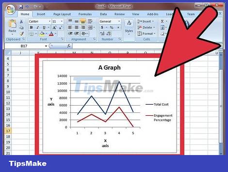
Create a chart in excel, assuming that all have the same units.
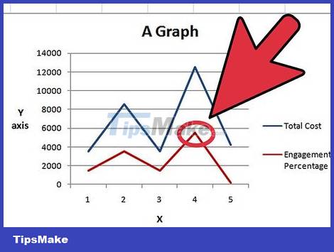
Go to the chart and right-click on the line of the data system to which you want to add a Y axis. In this example, if you want to add a Y axis for percentages, right click on the red line.
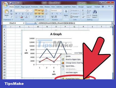
Select "Format Data Series".

Under "Axis," select the radio button next to "Secondary Axis."

Select OK, you will see the second Y axis appear on the graph.
Change the chart type of the second dataset

Back on the chart, right-click on the line of the data system to which you want to add a Y axis. In this example, if you want to add a Y axis for percentages, right click on the red line.
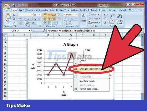
Select "Change Series Chart Type" (Change series chart type)
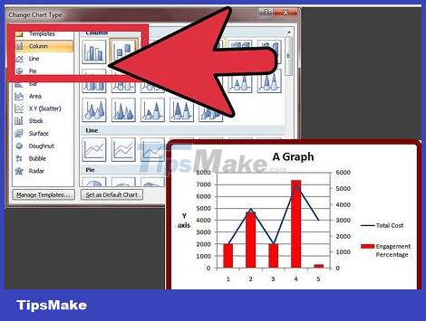
Select the chart type for which you want to add the second data series. In this example it is a column graph.