How to draw a pie chart in Excel 2016
Pie charts are the best way to show data, making your reports and summary sheets more scientific and logical, in today's article, TipsMake will help you write how to draw pie charts in Excel. 2016 with quite simple steps.
Table of Contents
If you already know how to draw a column chart in Excel that makes illustrating the data on the spreadsheet more intuitive, the following content, we will show you how to create or draw a pie chart in Excel.
How to draw pie charts in Excel
In this article, TipsMake will use Excel 2016 to demonstrate how to draw pie chart in Excel.
Suppose you have a data table as shown below, need to insert pie chart.

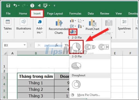
Step 1: You perform the highlighting of the data you need to draw a pie chart.

Step 2: Then go to the Insert tab-> select the icon of the pie chart, you can choose the type of chart to draw, for example, you choose the 2 - D Pie pie chart.
Step 3: After you make your selection -> the pie chart style will appear in the Excel spreadsheet.
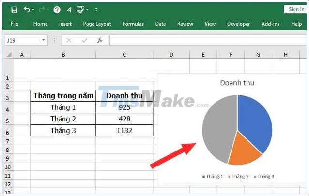
If you want to change the data in the spreadsheet -> when there is a change in the data, the chart will update automatically according to that change. For example, in January I entered the data to increase -> then you can see immediately the pie chart also changes.

So, with the 3 steps above, you can successfully draw a pie chart in Excel. Once the chart is created, you can also edit it like:
- Add other components to the chart:
Click on Chart Elements to see more small features:
+ Chart Title : Add a title for the chart.
+ Data Labels : Add data labels for the chart.
+ Legend : Add notes to the chart.

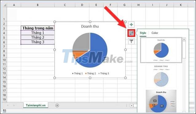
- Change color and chart style in Excel
To change the color and shape of the pie chart -> click on the Chart Styles icon as shown below, you can choose the style and color of the chart to best suit.
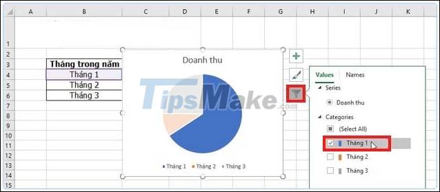
- Use the feature to filter or display data
For example, if you want to obscure the data of the 2 months of February and March, and if you want to show the data of January, you click on Chart Filters -> select the data you want to display. success.
Above are tips to help you know how to draw pie charts in Excel version 2016. If you use other versions of Excel such as Excel 2003, 2007, 2010, 2013, please refer to how to create pie charts in Excel. here to see how. Good luck!
Was this article helpful?
Your feedback helps us improve.
Related Articles
 Steps to use Pareto chart in Excel2 minutes read
 How to draw a line chart in Excel7 minutes read
 How to draw a bar chart in Excel5 minutes read
 How to make a thermometer template in Excel7 minutes read
 How to create 2 Excel charts on the same image4 minutes read
 8 types of Excel charts and when you should use them9 minutes read
Reader Comments 0
Sign in with email or Google to join the discussion.