How to create growth charts in Excel
How to create growth charts in Excel. Growth chart is a chart commonly used in economic growth issues, children's development ... So in Excel how is the growth chart drawn?
Growth chart is a chart commonly used in economic growth issues, children's development . So in Excel how is the growth chart drawn? Invite you to refer to the following article.
Here are detailed instructions on how to create growth charts and how to edit growth charts in Excel.
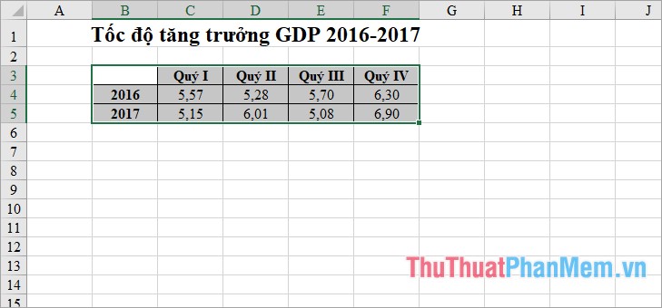
Step 1: Select the data area to draw growth chart, select the column headings, row headings to make comments, and the horizontal axis values of the chart.
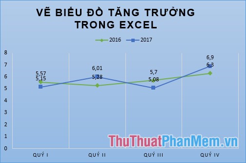
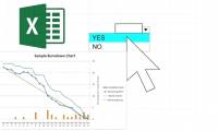
For example, a simple data table below.
Step 2: Select the Insert tab , there are many types of charts to help you draw growth charts, you can select the line chart to draw growth chart. Select the line chart icon and the area chart ( Insert Line or Area Chart ), select the Line chart ( Line chart) or Line with Markers (line chart with marker).
- Line chart .
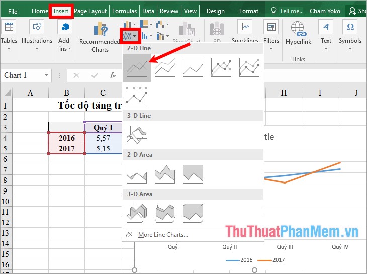
- Line with Markers chart .

So you've drawn a growth chart using a line chart in Excel.
Step 3: Edit the growth chart
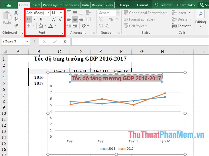
1. Add a title for the growth chart
Double click on the Chart Title in the chart and add the appropriate title for the growth chart.
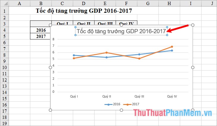
To edit the font, font style, font size, select the title and then edit in the Font section of the Home tab.
2. Add captions to the growth chart
To add a legend to the chart, click the blue + sign next to the chart, tick the check box in front of Legend to add a legend to the chart. To change the position for the caption, click the black triangle icon next to and select the position you want.

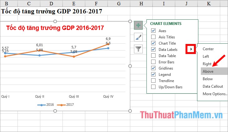
3. Add data sticker for growth chart
You choose the green + symbol next to the growth chart, tick the box in front of Data Labels to display the data sticker on the chart.

To change the location of the data sticker, select the black triangle icon next to Data Labels and select the appropriate location.
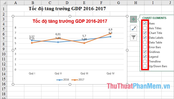
4. Add some other ingredients on the growth chart
You can add some other components to the growth chart by clicking the blue + sign next to the chart. Here you will see the components: Axis Titles (axis titles), Data Table (data tables), Gridlines (grid lines), Up / Down Bars (connecting bars). If you want to display any components, then tick the box before the component name. Similarly, if you want to remove any elements from the chart, you remove the tick in the box before the name of the component.
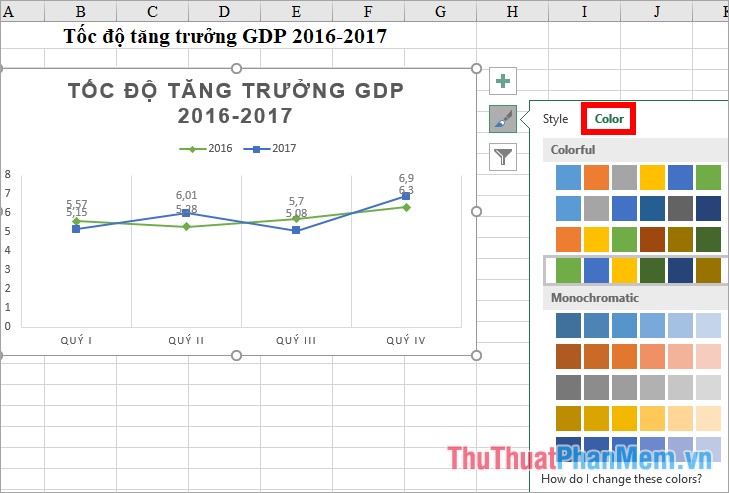
5. Change styles and colors for growth charts
To quickly change the chart style and the color of the lines in the chart, you select the brush icon next to the chart, then select the chart style in the Style tab .
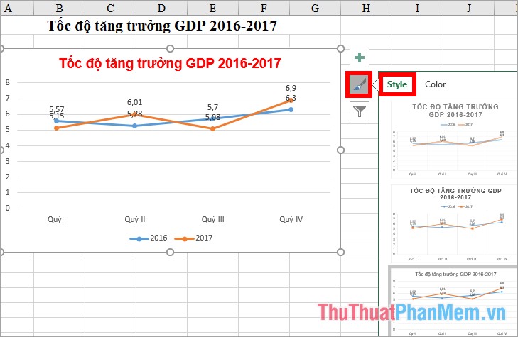
Next select the colors for the lines in the Color tab .
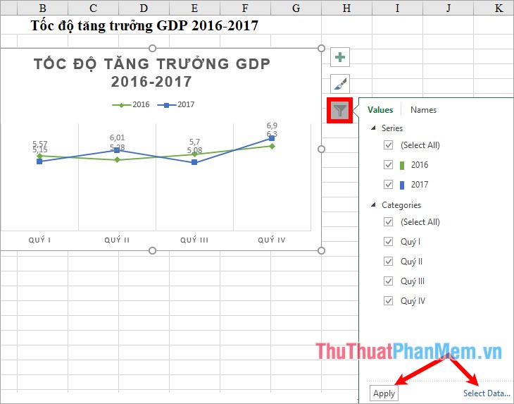
6. Filter data for the chart
Click the funnel icon next to the chart, where you can remove unnecessary data from the chart by removing the check mark in the square before that section and clicking Apply. If you want to select the data for the growth chart again, select Select Data.
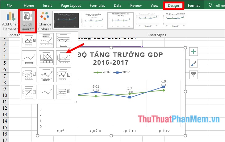
7. Change the layout type for growth chart
To change the different layout for the chart you select the chart -> Design -> Quick Layout -> select another layout for the chart.
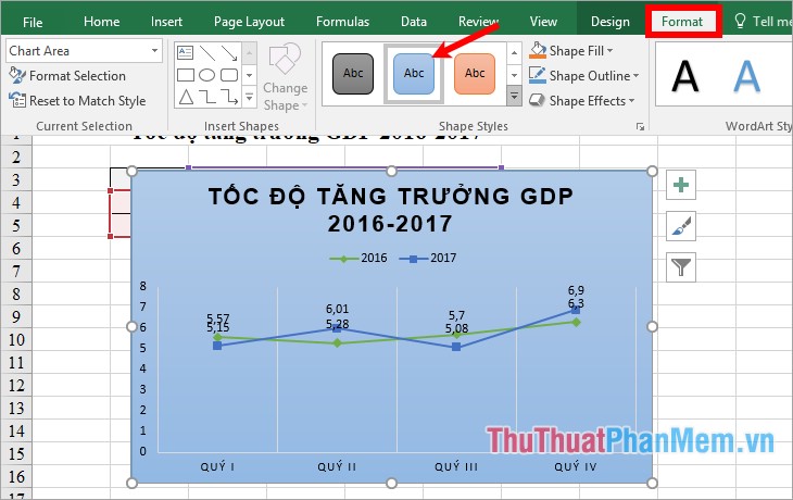
8. Change the background for growth chart
If you do not like the default white background color you can change the background color for the chart by selecting the chart -> Format -> in the Shape Styles section you select the background color for the chart.
9. Change the art font style, font color, text effect in the chart.
To change the font style and font color for all letters on the growth chart, select the chart (if you just want to change the title, select the title) -> Format -> select the font style in WordArt Styles.

Thus, the above article has detailed instructions for you to create growth charts in Excel. Hope the article will help you. Good luck!
Was this article helpful?
Your feedback helps us improve.
Related Articles
 How to draw a map chart on Excel4 minutes read
 Instructions on how to create charts in Excel professional7 minutes read
 How to create 2 Excel charts on the same image4 minutes read
 How to draw charts and graphs in Excel simply and quickly2 minutes read
 Instructions for creating interactive charts in Excel with INDEX function6 minutes read
 How to draw charts in Excel6 minutes read
Reader Comments 0
Sign in with email or Google to join the discussion.