Instructions on how to create charts in Excel professional
Instructions on how to create charts in Excel professional. Excel supports many types of charts from column charts, line charts to area charts, scatter charts, radar charts .... you can freely choose the chart type that fits the table. data required.
Instead of complicated tables, you want to rely on existing tables and chart in Excel, so it will be easy to track information and compare data with each other. Excel supports many types of charts from column charts, line charts to area charts, scatter charts, radar charts . you can freely choose the chart type that fits the table. Data need to draw a chart.

Here are instructions on how to create charts in Excel professionally, invite you to refer.
Draw a chart in Excel
Step 1: Select (black out) the data area to chart including the column headings. On the menu bar you choose Insert , you select the chart type in the Charts or you choose Recommended Charts.

Step 2 : Here you can choose more chart types in the All Charts tab , with each chart type having 2D or 3D format for you to choose:
Column (bar chart), Line (line chart), Pie (pie chart and annular are cut), Bar (horizontal bar chart), Area (area chart), XY (scatter chart), Stock (stock chart), Surface (face chart), Radar (spider web chart), .
Depending on the purpose of the chart that you select the appropriate chart to draw, after selecting the chart you select OK .

So you've completed the chart for the selected data range.

Elements on the chart in Excel
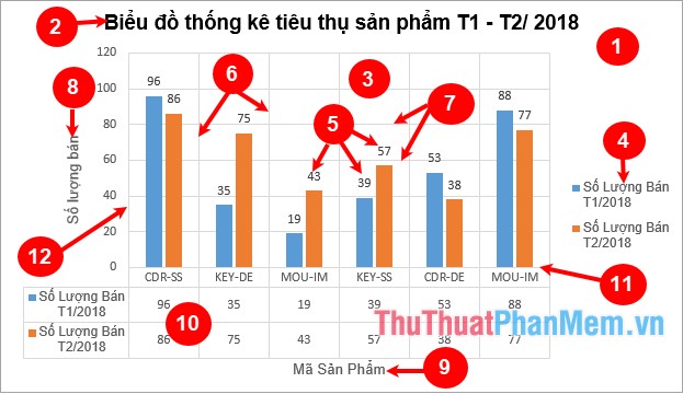
- Chart area: area to contain all elements on the chart.
- Chart title: title of the chart.
- Plot area: chart area.
- Legend: annotate the elements in the chart.
- Data label: data labels for diagram elements.
- Vertical gridlines: vertical gridlines in a chart.
- Horizontal gridlines: horizontal gridlines in a chart.
- Vertical axis title: title for the vertical axis (vertical axis) of a chart.
- Horizontal axis title: title for the horizontal axis (horizontal axis) of the chart.
- Data table: a chart of data that can be used to replace data labels.
- Horizontal axis: the horizontal axis (horizontal axis) of the chart.
- Vertical axis: the vertical axis (vertical axis) of a chart.
Edit the chart in Excel
1. Move the chart
Hold down the left mouse button on the chart area and drag to the position you want to move.
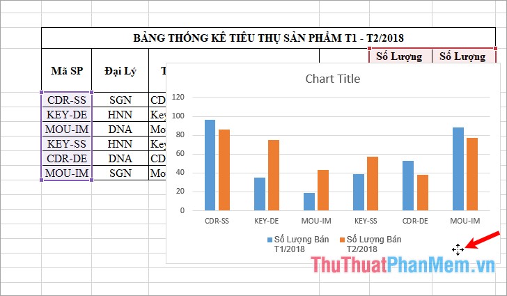
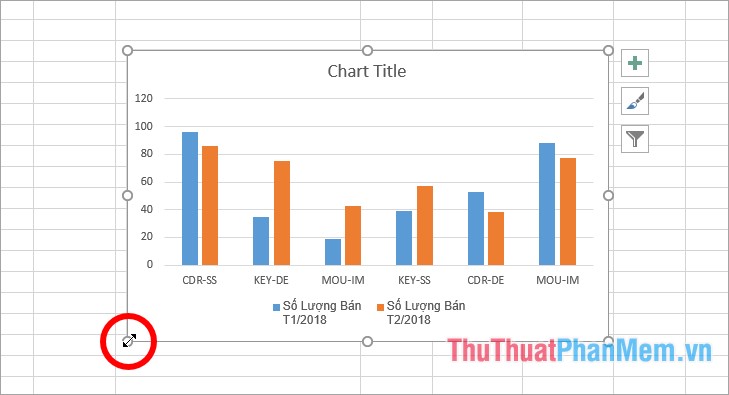
2. Change the chart size
Click on the chart, then position the mouse pointer on the knobs (the knobs at the four corners and between the four sides of the chart), a two-dimensional arrow icon you hold down and customize the appropriate size .
3. Add a title to the chart
If the chart already has Chart Title, then place your cursor on it and enter the title for the chart, you can edit the font, font size, font style, font color in the Font section of the Home tab .
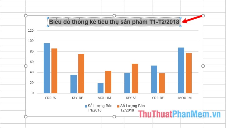
If the chart does not have Chart Title, then you select the chart -> Design -> Add Chart Element -> Chart Title -> choose the title position.

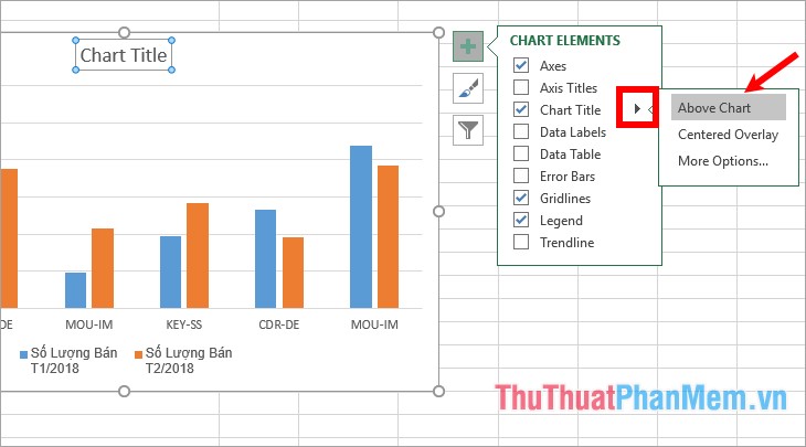
Or you can select the + symbol directly to the right of the chart and tick the Chart Title.
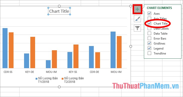
To choose the position for Chart Title, select the black triangle icon next to Chart Title , then enter the chart name in the Chart Title section on the chart.
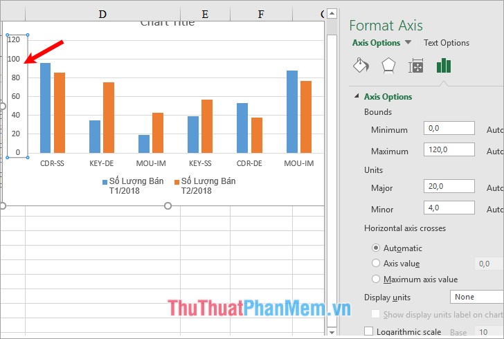
4. Edit the chart axis
You just need to double click on the vertical or horizontal axis of the chart, then Excel will appear on the right for you to edit.
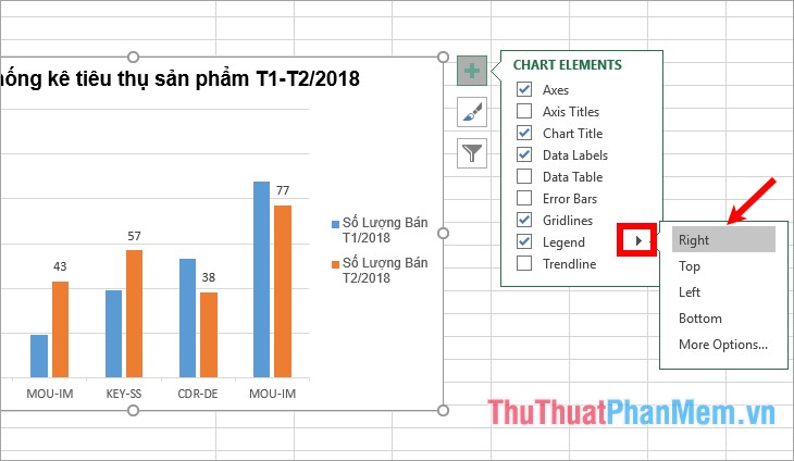
5. Show / hide some elements on the chart
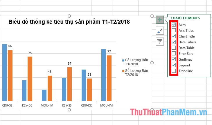
Click the + symbol to the right of the chart, here you have the components: Axes (information on the vertical and horizontal axis of the chart), Axis Titles (vertical axis title, horizontal axis of the chart) , Data Labels ( grid data labels), Gridlines (vertical and horizontal grid lines on the chart), Lengend (annotates the elements on the chart). If you want to display any components, then you tick the box in front of that component, if you want to hide, then you put a check mark before that component.
To change the type, change the position for any component, click the black triangle icon next to the name of the component and the option to change the element.
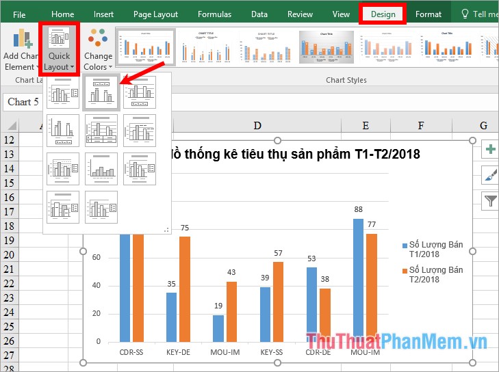
6. Change the layout for the chart
Select the chart -> Design -> Quick Layout -> choose the layout type for the chart.
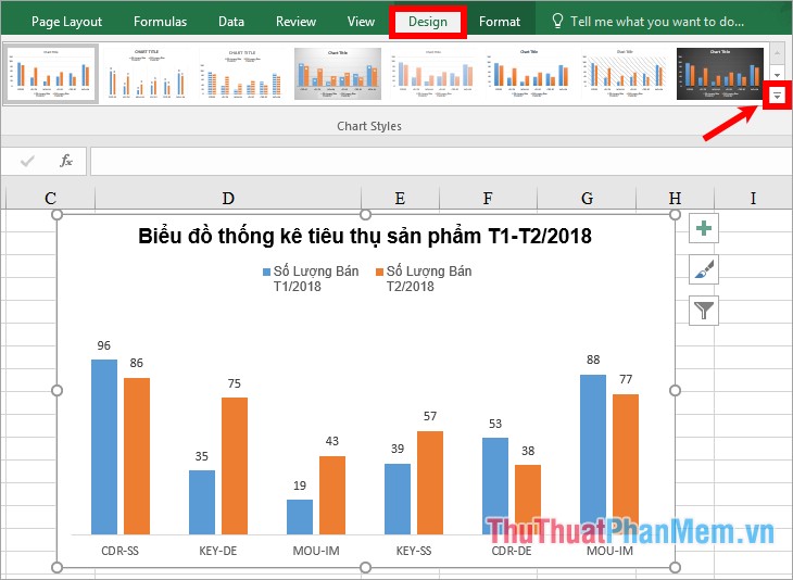
7. Change chart style
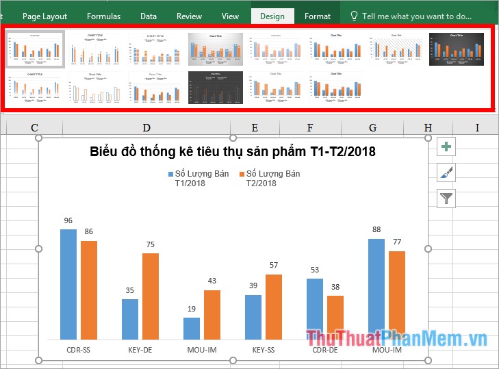
In the Design tab, select the chart style in the Chart Styles section , to select more chart styles, select the More icon .
Here you will have more choice of chart style.
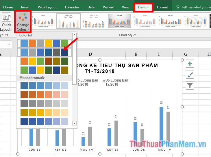
8. Change colors for the chart
To change the color of the chart you select the chart -> Design -> Change Colors -> select the color set for the chart.
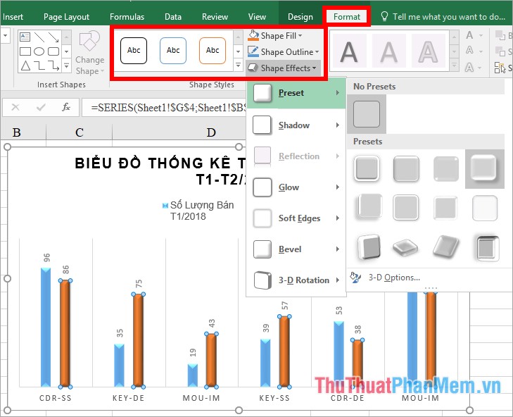
9. Change the style in the chart
Select shapes in the chart -> Format -> select the available shape in the Shape Styles section , fill the shape color in the Shape Fill section, the shape border in the Shape Outline section, the shape effect in the Shape Effects section .
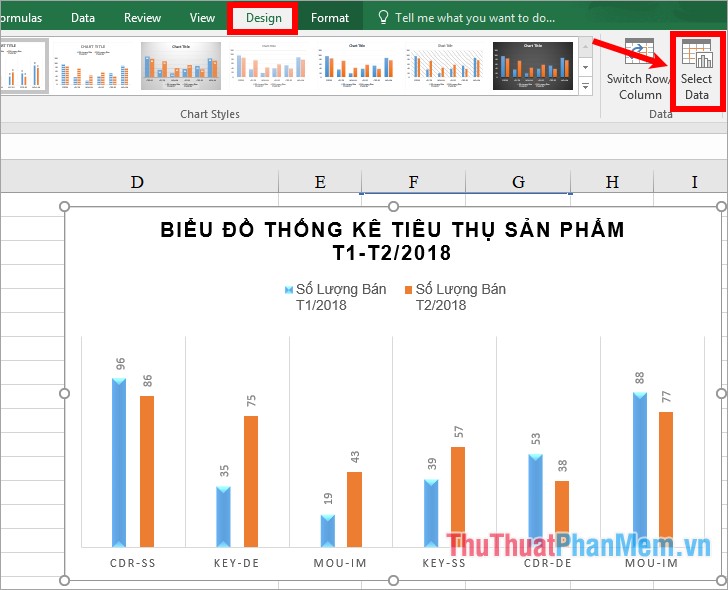
10. Change the data in the chart
You select the chart -> Design -> Select Data.
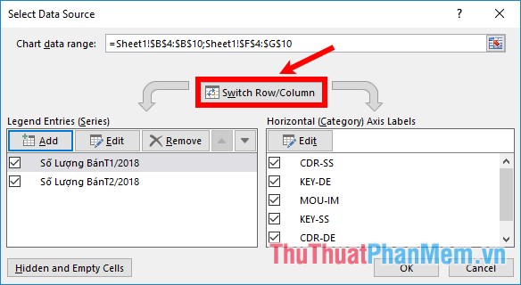
Appear the Select Data Source you change the data in two parts Legend Entries and Horizontal Axis Labels by selecting Edit and select the data range.
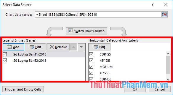
To reverse the position of rows and columns in the chart, select Switch Row / Column and click OK to close Select Data Source.
11. Print the chart
If you only want to print the chart, select the chart and press Ctrl + P , if you want to print both the data and the chart, you place the mouse pointer outside the chart and press Ctrl + P . Appears window print you can print preview and customize some print settings.

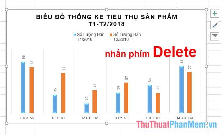
12. Delete the chart
Select the chart and press the Delete key .
Above is a detailed guide on how to create charts in Excel professional, hope the article will help you. Good luck!