What is One UI for Android?
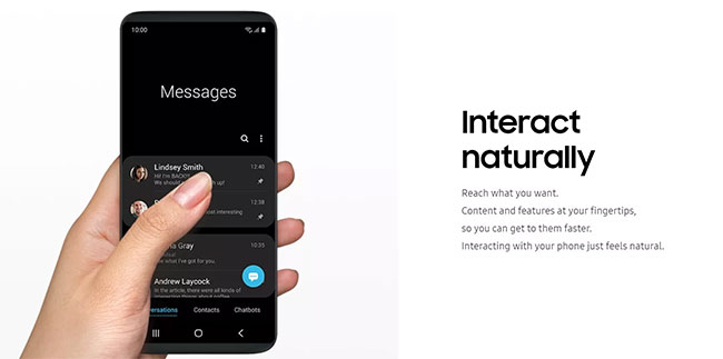
One UI replaces Samsung Experience to become Samsung's custom interface for Android. It is simplified, clutter-free and designed to display only necessary information, reducing distractions. Samsung's One UI user experience is especially useful for larger screens and one-handed use.
The goal is to minimize problems resulting from excessive smartphone use, including joint pain and eye strain. The One UI custom interface started rolling out in early 2019 for the latest Galaxy smartphones.
Ergonomic element and usability
Smartphones cause many side effects, including problems such as Texting Thumb syndrome (tendonitis and / or synovial membranes, including tendons that control the movement of the thumb) and Repeated stress. One UI is designed to reduce repetitive stress, as many people use (or try to use) the phone with one hand.

Samsung does split screen in many apps, such as Messages , placing content at the top of the screen and buttons at the bottom at hand. This way, people do not have to lengthen their thumbs uncomfortably or move the phone in their hands (this can lead to dropping and cracking the screen).
For example, the Clock app shows how long before the next alarm goes off, while you can manage your alarm using the control buttons at the bottom. Also, in the viewing area at the top, you will see the larger text. For large phones like the Galaxy Note 9, this layout is much easier to hold in your hand.
This split-screen approach will also work well with the company's foldable phones, with objects that can be manipulated on one side and the other to view content only.
One UI has also been designed to make the eyes more comfortable, with vibrant colors and a circular design for application icons, as well as many other factors.
Productivity and concentration
Another goal of Samsung is to reduce distractions, of course, which is another side effect of increasing phone time. Therefore, One UI is designed towards productivity goals.
For example, an element, called Focus Blocks , groups related settings together to make navigation easier and faster.
One UI also has a Dark Mode suitable for apps, so you won't be woken up by the phone's bright screen. Samsung's Do Not Disturb mode is another way to stay focused.
Update Samsung One UI
In February 2020. Samsung released One UI 2, adding a number of features including an improved Dark Mode, a screen recorder, and a few interface changes. One UI 2 also benefits from many of the improvements included in Android 10.
The screen recorder records what is happening on the screen, accompanied by audio recorded by the microphone and audio played on the phone. There is also an option to add selfie video feed and draw on the screen while recording.
Finally, there are two options for displaying notifications of incoming calls: Full screen alerts (like on stock Android) or floating pop-ups, so you don't get interrupted when playing games or watching videos. .
You should read it
- What is the difference between Samsung and Android phones?
- Android should be Samsung, not Google
- Microsoft and Samsung are about to bring each other to court for Android
- 16 Samsung phone models get One UI 6 update
- New features of Android 8.0 on Samsung Glaxy S8
- Ranking the 10 most quirky Android phones in history
- Upgrade calendar to Android Pie for Samsung devices is supported
- 8 best Android phones right now
- List of Samsung Galaxy devices that will receive the Android 15 update
- List of devices to be Android 8 - Android O of Samsung, Huawei, LG, Oppo, Sony and HTC
- Revealing the Samsung Experience 10 new interface customized with Android 9 Pie
- Already have Samsung Internet 9.0 with many upgrade points, invite you to download and experience
Maybe you are interested
How to post Instagram contributors Instructions for resetting Recall in Windows 11 Windows is now available for iPhone, iPad, Mac, and PC How to choose and care for ceramics Dangerous application that can 'penetrate' women's clothes in seconds has been removed This dangerous application can 'penetrate' women's clothing in seconds thanks to deepfake technology
