Instructions for displaying charts in powerpoint 2007
When you create a chart showing a certain table of data in Powerpoint 2007. But you do not know how to customize it as you like, refer to the article below.
First, draw the chart you want. Then click on the chart, select Animations, select Custom Animation and select Add Effect
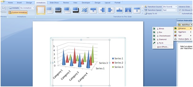
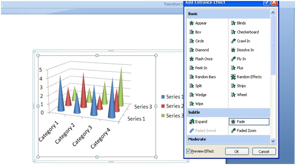
Then in Add Effect you select Entrance select Fade click ok
Next step you look at the right corner of the screen where the effect you have just selected for the chart is displayed Click the arrow and select Effcet Option

When you select the Effcet Option, a dialog box as shown below, you select Chart Animation. Here you will see the options that are appearing under each Series or Caterogy

When you select By Series, each value column in the chart will appear as shown below

Or when you want to select By Category your chart columns will be displayed as follows

For other tables, like columns or circles, you can do the same. Good luck.
Was this article helpful?
Your feedback helps us improve.
Related Articles
 Instructions for creating charts on PowerPoint5 minutes read
 PowerPoint 2019 (Part 22): Charts8 minutes read
 PowerPoint 2016: Working with Charts8 minutes read
 Work with charts in PowerPoint 20167 minutes read
 Instructions on how to create charts in Excel professional7 minutes read
 MS PowerPoint 2007 - Lesson 7: Insert images and graphics in the slide3 minutes read
Reader Comments 0
Sign in with email or Google to join the discussion.