How to graph functions in Excel
Graph different Excel functions when drawing graphs in Excel.
Table of Contents
Drawing charts on Exel is a simple and basic operation when we work with office tools. Users can then choose the most suitable chart type to perform, or compare the data in the table according to their needs. And besides drawing regular figures, we can also graph functions in Excel. To plot function graphs, there are many supporting software, especially GeoGebra graphing software, quality visual geometry for teachers and students. However, we can also show simple graphs right on Excel with the tutorial below.
- How to draw a map chart on Excel
- How to create 2 Excel charts on the same image
- How to draw a straight line, draw an arrow in Excel
- Create Excel charts that automatically update data with these three simple steps
Instructions for graphing functions in Excel
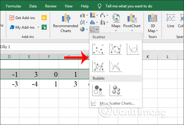
Step 1:
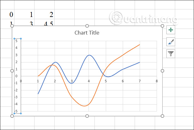
You must first enter the number sequence for the equation as shown below. Next, highlight the number 1 and click Insert to select the Scatter icon to select the graph you want to use.
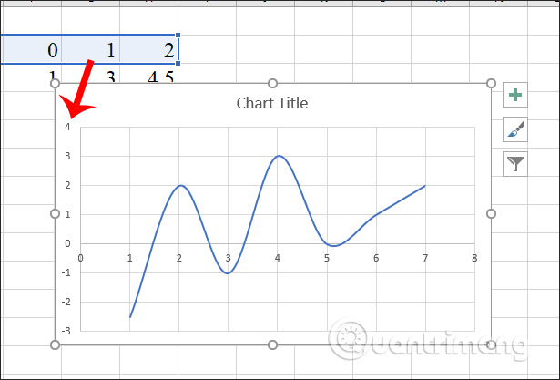
Step 2:
Next we double-click on the left vertical line of numbers displayed in the graph.
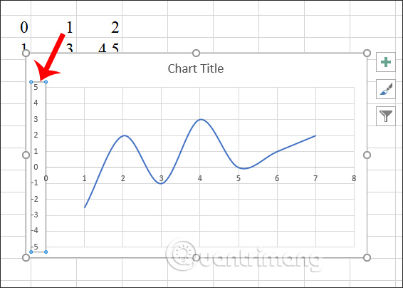
Display the interface on the right so that the user proceeds to adjust the value of the graph. At the Bounds section you edit the min and max values to -5.0 and 5. The part to enter the min value, max will depend on the maximum and minimum values of the series 1 and 2 in the table.

Then the graph will change the values at the left vertical number sequence as shown.
Step 3:
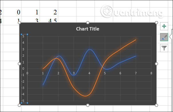
In the function graph, users click on the funnel-shaped icon and display the next interface, click on Select Data .
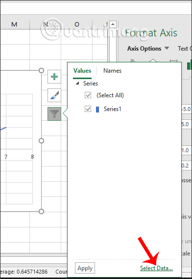
In the Select Data Source interface, click the Add button to add a value to the chart.

Step 4:
In the new interface in the Series Y value , users use the mouse to highlight the second number in the table to enter values for the Y series. Click OK to add the value.

Step 5:
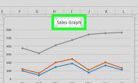
As a result, we have a graph of functions drawn on Excel as shown below.
Step 6:
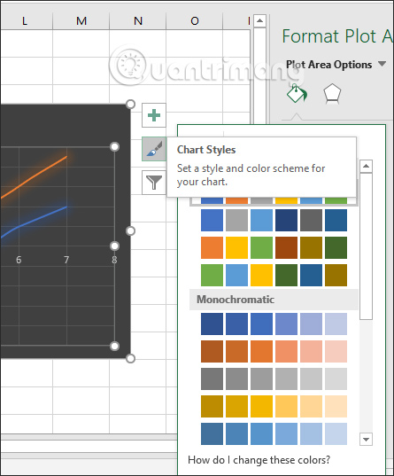
If the user wants to change the chart display type again, in the Chart Styles section we select the chart type that we want to use.

The chart type will be changed soon.
To change the color for each value in the function chart, users click on the brush icon , click on Color and then select another color set to display for the graph in the graph.
Soon the function graph has been changed to a new color.

The above is a step by step graphing functions in Excel with basic and simple graphs. After the drawing is completed, we continue to follow the steps to change the display type, enter the graph name as when creating a normal chart in Excel.
I wish you all success!
Was this article helpful?
Your feedback helps us improve.
Related Articles
 How to graph trigonometric functions with Excel4 minutes read
 Instructions on how to graph in Excel4 minutes read
 Summary of trigonometric functions in Excel5 minutes read
 Detailed instructions on how to graph in excel3 minutes read
 How to fix the SUM function doesn't add up in Excel2 minutes read
 How to Make a Line Graph in Microsoft Excel4 minutes read
Reader Comments 0
Sign in with email or Google to join the discussion.