Excel 2019 (Part 22): Charts
It can be a bit overwhelming when an Excel workbook contains a lot of data. Charts allow you to visualize workbook data graphically, making it easier to understand comparisons and trends..
It can be a bit overwhelming when an Excel workbook contains a lot of data. Charts allow you to visualize workbook data graphically, making it easier to understand comparisons and trends.
Learn about charts
Excel offers several chart types, allowing you to choose the one that best suits your data. To use charts effectively, you need to understand how to use the different chart types.
Excel offers many different types of charts , each with its own advantages:
- Bar charts use vertical bars to represent data. They can be suitable for many different types of data, but are most commonly used for comparing information.
- Line charts are ideal for displaying trends. Data points are connected by lines, making it easy to see whether values are increasing or decreasing over time.
- Pie charts make it easy to compare percentages. Each value is displayed as a portion of a circle, so it's easy to see which values make up the overall percentage.
- Bar charts work similarly to column charts, but they use horizontal bars instead of vertical ones.
- Area charts are similar to line charts, except they include areas below the lines connecting the data points.
- Surface charts allow you to display data in a 3D panorama. They work best with large datasets, allowing you to view multiple types of information simultaneously.
In addition to knowing the different types of charts, you'll need to understand how to read them. Charts contain several elements or components that can help you interpret the data.
How to insert a chart
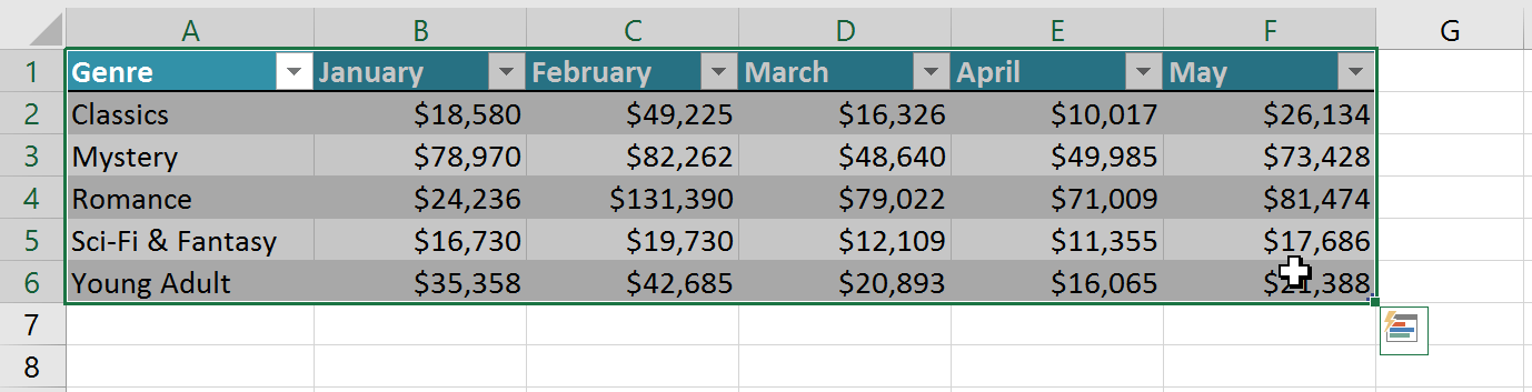
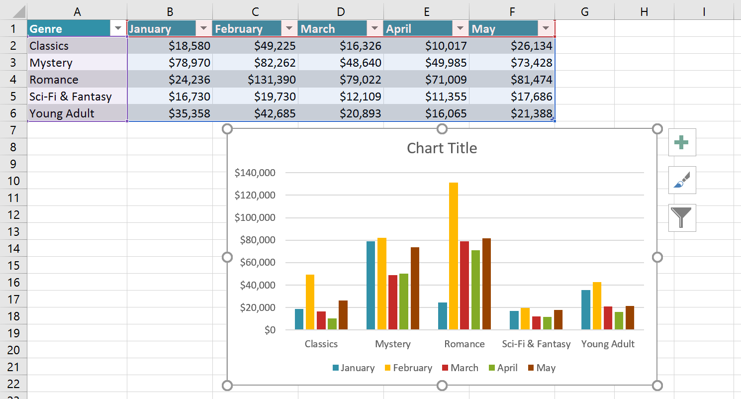
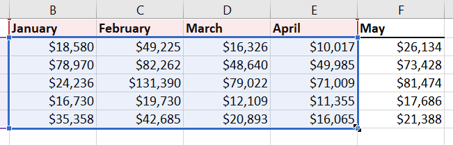
1. Select the cells you want to chart, including the column headers and row labels. These cells will be the data source for the chart. For example, we would select cells A1:F6.
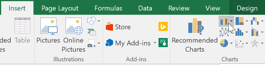
2. From the Insert tab , click the desired Chart command. For example, we would select Column.
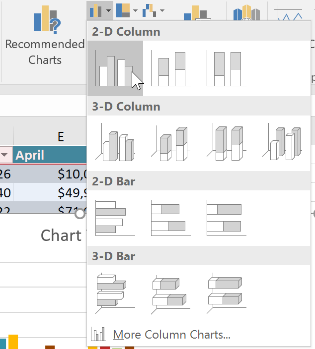
3. Select the desired chart type from the drop-down menu.
4. The selected chart will be inserted into the spreadsheet.
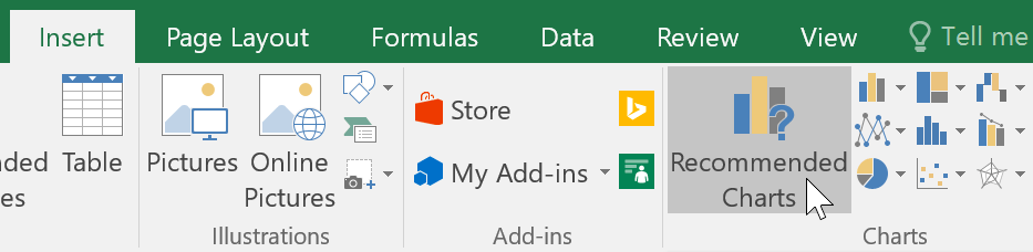
If you're unsure which chart type to use, the Recommended Charts command will suggest several charts based on your source data.
Charts and layout styles
After inserting a chart, there are a few things you might want to change about how the data is displayed. It's easy to edit the chart's layout and style from the Design tab.
Excel allows you to add chart elements—including chart titles, legends, and data labels—to make charts easier to read. To add a chart element, click the Add Chart Element command on the Design tab , then select the desired element from the drop-down menu.
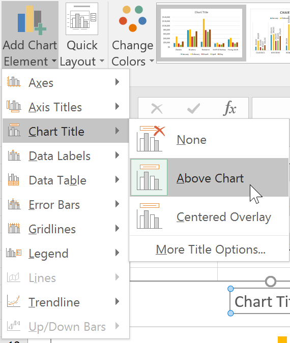
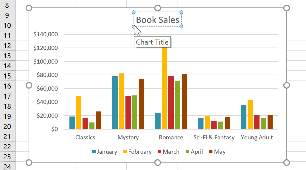
To edit a chart element, such as the chart title, simply double-click the placeholder and begin typing.
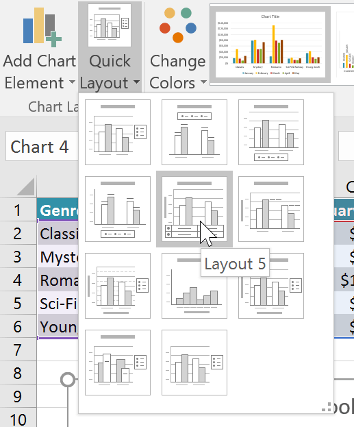
If you don't want to add individual chart elements, you can use one of Excel's predefined layouts. Simply click the Quick Layout command , then select your desired layout from the drop-down menu.
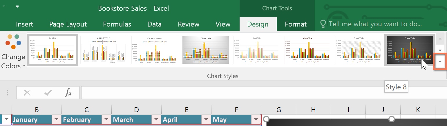
Excel also includes several chart styles, allowing you to quickly modify the appearance of your charts. To change a chart style, select the desired style from the Chart styles group. You can also click the drop-down arrow on the right to see more styles.
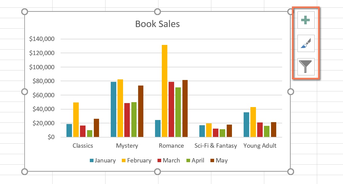
You can also use chart formatting shortcuts to quickly add chart elements, change chart styles, and filter chart data.
Other charting options
There are many other ways to customize and arrange charts. For example, Excel allows you to rearrange chart data, change chart types, and even move charts to a different location in the workbook.
How to convert row and column data
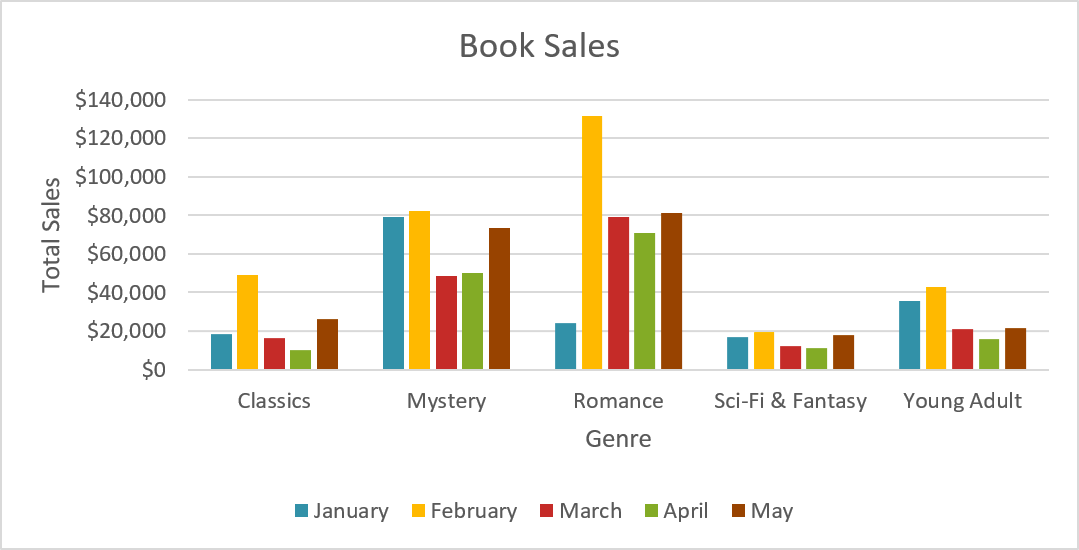
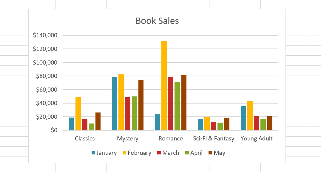
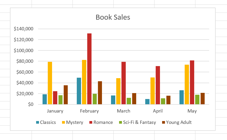
Sometimes, you might want to change how your chart groups your data. For example, in the chart below, the Book Sales data is grouped by category, with each month corresponding to a column. However, it's possible to swap the rows and columns so that the chart groups the data by month and each category corresponds to a column. In both cases, the chart contains the same data, just organized differently.
1. Select the chart you want to modify.
2. From the Design tab , select the Switch Row/Column command .
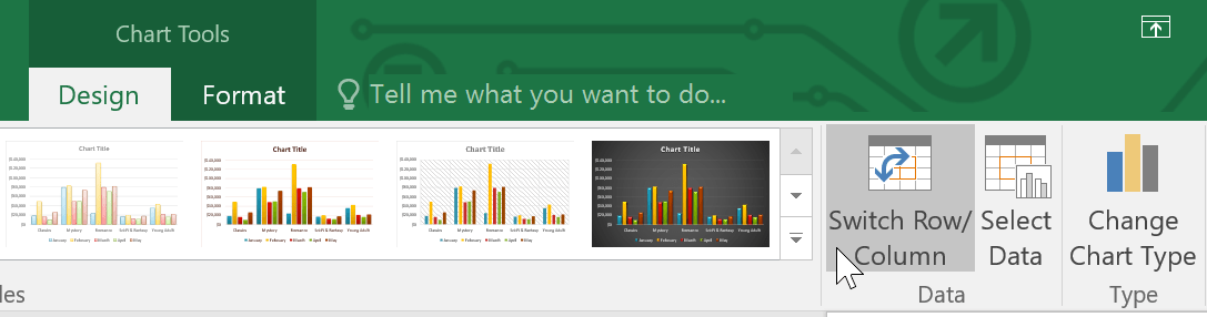
3. The rows and columns will be transformed. In the example, the data is now grouped by month, and each category corresponds to a column.
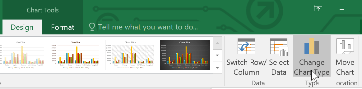
How to change the chart type
If you find that your data isn't performing well in a particular chart type, you can easily switch to a different chart type. For example, you could change from a column chart to a line chart.
1. From the Design tab , click the Change Chart Type command .
2. The Change Chart Type dialog box will appear. Select the new chart type and layout, then click OK. For example, we would select a Line chart.
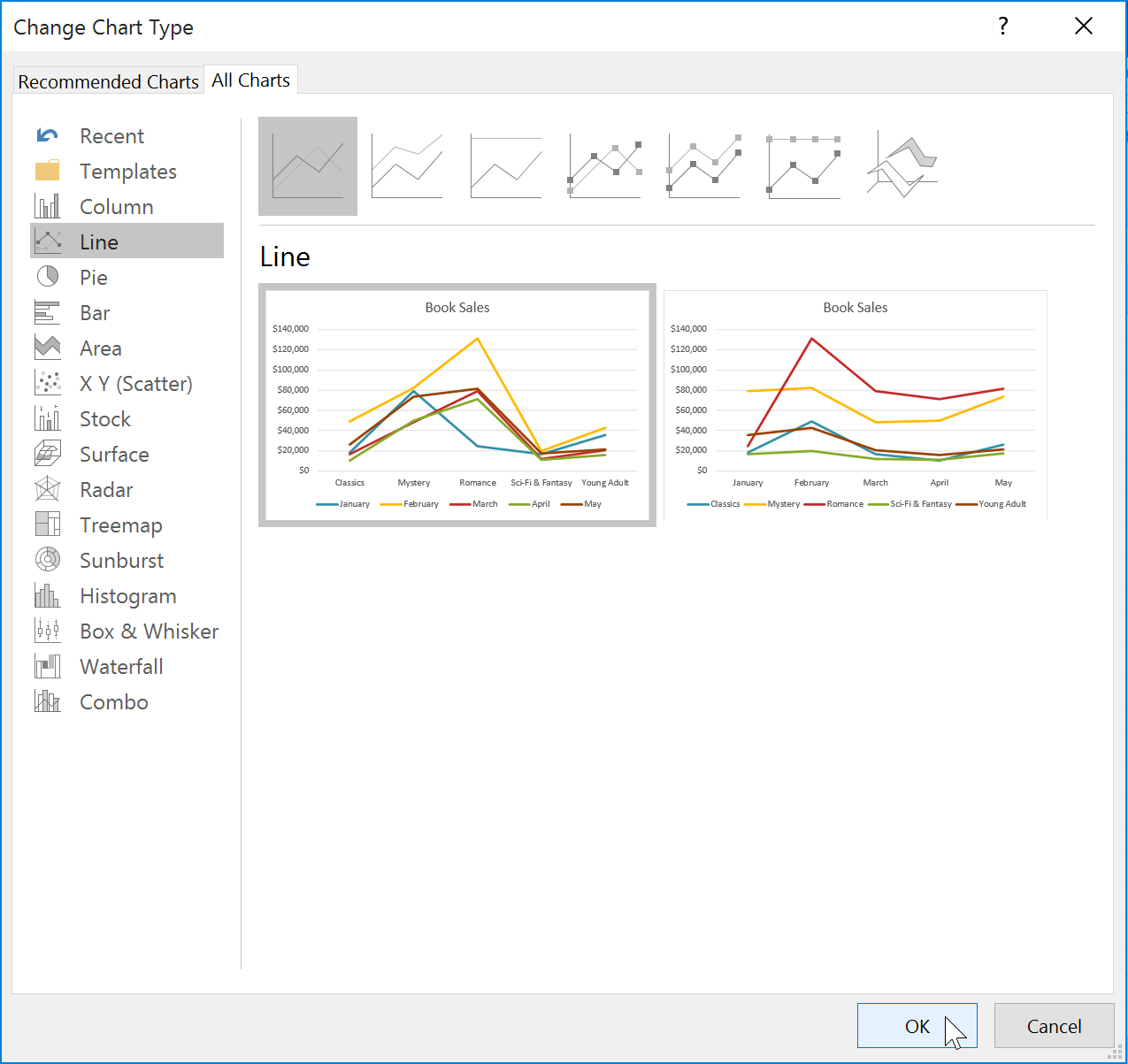
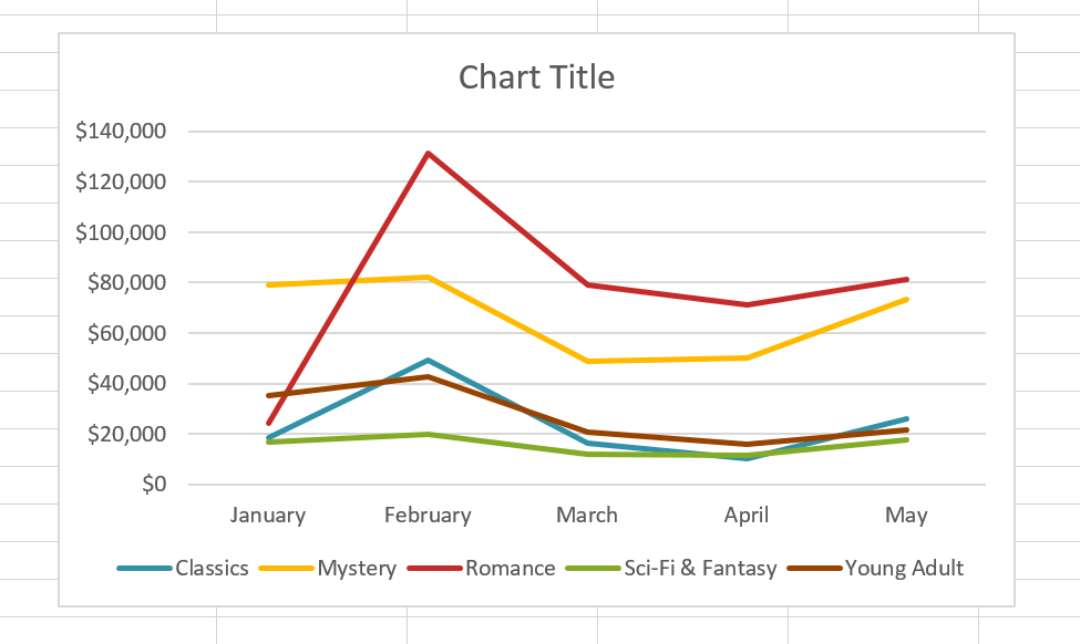
3. The selected chart type will appear. In this example, a line chart makes it easy to see trends in sales data over time.
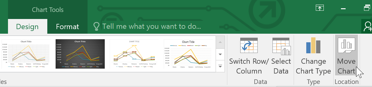
How to move the chart
Whenever you insert a new chart, it will appear as an object on the same worksheet that contains the source data. You can easily move the chart to a new worksheet to help keep the data organized.
1. Select the chart you want to move.
2. Click on the Design tab , then select the Move Chart command.
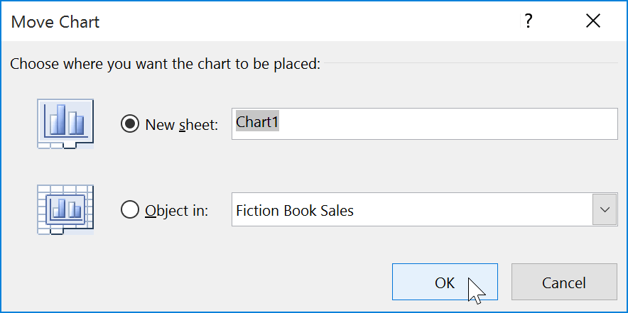
3. The Move Chart dialog box will appear. Select the desired location for the chart. For example, we will choose to move it to a new worksheet.
4. Press OK.
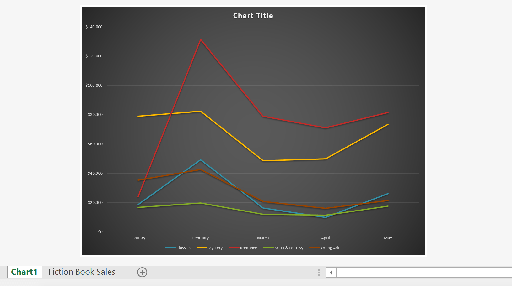
5. The chart will appear at the selected location. In this example, the chart now appears on a new worksheet.
Keep the charts up-to-date.
By default, when you add more data to your spreadsheet, the chart may not include the new data. To fix this, you can adjust the data range. Simply click on the chart and it will highlight the data range in your spreadsheet. Then, you can click and drag the handle in the bottom right corner to change the data range.
If you frequently add more data to your spreadsheet, updating the data range can become tedious. Fortunately, there's an easier way. Simply format the source data as a table , then create a chart based on that table. As you add more data, it will automatically be included in both the table and the chart, keeping everything consistent and up-to-date.