The purpose of charting is to clarify the numbers from which comments and conjectures are made through these figures. To make the conjecture easy and high accuracy, people often use trendlines to predict future trends. Therefore, the following article shows how to add a trend line or moving average to a chart.
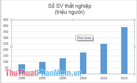
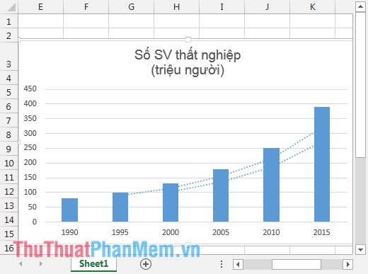
For example, you want to add a trendline and moving average to the following chart:
1. Add the trend line to the graph
Step 1: Move to the chart, click the plus icon -> Trendline -> Linear .

To identify and predict future unemployment trends continue to do the following:
Step 2: Click the trendline -> right-click and select Format Trendline .

Step 3: The dialog box appears on the Display Equation on chart and Display R- Squal value on chart .

After you tick on the trend line appear the equation and R.

- Where the equation y = 58.57x- 16.667 is a functional equation of the Trendline trendline .
- R2 = 0.8896 <1 proves that the Trendline equation is very accurate -> high reliability.
- From the function equation of the Trendline line, you can predict the number of unemployed graduates in 2020. In the data sheet above 2020, if included in the 6th row => x = 6 instead of Trendline equation, y = 334,753 => In 2020, there will be approximately 335 students who graduate without unemployment if their current situation does not improve.
Thus, thanks to the trend line, you can predict the future development trend and can especially predict how that number will be in the future. From there can take remedies to prevent that situation from happening.
2. Add the moving average to the graph
To calculate the average value over the years, the average moving average has been used to clarify the increase or decrease of the average value, whether there have been any changes in the average over the years.
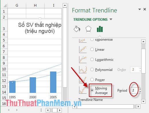
Step 1: Click the graph -> Select the plus icon -> select Trendline -> select More options .

Step 2: Check the Moving Average item and select 2 in the Period section (choose the comparative value in 2 years).
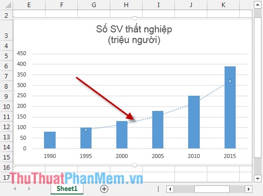
Result:
Now choose an average of 4 years to see how the moving average changes so that you can find future trends more easily and accurately. In Period select the value 4.
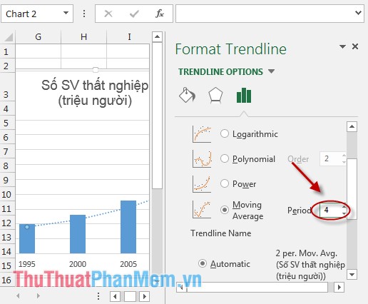
Compare the 2-year average range and the 4-year average. Result:
The average moving over 2 years is a longer one. As shown on the graph we see an increase in unemployment when students graduate.
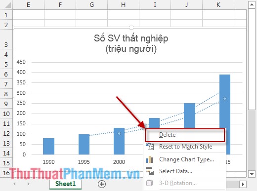
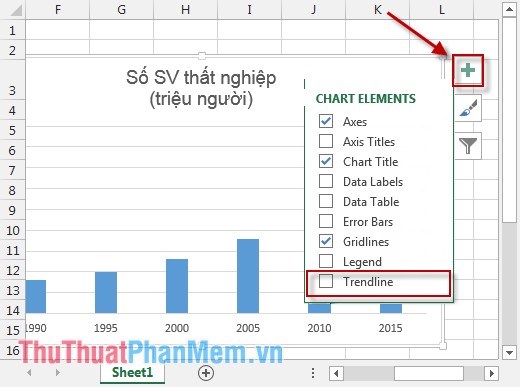
3. Delete trend lines or moving averages in the chart
You can use the following 2 ways:
- Option 1: Click to select the trend line or the moving average directly -> Right-click -> Delete .
- Option 2: Move to the chart -> Click the arrow to remove the checkmark in the Trendline section .
The above are some ways to help you analyze and predict the future trend of a problem based on actual data.
Hope to help you. Good luck!


 How to master numerical data in Google Sheets with the AVERAGE function
 How to check the pressure of a Linux system
 How to calculate grade point average in Excel fast and standard
 AVERAGE function - The function returns the average of the arguments in Excel
 AVERAGEIF function - The function returns the average of the arguments with the conditions specified in Excel
 How to calculate the average in Excel