PowerPoint 2016: Working with Charts
Charts are a tool that users can employ to represent data graphically. Using a chart in a presentation helps the audience better understand the meaning behind the numbers..
Charts are a tool that users can employ to represent data graphically. Using a chart in a presentation helps the audience better understand the meaning behind the numbers. This makes it easier to visualize comparisons or trends, etc.
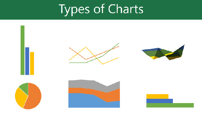
Types of charts
PowerPoint offers several chart types, allowing users to choose the one that best suits their data. To use charts effectively, users will need to understand how to use the different chart types. PowerPoint 2016 has many chart types, each with its own advantages.
Identify the parts of the chart.
In addition to knowing the different types of charts, you'll need to understand how to read them. Charts contain several different elements, and these different parts can help interpret the data.
Insert chart
PowerPoint uses spreadsheets as placeholders to enter data for charts, just like Excel. The data entry process is quite simple.
How to insert a chart
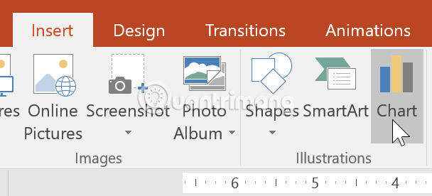
1. Select the Insert tab, then click the Chart command in the Illustrations group.
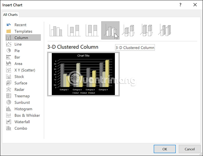
2. A dialog box will appear. Select a category from the left pane and review the charts that appear in the right pane.
3. Select the desired chart, then click OK.
4. A chart and spreadsheet will appear. The data appearing in the spreadsheet is the source data that the user will replace with their own information. The source data is used to create the chart.
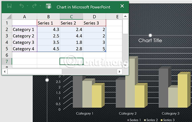
5. Enter the data into the spreadsheet.
6. Only data enclosed by blue lines will appear in the chart, but this area will automatically expand as the user continues to input data.
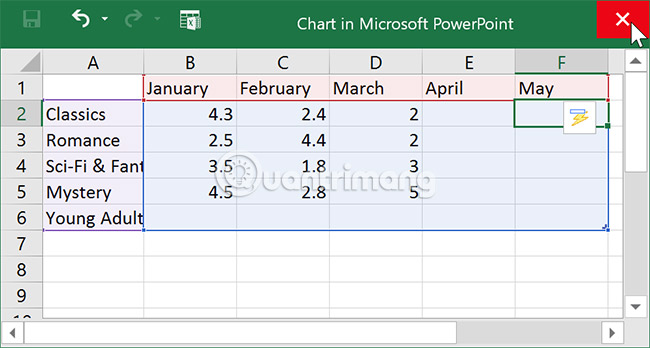
7. When finished, click X to close the spreadsheet.
8. The chart will be completed.
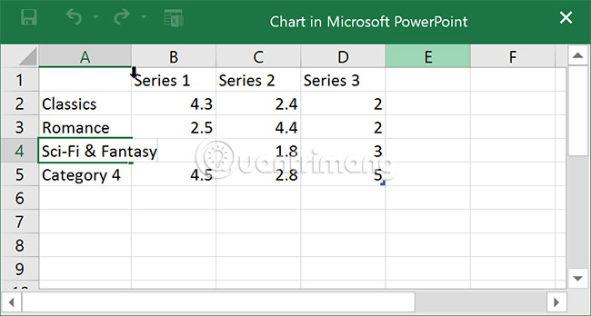
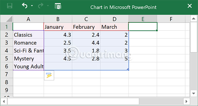
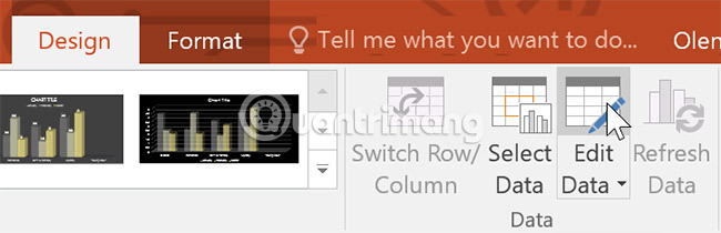
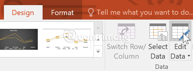
Users can edit chart data at any time by selecting the chart and clicking the Edit Data command on the Design tab.
Users can also click the Insert Chart command in the placeholder to insert a new chart.

Create charts with existing Excel data.
If you already have data in an existing Excel file that you want to use for the chart, you can transfer the data by copying and pasting it. Simply open the spreadsheet in Excel, select and copy the desired data, and then paste it into the source data area for the chart.
Users can also embed existing Excel charts into PowerPoint presentations. This can be useful when you need to update data in your Excel file and want the chart to automatically update whenever the Excel data changes.
Modify charts with charting tools.
There are many other ways to customize and arrange charts. For example, PowerPoint allows you to change the chart type, rearrange the chart data, and even change the chart layout and style.
How to change the chart type
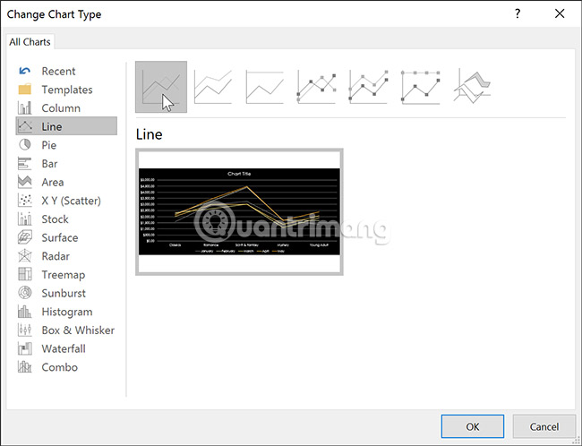
If you find that the data doesn't fit a particular chart type, it's easy to switch to a different chart type. In the example in this article, we'll change from a column chart to a line chart.
1. Select the chart you want to change. The Design tab will appear on the right side of the ribbon.
2. From the Design tab, click the Change Chart Type command.

3. A dialog box will appear. Select the desired chart type, then click OK.
4. A new type of chart will appear.
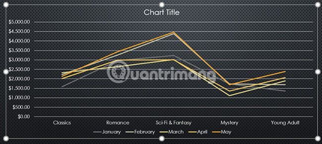
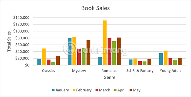
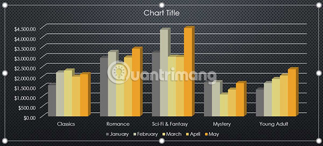
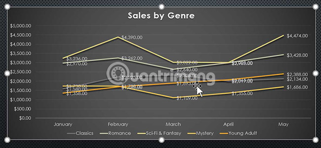
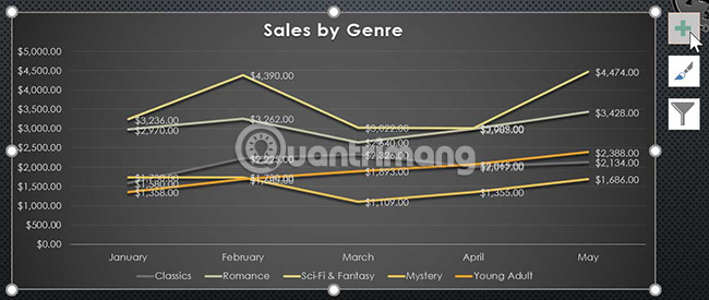
How to transfer row and column data
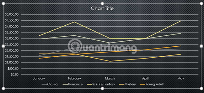
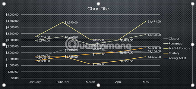
Sometimes, users may want to change how your data grouping chart is displayed. For example, in the chart below, book sales data is grouped by category, with each month on a separate row. However, we can swap the rows and columns to group the data by month, with each category on a separate row. In both cases, the chart contains the same data, just organized differently.
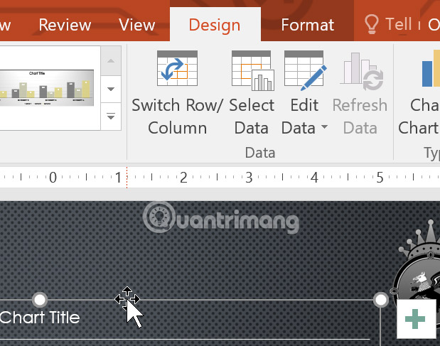
1. Select the chart you want to modify. The Design tab will appear.
2. From the Design tab, select the Edit Data command in the Data group.
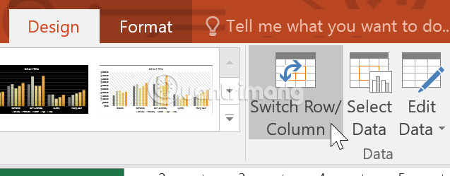
3. Click on the chart again, then select the Switch Row/Column command in the Data group.
4. The rows and columns will be transformed. In the example in this article, the data is currently grouped by month, with each category on a separate row.
It can be seen that when data is entered into the first column of a spreadsheet, row and column conversions can produce unexpected results. One solution is to enter a single quotation mark before each number, indicating that the spreadsheet is formatted as text instead of a numerical value. For example, the year 2016 would be entered as '2016'.
How to change the chart layout
The chart layout is predefined, allowing users to modify chart elements, including the title, legend, and data labels, to make the chart easier to read.
1. Select the chart you want to modify. The Design tab will appear.
2. From the Design tab, click the Quick Layout command.
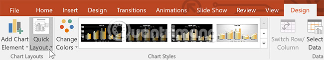
3. Select your desired layout from the predefined menu that appears.
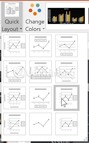
4. The chart will be updated to reflect the new layout.
To change a chart element (such as the chart title), click on the element and start typing new content.

How to change chart types
Chart styles allow users to quickly modify the interface.
1. Select the chart you want to modify. The Design tab will appear.
2. From the Design tab, click the More drop-down arrow in Chart Styles.
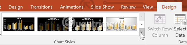
3. Select your desired style from the menu that appears.
4. The chart will appear in the selected style.
Users can also use chart formatting shortcuts to quickly add chart elements, change chart styles, and filter chart data.
Practice
1. Open the practice example presentation . You will also need to download the accompanying practice workbook.
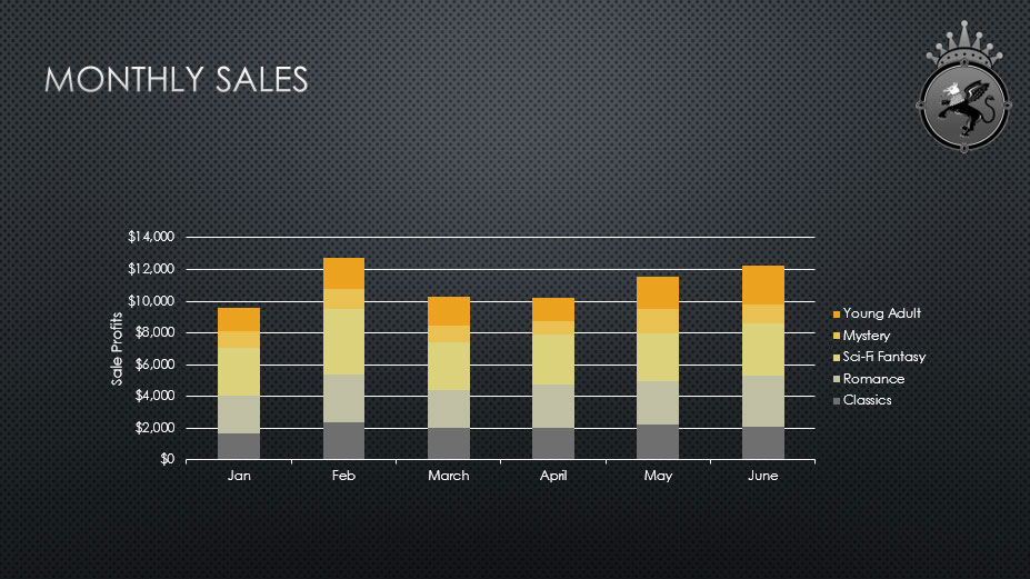
2. On the last slide, insert a line graph.
3. Open the practice workbook in Excel. Copy the data and paste it into the chart spreadsheet.
4. Delete the chart title.
5. Change the chart type to Stacked Column .
6. Use the Quick Layout drop-down menu to change it to Layout 10 .
7. Click the Chart Elements shortcut button , click the arrow next to Axis Titles , and select Primary Vertical as the axis title .
8. Double-click the axis title, then rename it to Sale Profits .
9. Convert Row/Column data.
10. When you're finished, your slide will look like this:
I wish you success!
See more:
- Presenting 3D charts in PowerPoint
- How to create a mind map in PowerPoint
- How to add effects to Excel charts in PowerPoint