How to create interactive charts and graphs on your Mac using Numbers
Charts and graphs are great tools for displaying data. They are easy to read, understand and provide a clear picture of the information. Numbers for Mac provides a feature for creating interactive charts and graphs. Here is how to use it.
Charts and graphs are great tools for displaying data. They are easy to read, understand and provide a clear picture of the information.
What is even better than regular static charts are the graphs you can interact with. This option allows you to display your data differently and gives you the opportunity to focus on specific parts.
Numbers for Mac provides a feature for creating interactive charts and graphs. Here is how to use it.
How to create a chart in Numbers on a Mac
- What is the interactive chart in Numbers?
- How to create interactive charts on your Mac using Numbers
- Step 1: Enter data
- Step 2: Create an interactive chart
- Step 3: Customize the chart
- Step 4: Edit the data reference
What is the interactive chart in Numbers?
In short, the interactive chart in Numbers is a chart that allows you to display your data in stages. You can use the slider or buttons to move through your data elements. For example, you can view sales by product per month and use the slider to view each month.
This allows you to present your data in a way that is easy to understand and more focused on each stage.

How to create interactive charts on your Mac using Numbers
Step 1: Enter data
Before you can create an interactive chart using Numbers, you need to enter data. Complete the spreadsheet and for best results, use column and row headings, as these will help the data display properly on the chart. Once you finish preparing the data, the rest will be very easy.
Step 2: Create an interactive chart
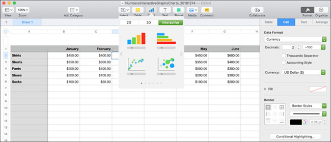
Select the data sheet by clicking on the small circle at the top left of the worksheet. Then click Chart> Interactive from the toolbar. You will see 4 different chart types (as in Microsoft Excel).
1. Vertical bar chart: This chart type works well for comparing values in a category.
2. Horizontal bar chart: Like above, this chart type is also suitable for comparing values in a category.
3. Scatter chart: This chart type is very suitable for comparing between value pairs in data series.
4. Bubble chart: This chart type is suitable for comparing between three data points in a sequence.
When you see these four options, you can use the arrows to move through additional styles or color schemes for each. Click on the chart you want to use and the chart will be filled into the worksheet based on the data entered.

Step 3: Customize the chart
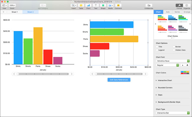
After creating your chart, you have many options to customize it. The easiest way to do this is with the sidebar, where you can see your options and changes happening at the same time. If the sidebar is closed, click Format from the top right to open.
Now, select the chart and then the Chart tab in the sidebar. You will also see tabs for Axis, Series and Arrange that you can use for different types of charts and data series. For example, the article will look at the Chart tab , vertical bar graph and horizontal column.

Custom option
Starting at the top of the sidebar, you have the following options:
- Chart Style : These are the color scheme options you see when you first select an interactive chart.
- Chart Options : You can check the checkboxes to use Title, Legend, Border and Hidden Data.
- Chart Font : You can change the font style, format, size and color.
- Interactive Chart : Choose between using the slider with buttons or just buttons to move through the data. You can also choose Below or Above for the location of Data Set Name .
- Rounded Corners : You can use the slider to adjust the roundness of the corners on the bar.
- Gaps : Adjust the percentage for spaces between bars and columns.
- Background & Border Style : You can use colors, gradients or images as the background.
- Chart Type : Choose a different chart type to use. This is a quick and easy way to see how the data will display using a different chart type.
If you use scatter or bubble charts, you'll notice that some of these options have changed. For example, you don't have the Rounded Corners feature because you don't have any bars with corners.
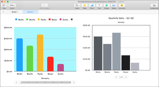
With some small customizations, you can change the complete look of the chart. This is a great way to make the data you present to your business and audience more relevant. Let's look at how two charts of the same kind, with the same data, will look completely different.

Step 4: Edit the data reference
When you change the data in your table, the chart will automatically update to reflect those changes. You can also make adjustments by clicking on the chart and then selecting Edit Data References .
Delete a data series
One advantage of using buttons to edit data is that you can choose the exact element you want to change in your chart. For example, you might want to delete some data from a chart but not from your table.
1. Select the chart and click Edit Data References .
2. Go to the table and click the arrow for the column you want to delete.
3. Click Delete Series.
You will immediately see the data removed from the chart and that column in the table is no longer highlighted as part of the chart. However, the data is still in the table.

Data inversion
Another thing you can do is draw rows as strings instead of columns or vice versa.
1. Select the chart and click Edit Data References .
2. Go to the table and click the arrow for a column.
3. Click Plot Rows as Series .
You can see in the example that instead of viewing each month (the first row heading), you can now view each product (the first column heading) in the chart. Basically, these two things have been exchanged. This allows you to switch the way your data is displayed very quickly, without hassle and without creating an entirely new chart.

When you finish editing the data reference, click the Done button at the bottom of the Numbers window.
The interactive chart and graph options in Numbers are great tools for presenting data. And if you're interested in using Excel for your spreadsheets, you can also create charts and graphs there very easily. Refer:
- How to draw flowcharts in Excel
- How to create a pie chart in Microsoft Excel
Hope you are succesful.


 Draw a bar graph with positive and negative values in Excel
  How to edit chart notes in Google Sheets
  How to create growth charts in Excel
  Steps to reset chart in Excel
  How to draw a map chart on Excel
  How to draw charts in Excel