Practical exercise on production statistics table in Excel
The following article guides you in detail practical exercises on production statistics table in Excel 2013. For example, the following data table: Making production statistics table. First calculate the total value of the items. Use live data statistics chart
The following article guides you in detail practical exercises on production statistics in Excel 2013.
The example has the following data table:
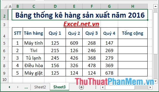
Production statistics table. First calculate the total value of the items. Use visual data charts to compare between quarters of items.
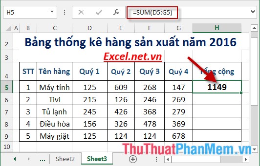
Step 1: Calculate the total number of items sold in the year. In the cell to calculate enter the formula: = SUM (D5: G5) -> press Enter -> the result is:
Step 2: Similarly copy the remaining values to result:

Step 3: Select the data area to create statistical chart -> Insert -> go to Columns -> select the type of chart to create:

Step 4: After selecting the chart type is as shown:

Step 5: You can edit the title right on the chart:

Step 6: In case you want to change the position of notes, for example, change the notes of items to the right, do the following: Click on the chart -> click on the Chart Element icon -> Legend -> Right:

Step 7: After editing, there is a chart as shown:
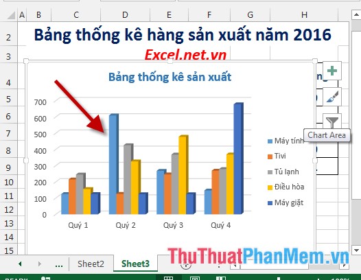
Looking at the chart, you can immediately compare and statistic data between the quarter and quarterly items. Not just the numbers are aggregated anymore, charts help you to statistic data quickly, have a visual look and provide trends and remedies for limited items.
The above is a detailed guide on how to produce manufactured statistics in Excel 2013.
Good luck!
Was this article helpful?
Your feedback helps us improve.
Related Articles
 How to view Workbook Statistics in Excel2 minutes read
 Practical exercise on computer rental list in Excel2 minutes read
 Create descriptive statistics table for dataset in Excel2 minutes read
 Instructions for naming Excel tables3 minutes read
 How to use the NORMDIST function in Excel - Function that returns the distribution in Excel3 minutes read
 Instructions on how to remove table formatting in Excel5 minutes read
Reader Comments 0
Sign in with email or Google to join the discussion.