How to draw tornado charts in Excel
The following article details how to draw tornado charts in excel..
The following article details how to draw tornado charts in excel.
Step 1: Draw the original chart in a horizontal format:

Step 2: Click the Male parameter -> Right-click and choose Format Data Series to select the format for the male ratio data.

Step 3: The Format Data Series dialog box appears in the Series options section, select Secondary Axis .
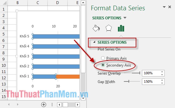
After selecting the Secondary Axis chart, the shape is as follows :

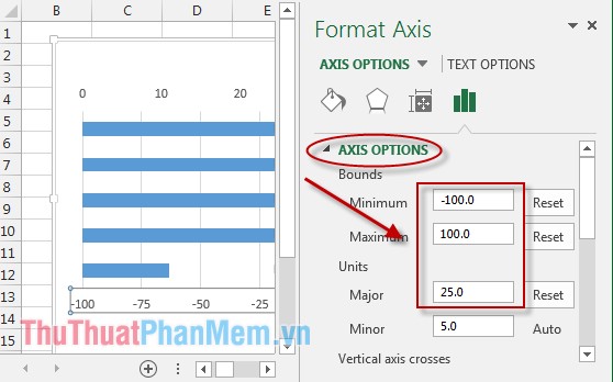
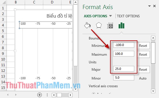
Step 4: Select the X axis (horizontal axis represents the values of the scale) -> Right-click and choose Format Axis .

Step 5: The dialog box appears in the Bounds section of the item:
- Minimum : Enter -100.
- Maximum : Enter 100.
- Major : Enter 25.
- Minor : Leave the Auto mode .
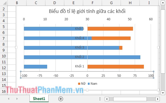
Once the selection is made, the chart will look like:
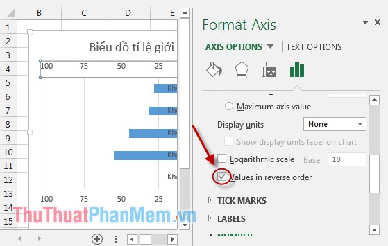
Step 6: Continue to select the upper horizontal axis -> right click and choose Format Axis .
Step 7: In Bounds, enter parameters as shown:
Move your mouse down to the bottom of the check box to select the Values in reverse order section .
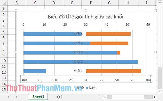
The result after choosing the chart has the form:
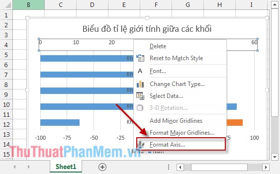
Step 8: Next, format the negative values in the X axis. Right-click the X axis (1 of the 2 axes) -> Select Format Axis .
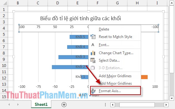
Step 9: In the Number section, select Category section, select Custom , Format Code section enter 0; 0 -> click Add . In this example, there is no unit, if in the case you leave unit% enter 0%; 0%.

After the selection of the X-axis is no longer a negative value. So, the tornado chart has the form: The values of the same type are on the same side of the graph. Looking at the chart, you can immediately compare the sex ratio among the blocks.

Among all blocks, the percentage of female students is higher than that of male students, and grade 1 has the highest percentage of female students.
Above is a detailed guide on how to draw a tornado chart. Hope to help you with the application to compare data visually and quickly.
Good luck!