How to Create a Probability Distribution Graph in Excel
TipsMake today will show you how to create a column histogram on Microsoft Excel. A probability distribution chart is a column graph that displays frequency data that allows you to calculate numbers.
Insert information
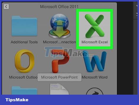
Open Microsoft Excel. The app has a white "X" icon on a green background. The Excel spreadsheet collection page opens.
On Mac, this step can open a new Excel sheet with no data. Then skip to the next step.
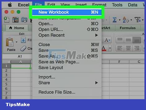
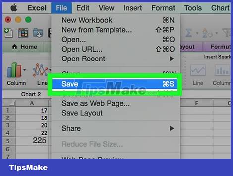
Create a new document. Click Blank workbook in the upper-left corner of the window (Windows), or click File and choose New Workbook (Mac).
Determine the smallest and largest data point. This is quite important in determining the counts in each drawer and the number of drawers required.
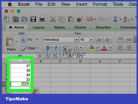
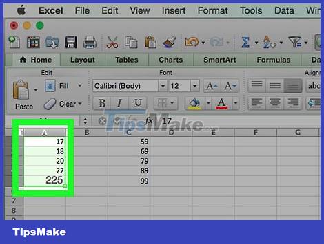
For example, if your data range spans 17 to 225, the smallest data point will be 17 and the largest 225.

Determine the number of drawers you need. Boxes are used to organize data into groups on a probability distribution chart. The easiest way to calculate the number of bins is to take the largest data point (in the example, 225), divide it by the number of data points in the graph (for example, 10) and then round up or down to the nearest integer, however rarely do we have more than 20 or less than 10 numbers. You can use the formula if you are not familiar:
Sturge's formula: K = 1 + 3.322 * log(N) where K is the number of bins and N is the number of data points; after you find K, round up or down to an approximate integer. Sturge's formula is best suited for linear or "clean" datasets.
Rice's formula: cube root of (number of data points) * 2 (for a dataset with 200 points, you'll need to find the square root of 200, then multiply the result by 2). This formula is best suited for erratic or inconsistent data.
Determine the counts in each drawer. Now that you know the number of bins, you can find the most uniform distribution. The counts in each bin consist of the largest and smallest data points, which will increase in a linear fashion.
For example, if you were to generate data for each box of a probability distribution representing test scores, you would most likely use the increment operator of 1 to represent different scales (e.g. 5, 6) , 7, 8, 9).
Increasing multiples of 10, 20, or even 100 is a commonly used standard for the count in each drawer.
If there are outliers that mutate, you can either put them outside the range of cells or increase/decrease the range of counts in each bin enough to include the outlier value.
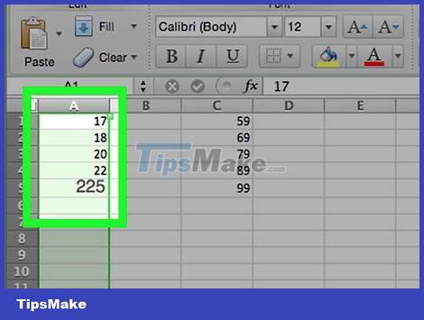
Add data to the column. Enter each data point in its own cell in column A.
For example, if you have 40 data, you can add each corresponding number to cells A1 through A40.

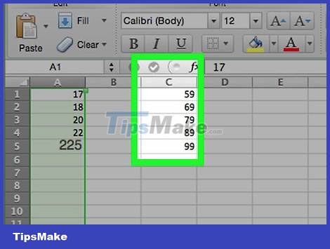
Add the counts in each drawer to column C if you use a Mac. Starting in cell C1 and below, enter each number in each box into the cell. After completing this step, you can proceed to create the probability distribution graph.
Skip this step on a Windows computer.
Create charts on Windows

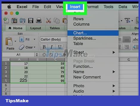
Select data. Click the top cell in column A, then hold down the ⇧ Shift key while clicking the last cell containing the data in column A.

Click the Insert tab located in the green ribbon at the top of the Excel window. The toolbar near the top of the window will switch to showing options in the Insert tab.
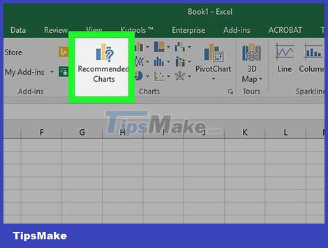
Click Recommended Charts . This option is located in the "Charts" section of the Insert toolbar. A window will pop up.
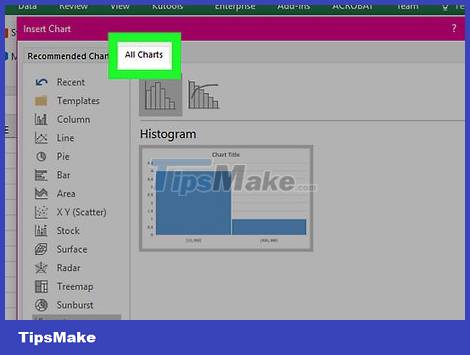
Click the All Charts tab . This tab is at the top of the pop-up window.
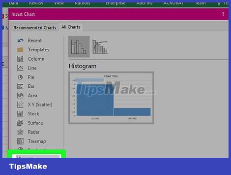
Click the Histogram tab on the left side of the window.
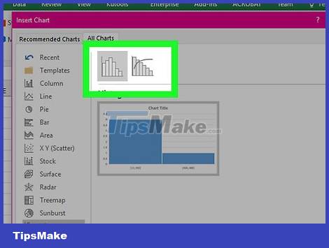
Select the Histogram template. Click the column chart icon to the left to select the Histogram sample (not the Pareto chart), then click OK. A simple probability distribution graph will be created using the data you choose.
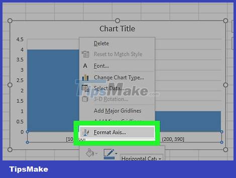
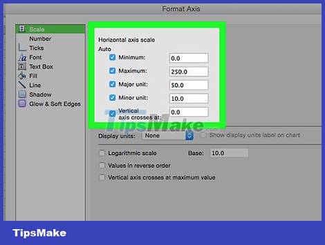
Open the horizontal axis menu. Right-click the horizontal axis (the horizontal axis containing the data ranges), click Format Axis. from the drop-down menu, and select the column graph icon in the "Format Axis" menu that appears. to the right of the window.
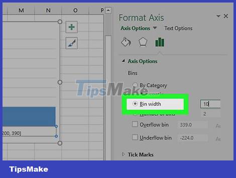
Check the "Bin width" box in the middle of the menu.
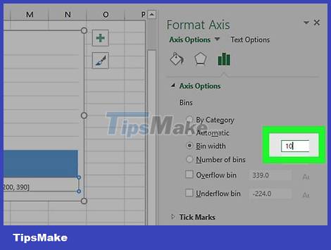
Enter the number of counts in each drawer. Enter the distance between the counts in each box in the "Bin width" box and then press ↵ Enter. Excel will rely on the data and automatically format it so that the histogram shows the appropriate number in the column.
For example, if you use 10 increments, enter 10 here.

Label the chart. This is only necessary if you want to add titles to the axes or the whole chart:
Axis Titles - Click the green + sign on the right side of the chart, check the "Axis Titles" box, click on any Axis Title text box located on the left or bottom of the graph and then click on it. Enter the title you want.
A title for the chart - Click the Chart Title text box at the top of the histogram, then enter the title you want to use.

Save histogram. Press Ctrl+S, select a save location, enter the name you want, and click Save.
Create charts on Mac
Select data and bins. Click on the top value cell in column A to select it, then hold down the ⇧ Shift key while clicking in cell C in the same row as cell A containing the last value. All data and counts in each respective bin will be highlighted.
Click the Insert tab located in the green ribbon at the top of the Excel window.
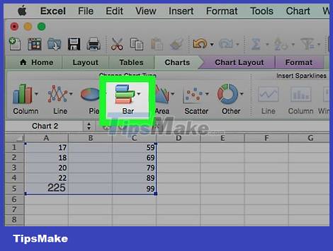
Click the column graph icon. This option is located in the "Charts" section of the Insert toolbar. A window will pop up.

Click the "Histogram" icon. This set of blue columns is below the "Histogram" heading. A probability distribution plot will be generated according to the data and the counts in each of the existing bins.
Make sure you don't click the "Pareto" icon, a blue multi-column with an orange line.
Review the probability distribution chart. Before saving, check if the graph is correct; if not then you need to adjust the counts in each drawer and recreate the chart.
Save session. Press ⌘ Command+S, enter the name you want to give the file, choose a save location (if necessary) and click Save.
- F.INV.RT function - The function returns the right-inverse head value of the probability distribution F in Excel
- CHIDIST function - Function returns the right end probability of the distribution when squared in Excel
- F.INV function - The function returns the inverse of the probability distribution F in Excel
- F.DIST - The function returns the probability distribution F in Excel
- CHISQ.INV function - The function returns the inverse of the probability of the left end of the distribution when squared in Excel
- CHISQ.INV.RT function - The function returns the inverse of the right end probability of the distribution when squared in Excel
- F.DIST.RT function - The function returns the right probability distribution F for 2 data sets in Excel
- BINOM.DIST function - Function returns the probability of binomial distribution of individual terms in Excel
- Effective ways to use ChatGPT in Excel
- Microsoft Office Web Apps: Not as expected
- Add 'spice' to Office 2010
- 10 steps to create calculating form in Word
- Instructions to remove passwords for MS Office files
- Use Google Docs to convert MS Office files into PDF
- Some new features of Access 2010
- Save images in Word files into separate files
- Create your own numbering format in Word
- Word and Excel will have online versions available online


-
 Instructions for setting up Gmail in n8n
-
How to use the IMPORTRANGE function in Google Sheets
-
4 productivity tasks simplified thanks to local LLM.
-
The 'Upload' button on AI: A productivity gateway or a secret 'evaporation' trap?
-
How to transfer memo data and chat history to Gemini
-
TOP best AI tools for data analysis
 Instructions for setting up Gmail in n8n
 How to use the IMPORTRANGE function in Google Sheets
 4 productivity tasks simplified thanks to local LLM.
 The 'Upload' button on AI: A productivity gateway or a secret 'evaporation' trap?
 How to transfer memo data and chat history to Gemini
 TOP best AI tools for data analysis
-
Application
-
Web Email
-
Website - Blog
-
Web browser
-
Support Download - Upload
-
Software conversion
-
Social Network
-
Simulator software
-
Online payment
-
Office information
-
Music Software
-
Map and Positioning
-
Installation - Uninstall
-
Graphic design
-
Free - Discount
-
Email reader
-
Edit video
-
Edit photo
-
Compress and Decompress
-
Chat, Text, Call
-
Archive - Share
-
-
System
-
Mac OS X
-
Hardware
-
Game
-
Tech info
-
Technology
-
Science
-
Life
-
Electric
-
Program
-
Mobile