Animation animation effects in CSS
Animation was introduced in CSS3 version, allowing to create motion effects without using Javascript or Flash..
Animation was introduced in CSS3 version, allowing to create motion effects without using Javascript or Flash.
What is CSS Animation?
Animation is understood as a motion effect, used to create moving effects for elements and is used quite a lot in websites today.
To create an Animation motion, you need to have keyframes. Each keyframe will be run at a specified time and in that keyframe it specifies how the element will move.
In addition, Animation includes a number of attributes that specify quite important details of the accompanying effects such as:
- Animation-name attribute
- Animation-duration attribute
- Animation-timing-function properties
- Animation-delay attribute
- Animation-iteration-count attribute
- Aniamtion-direction attribute
- Animation-fill-mode properties
Find out more about keyframes and the attributes needed in the next content with TipsMake.com.
Keyframe rules
Within this rule, you define keyframes to determine how the element will move at a given time.
Syntax of keyframe:
 @keyframes Name {
  /*code*/
 }
- Name: the name of the animation you want to create.
- Code: The code specifies the motion process. There are 2 types:
- Use percentages from 0% to 100%.
- from . to: set the value from the beginning (from - equivalent to 0%) to the end (big - equivalent to 100%).
For movement to occur need to connect @keyframes with the element.
Example 1: Change the background color, use syntax from . to:
 /* Code animation */
 @keyframes example {
  from {background-color: pink;}
  to {background-color: purple;}
 }

 /* Áp dụng animation vào phần tử */
 div {
  width: 100px;
  height: 100px;
  background-color: purple;
  animation-name: example;
  animation-duration: 4s;
 }

Example 2: Change the background color, use the syntax%:
 /* Code animation */
 @keyframes example {
  0% {background-color: crimson;}
  25% {background-color: lightsalmon;}
  50% {background-color: pink;}
  100% {background-color: indigo;}
 }

 /* Áp dụng animation vào phần tử */
 div {
  width: 100px;
  height: 100px;
  background-color: crimson;
  animation-name: example;
  animation-duration: 4s;
 }

Full code:
Example 3: Change both the background color and the element's position
 /* Code animation */
 @keyframes example {
  0% {background-color:red; left:0px; top:0px;}
  25% {background-color:yellow; left:200px; top:0px;}
  50% {background-color:blue; left:200px; top:200px;}
  75% {background-color:green; left:0px; top:200px;}
  100% {background-color:red; left:0px; top:0px;}
 }

 /* Áp dụng animation vào phần tử */
 div {
  width: 100px;
  height: 100px;
  position: relative;
  background-color: red;
  animation-name: example;
  animation-duration: 4s;
 }

Full code:
Note: To create Animation effects, you must define at least two things:
- The animation-duration attribute is the duration of the effect. If the duration is not specified, no effect will occur because the default value is 0.
- The animation-name attribute determines which element will execute animation.
Animation-delay attribute
The animation-delay attribute is used to determine the delay between the time a property changes and when the animation effect actually starts.
Example 1: Delay of 1 second before starting the effect.
 div {
  width: 100px;
  height: 100px;
  position: relative;
  background-color: red;
  animation-name: example;
  animation-duration: 4s;
  animation-delay: 1s;
 }

Full code:
Animation-delay accepts negative values. If using negative values, the animation will start as the element played in N seconds.
Example 2: Animation will start as if it has been played for 2 seconds:
 div {
  width: 100px;
  height: 100px;
  position: relative;
  background-color: red;
  animation-name: example;
  animation-duration: 4s;
  animation-delay: -2s;
 }

Animation-iteration-count attribute
The animation-iteration-count attribute is used to set the number of times an animation is executed. The value is usually:
- A certain number of times
- Infinite : animation repeated continuously and infinitely
Example 1: Animation runs 3 times and stops
 div {
  width: 100px;
  height: 100px;
  position: relative;
  background-color: red;
  animation-name: example;
  animation-duration: 4s;
  animation-iteration-count: 3;
 }

Example 2: Animation repeats continuously and infinitely
 div {
  width: 100px;
  height: 100px;
  position: relative;
  background-color: red;
  animation-name: example;
  animation-duration: 4s;
  animation-iteration-count: infinite;
 }

Animation-direction attribute
The animation-direction attribute is used to determine the direction of the animation. The values that animation-direction can receive are:
- normal: animation normally moves forward (default)
- reverse: animation moves in the opposite direction, backwards.
- alternate: animation moves forward, then backs in the opposite direction
- alternate-reverse: animation moves backwards, then moves forward.
Example 1: Running animation in the opposite direction
 div {
  width: 100px;
  height: 100px;
  position: relative;
  background-color: crimson;
  animation-name: example;
  animation-duration: 4s;
  animation-direction: reverse;
 }

Example 2: Running animation with the value of the alternate
 div {
  width: 100px;
  height: 100px;
  position: relative;
  background-color: crimson;
  animation-name: example;
  animation-duration: 4s;
  animation-iteration-count: 2;
  animation-direction: alternate;
 }

Example 3: Running animation with alternate-reverse value
 div {
  width: 100px;
  height: 100px;
  position: relative;
  background-color: crimson;
  animation-name: example;
  animation-duration: 4s;
  animation-iteration-count: 2;
  animation-direction: alternate-reverse;
 }

Full code for your reference:
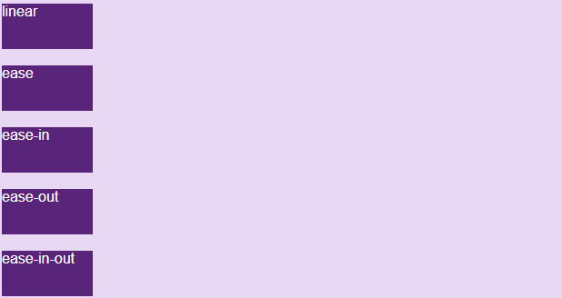
Animation-timing-function properties
Animation-timing-function properties are used to determine the speed of change when the effect moves.
The values available are as follows:
- ease: creating transition effect at the beginning, then slowly then slowly and nearing the end slowly (default value).
- linear : create transition effect from start to finish at the same speed.
- ease-in: create a slow transition effect at the start.
- ease-out: create a slow transition effect at the end.
- ease-in-out: creates a transition effect both at the beginning and the end.
- cubic-bezier (n, n, n, n): allows you to define a value of your own according to bezier (TipsMake.com will introduce in a separate article later).
 #div1 {animation-timing-function: linear;}
 #div2 {animation-timing-function: ease;}
 #div3 {animation-timing-function: ease-in;}
 #div4 {animation-timing-function: ease-out;}
 #div5 {animation-timing-function: ease-in-out;}
Run the following code yourself to see the difference:
Animation-fill-mode properties
CSS animations do not affect the element before running the first keyframe and after the last keyframe ends. And the animation-fill-mode attribute is used to change the state of the element before starting the animation.
The values available are as follows:
- none: when the animation does not work, it will retain the element's immobile status, without adding any style to the element (default).
- forwards : when the animation doesn't work after the animation ends, this value will apply the properties of the last time appearing in keyframe to the state of the element (depending on animation-direction and animation-iteration-count).
- backwards : when animation does not work before the animation starts (in the delay time), this value will apply the properties of the first occurrence in keyfame to the state of the element (depending on the anmation- attribute direction).
- both: combine forwards and backwards for element state.
 #div1 {-webkit-animation-fill-mode: none;}
 #div2 {-webkit-animation-fill-mode: forwards;}
 #div3 {-webkit-animation-fill-mode: backwards;}
 #div4 {-webkit-animation-fill-mode: both;}

You try to demo yourself to see the difference, full code here:
Include attributes
We have a full declaration of 6 attributes as follows:
 div {
  animation-name: example;
  animation-duration: 5s;
  animation-timing-function: linear;
  animation-delay: 2s;
  animation-iteration-count: infinite;
  animation-direction: alternate;
 }
However, in some cases, the above declaration is unnecessary and lengthy. So CSS supports us with an attribute that can declare the entire value of the above attributes, which is the animation attribute .
The syntax is as follows (note the order of declaration):
animation: name | duration | timing-function | delay | iteration-count | direction | fill-mode
So the above example can be briefly declared in 1 line as follows:
 div {
  animation: example 5s linear 2s infinite alternate;
 }
Last lesson: Transition transition effect in CSS
Next lesson: Tooltip effect in CSS
 Samuel Daniel