Create Button in CSS
Buttons are clickable buttons on your site.
Table of Contents
Buttons are clickable buttons on your site. In this article, TipsMake.com will show you how to create buttons and introduce some nice buttons that you can apply.
Basic design buttons
 .button {
  background-color: #58257b; /* màu của Quản trị mạng ^^ */
  border: none;
  color: white;
  padding: 15px 32px;
  text-align: center;
  text-decoration: none;
  display: inline-block;
  font-size: 16px;
 }
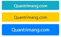
Change color for Button
Use the background-color attribute to change the background color for the generated buttons:
 .button1 {background-color: crimson;}
 .button2 {background-color: lightsalmon;}
 .button3 {background-color: seagreen;}
 .button4 {background-color: midnightblue;}
 .button5 {background-color: indigo;}
Format Button size
You use font-size or padding properties to change the size of the generated buttons. Using font-size, the button scales according to the font size:
 .button1 {font-size: 10px;background-color: Crimson;}
 .button2 {font-size: 12px;background-color: LightSalmon;}
 .button3 {font-size: 16px;background-color: SeaGreen;}
 .button4 {font-size: 20px;background-color: MidnightBlue;}
 .button5 {font-size: 24px;background-color: Indigo;}
Using padding to change the space between the display content of the element and its contour, this property can also change the size of the button while maintaining the content size.
 .button1 {padding: 10px 24px;}
 .button2 {padding: 12px 28px;}
 .button3 {padding: 14px 40px;}
 .button4 {padding: 32px 16px;}
 .button5 {padding: 16px;}
By default , the size of the node is determined by its text content (as wide as the content inside the element). However, you can also easily use the width width attribute to change the width of the button:
 .button1 {width: 250px;}
 .button2 {width: 50%;}
 .button3 {width: 100%;}
Bo rounded the corners of the buttons
Use the border-radius attribute to round the corners of the buttons by defining the radius of the corners and rounding it with that radius.
 .button1 {border-radius: 2px;}
 .button2 {border-radius: 4px;}
 .button3 {border-radius: 8px;}
 .button4 {border-radius: 12px;}
 .button5 {border-radius: 50%;}
You add and practice with the attributes above to see the changes.
Change the border color for Button
You use the border attribute to change the border color for the button.
 .button1 {
  background-color: white;
  color: black;
 border: 2px solid #DC143C;
 }
 .
Button disabled
Use the opacity attribute to add transparency to the button (create "disable" interface).
Tip: You can also add cursor attributes to the "not-allowed" value to display a mark that cannot be clicked when you hover over:
 .disabled {
  opacity: 0.6;
  cursor: not-allowed;
 }
Effects when hovering over Button
Change color when hovering over the button
Use: hover selector to change the button style when you hover over.
Tip: Use the transition-duration attribute to determine the speed of the hover effect:
 .button {
  -webkit-transition-duration: 0.4s; /* Safari */
 transition-duration: 0.4s;
 }

 .button:hover {
  background-color: crimson;
  color: white;
 }
 .

Create Button with shadow
Use the box-shadow attribute to add shadows to the button:
 .button1 {
  box-shadow: 0 8px 16px 0 rgba(0,0,0,0.2), 0 6px 20px 0 rgba(0,0,0,0.19);
 }

 .button2:hover {
  box-shadow: 0 12px 16px 0 rgba(0,0,0,0.24), 0 17px 50px 0 rgba(0,0,0,0.19);
 }

Group consists of many buttons

Delete the margin attribute and add float: left to each button to join the nodes together to form the above group.
 .button {
  float: left;
 }
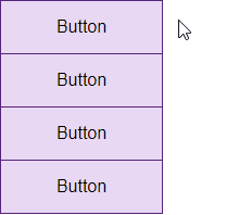
The vertical grouped buttons use display: block instead of float: left to overlap the nodes:
 .button {
  display: block;
 }
Place the Button on the image

Some beautiful Button effects
Add an arrow to the button when hovering over:


Add Fade effect when hover:

Add "ripple" effect when clicking:

Was this article helpful?
Your feedback helps us improve.
Related Articles
 The app replaces Android physical Home button5 minutes read
 How to create your own Start button13 minutes read
 How to add a scroll button to the top of the page for web pages4 minutes read
 Do you know how to create the Like button effect on Facebook?3 minutes read
 Lesson 11: Button Groups in Bootstrap 54 minutes read
 Create Start button on Windows 86 minutes read
Reader Comments 0
Sign in with email or Google to join the discussion.