FLOAT and CLEAR properties in CSS
The float property is used to move an element to the left or right corner of the space surrounding it, which is essential in formatting the page layout.
Table of Contents
float . property
The Float property is used to move an element to the left or right corner of the space surrounding it, which is essential in formatting the page layout.
By default, all HTML elements are non-float .
The Float property can have one of the following values:
- left : Fixed the element to the left.
- right: Fixed the element to the right.
- none: Located in its own place (normal state).
- inherit : The element inherits the value from the parent float.
Syntax of Float
tagName {float: value;}
Note : When an element is CSS floated left or right, all tags of the same level after it will overflow and fill the empty row of the row containing the CSS floated left or right tag.
Attribute Clear
Clear is almost the opposite of float. The Clear property prevents component A from taking up the space of component B (with component B being the element using float). Sometimes we do not want to float in certain situations, we will use clear to overcome.
To put it simply, clear is used to solve the problem in the float property's notice above.
The float property can have one of the following values:
- left: Overflow to the left.
- right: Overflow to the right.
- none: Allow overflow on both sides (default).
- both: Do not allow overflow to either side
- inherit : The element inherits the value from the parent float.
The most common way to use the Clear property is after you've used the Float property on an element. If an element is floated to the left, you should clear it to the left. Your Float element will continue to float, but the removed element will appear below it on the web page.
Clearfix
Clearfix in CSS is a way of using CSS properties to adjust the space of a parent tag relative to child tags that use floats. If an element being floated is higher than the parent element, it will cause the content to overflow. To fix it, we use the clearfix overflow: auto class :
Clearfix overflow: auto is used very effectively, however, it is recommended to use the new Clearfix which is more convenient and easy to use, used for most of the web today:
.clearfix::after {content: "";clear: both;display: table;}
Box grid layout
The best use of float is to create side-by-side box layouts.
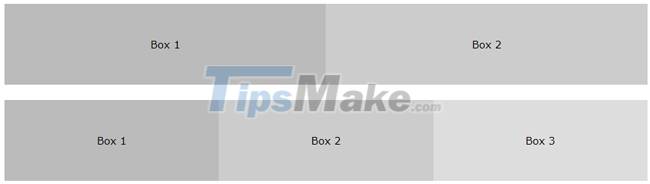
* {box-sizing: border-box;}.box {float: left;width: 33.33%;padding: 50px;}
Composition of images placed side by side
Float box grid layout like the example above can also be used to display images side by side
.img-container {float: left;width: 33.33%;padding: 5px;}
Equal height box layout
In the previous example, we learned how to float boxes side by side with equal width. However, it is not easy to create boxes of equal height. The quick fix is to set a fixed height:
.box {height: 500px;}
Was this article helpful?
Your feedback helps us improve.
Related Articles
 The float () function in Python3 minutes read
 float.h in C4 minutes read
 Align - Align in CSS4 minutes read
 Decoding the mysterious stone that can float for years, even sinks and floats again3 minutes read
 The device can cause droplets to float in the air2 minutes read
 What caused the ball to float on such a jet?2 minutes read
Reader Comments 0
Sign in with email or Google to join the discussion.