Query Media in CSS
@media in CSS is a feature that allows us to customize CSS to fit different devices
Table of Contents
@media in CSS is a feature that allows us to customize CSS to fit different devices like desktop, tablet, smartphone, TV device and printing device .
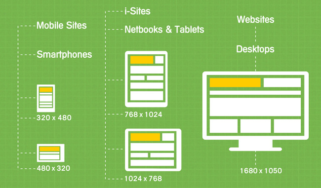
These media queries will look at different aspects such as the viewport's width and height, the width and height of the display device, the direction of use is horizontal or vertical along with a specific resolution to adjust for well suited.
@Media syntax
This attribute has the following syntax:
 @media not|only mediatype and (media feature) {
  CSS-Code;
 }
Media Type
Media Feature
Some examples
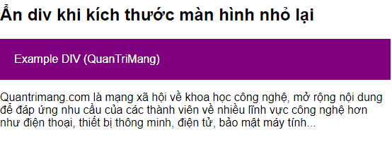
1. If the browser width is less than or equal to 600px, hide the element div class example
 @media screen and (max-width: 600px) {
  div.example {
   display: none;
  }
 }
Full code:
Hide the div when the screen size is smaller
TipsMake.com is a social network about science and technology, expanding content to
meeting members' needs for more technology fields such as electricity
voice, smart device, electronics, computer security .
2. If the browser width is greater than 800px, set the lavender, 400px to 999px background color to lightsalmon, less than 400px then lightblue.
 body {
  background-color: lightblue;
 }

 @media screen and (min-width: 400px) {
  body {
   background-color: lightgreen;
  }
 }

 @media screen and (min-width: 800px) {
  body {
   background-color: lavender;
  }
 }
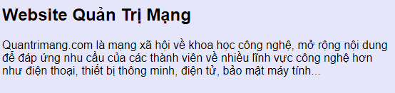
Website TipsMake.com
TipsMake.com is a social network about science and technology, expanding content to
meeting members' needs for more technology fields such as electricity
voice, smart device, electronics, computer security .
3. Create a flexible navigation menu that displays multiple interface sizes (displayed horizontally on a large screen and vertically on a small screen):
 @media screen and (max-width: 600px) {
  .topnav a {
   float: none;
   width: 100%;
  }
 }
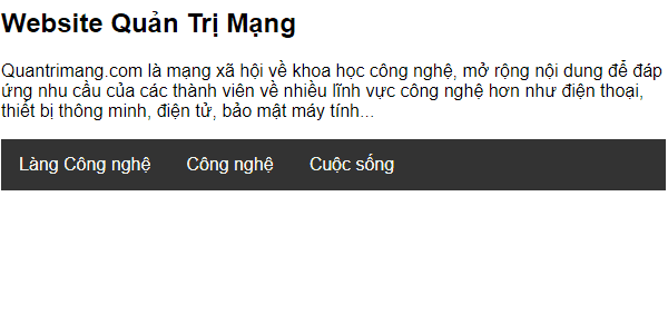
Website TipsMake.com
TipsMake.com is a social network about science and technology, expanding content to
meeting members' needs for more technology fields such as electricity
voice, smart device, electronics, computer security .
  Làng Công nghệ
  Công nghệ
  Cuộc sống
4. Create flexible display columns interface that meets a variety of interface sizes.
 /* hiển thị 2 cột thay vì 4 cột mặc định khi màn hình có chiều rộng dưới 920px*/
 @media screen and (max-width: 992px) {
  .column {
   width: 50%;
  }
 }

 /* các cột xếp chồng lên nhau thay vì cạnh nhau khi màn hình có chiều rộng dưới 600px */
 @media screen and (max-width: 600px) {
  .column {
   width: 100%;
  }
 }
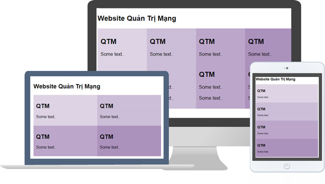
You resize the browser to see the change:
Website TipsMake.com
QTM
Some text .
QTM
Some text .
QTM
Some text .
QTM
Some text .
5. Create layout website display flexibly to meet many interface sizes.

Page Title
Website TipsMake.com
Knowledge - Experience - FAQ
Using flexible layout.
  Làng Công nghệ
  Công nghệ
  Khoa học
  Cuộc sống
Introduce
TipsMake.com is a social network about science and technology.
Highlights
Follow Me
YouTube
Form - Form in CSS
Quách Tỉnh, February 14, 2019
Forms are an integral part of any kind of website.
In this article, TipsMake.com will show you how to build the section
   giao diện hiển thị của một biểu mẫu cơ bản. Giao diện này có thể được làm
   khá đẹp mắt với CSS
Attribute Selector in CSS
Quách Tỉnh, February 14, 2019
Attribute selector is the way to select the elements you want to type in
tài liệu HTML dựa vào thuộc tính của một hay nhiều thẻ HTML nào đó.
Attribute selector can select objects without having to
   khai báo thêm các Class hoặc ID vào trong thẻ HTML và vẫn có thể hướng
   được đến các thành phần đó, giúp code gọn gàng hơn và mạch lạc hơn.
License No. 362 / GP-BTTTT. Ministry of Information and Communications issued on June 30, 2016.
Was this article helpful?
Your feedback helps us improve.
Related Articles
 The multiple-choice question set has an answer to Query P12 minutes read
 Action Query in Action 20167 minutes read
 Multiple choice questions have a Query option3 minutes read
 Set up Query Criteria in Access 20164 minutes read
 What do you know about data queries?3 minutes read
 The bootcfg query command in Windows2 minutes read
Reader Comments 0
Sign in with email or Google to join the discussion.