Table of Contents
What Is Flex CSS: Use the Flexbox Page Layout in CSS is easier to understand when the core ideas are paired with practical examples. The sections below explain the topic clearly, highlight useful steps, and point out details that can prevent common errors.
In the previous lessons, TipsMake.com showed you how to design web layouts using float attributes, techniques clear float or put nested positions. However, this method often has to write a lot of CSS code and the results are really difficult to predict, maybe as you like, can be extremely. bad.
But luckily, Flexbox Layout was born to improve these disadvantages. With Flexbox, you can solve a lot of layout issues in CSS in a flexible, easy and time-saving way with just a few lines of code. So let's find out what Flexbox is and why it is so powerful?
What is Flexbox?
Flexbox Layout (also called Flexible Box) is a page layout that is capable of self-balancing, changing width / height and the order of elements inside to fit all types of display devices. display and screen size.
For a normal layout, you need to set the size of the element, set it to block or inline, give it a float, and with Flexbox you just need to set the display horizontally or vertically, then internal elements can be displayed at will.
Note : Flexbox Layout is best suited to set up a layout on a small scale, while setting up a layout with a larger scope, it is still recommended to use the usual style of grid layout (grid layout).
Basic concepts and terms
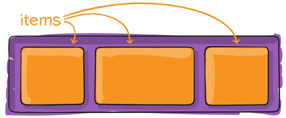
The Flex layout is set up from a parent container that acts as a flex containter and its immediate children (immediate children) act as flexible items (flex items).
Here is the Flexbox structure diagram:
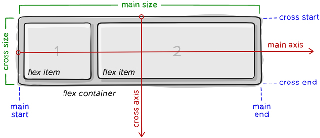
The most important component of Flexbox is
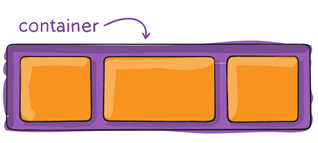
- container: is a large element surrounding the inner element, the internal items will display based on the container's settings.
- item: is a child of the container, you can set how many columns it will use in a container, or set its display order.

Items will be arranged according to the main axis axis (starting from main-start, ending at main-end) or following the axis axis (starting from the cross-start, ending at the cross-end).
- main axis: this is the main axis to control the direction that the item will display. Note that the main axis is not always horizontal like the diagram above, you can use the flex-direction attribute to change the direction of the axis and then the items will display according to it.
- main-start | main-end: when setting up flexbox, the items in the container display from the starting point called main-start to the end point called the main-end.
- main size: size (width or height) of items, depending on the direction of the main axis.
- cross axis : cross axis is always the perpendicular axis of the main axis. Its direction depends on the direction of the main axis.
- cross-start | cross-end: has the same meaning but always perpendicular to main start, main end.
- cross size: the size (width or height) of items based on the cross axis, depending on the direction of the main axis.
Properties of Flex Container

display
To use flex in css, we simply need to declare the display: flex attribute
.container {display: flex; /* hoặc inline-flex */}
Note: Common CSS columns are unusable in flex containers.
flex-direction
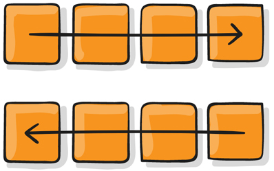
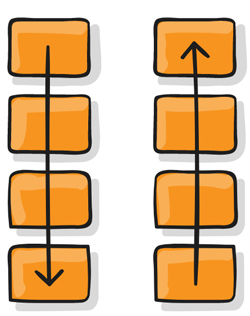
The flex-direction attribute determines the direction of the main-axis so that the container arranges items.
Syntax:
.container {flex-direction: row | row-reverse | column | column-reverse;}
Parameters:
- row : By default, flex items are arranged horizontally, from left to right (horizontal main axis).
- row-reverse: flex items are arranged horizontally, from right to left (horizontal main axis).
- column: vertical flex items are arranged vertically, from top to bottom (vertical main axis).
- column-reverse: flex item arranged vertically, from bottom to top (vertical main axis).
For instance,:
.flex-container {display: flex;flex-direction: row;}

.flex-container {display: flex;flex-direction: row-reverse;}

.flex-container {display: flex;flex-direction: column;}

.flex-container {display: flex;flex-direction: column-reverse;}

flex-wrap

By default, the item will automatically resize the element so that it always displays on the same line no matter which size you resize, which makes it easy to internal content (if any). Squeeze again, can cause bad interface.
So, we have the flex-wrap attribute that allows the item to automatically flow down when the container size changes.
Syntax:
.container{flex-wrap: nowrap | wrap | wrap-reverse;}
Parameters:
- nowrap: by default, all items will be on one line.
- wrap: when the container size changes and the total width of items is larger than the width of the container, the item will automatically flow down.
- wrap-reverse: similar to wrap, but instead of going down, the item will automatically jump up.
For instance,:
.flex-container {display: flex;flex-wrap: nowrap;}

.flex-container {display: flex;flex-wrap: wrap;}

.flex-container {display: flex;flex-wrap: wrap-reverse;}

flex-flow
The flex-flow attribute helps group two flex-direction and flex-wrap attributes.
Syntax:
flex-flow: <'flex-direction'> || <'flex-wrap'>
For instance,:
.flex-container {display: flex;flex-flow: row wrap;}
justify-content
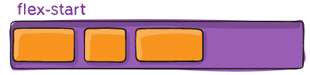
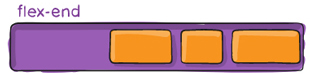
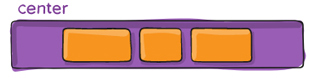
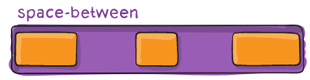
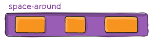

By default, the internal items will start from main start to the main end, however, sometimes the container still has space. So, you can use the justify-content property to adjust the starting position and align the items inside the container along the main axis axis , horizontally or vertically depending on flex-direction.
Syntax:
.container {justify-content: flex-start | flex-end | center | space-between | space-around | space-evenly;}
Parameters:
- flex-start: the default value, the item will start from the main-start margin of the container.
- flex-end: item will start from the main main end of the container (different from row-reverse is to change the direction of display).
- center: item will be in the middle of container.
- space-between: items will have equal spacing between the items because the container will automatically align the distance, the first item will contain the main-start point, the last item will contain the main-end point.
- space-around: similar to space-between, but the difference is that each item has 2 side spacing and these distances are equal.
- space-evenly: items are distributed so that the distance between any item, between the item and the margins is equal.
For instance,: Here the main axis is horizontal
.flex-container {display: flex;justify-content: flex-start;}

.flex-container {display: flex;justify-content: flex-end;}

.flex-container {display: flex;justify-content: center;}

.flex-container {display: flex;justify-content: space-between;}

.flex-container {display: flex;justify-content: space-evenly;}

.flex-container {display: flex;justify-content: space-around;}

align-items
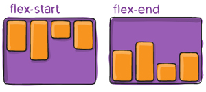
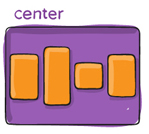

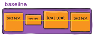
The align-items attribute helps adjust the starting position and align the items inside the container along the axis of the cross axis, horizontally or vertically depending on flex-direction.
Syntax:
.container {align-items: stretch | flex-start | flex-end | center | baseline;}
Parameters and examples illustrated
stretch: the default value, elements will be extended to fill its container, but the height / width value will be preferred if there is one, then the item will not be full high but only take the height / width value you set.
.flex-container {display: flex;align-items: stretch;}

flex-start: item will start from the container's cross-start margin.
For instance, , if the default with the main axis is horizontal, the vertical axis is vertical, flex-direction: row then the items will start from above.
.flex-container {display: flex;align-items: flex-start;}

flex-end: item will start from the cross-end margin of the container. If the default with the vertical axis is vertical, flex-direction: row then the items will roll down.
.flex-container {display: flex;align-items: flex-end;}
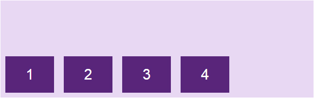
center: item will center in the direction of the cross axis.
.flex-container {display: flex;align-items: center;}

baseline: item is aligned according to their baseline.
The baseline is the path where all the letters will "sit up". You can use different font sizes to see that the items are aligned to the baseline baseline:
.flex-container {display: flex;align-items: baseline;}

align-content

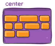


The align-content attribute helps align the distance between items within the container along the axis of the horizontal axis, horizontally or vertically depending on flex-direction.
Syntax:
.container {align-content: flex-start | flex-end | center | space-between | space-around | stretch;}
Parameters:
flex-start: item will start from the container's cross-start margin.
.flex-container {display: flex;flex-wrap: wrap;align-content: flex-start;}

flex-end: item will start from the cross-end margin of the container.
.flex-container {display: flex;flex-wrap: wrap;align-content: flex-end;}

center: item will be located between containers base on cross-axis.
.flex-container {display: flex;flex-wrap: wrap;align-content: center;}

space-between: items will have equal spacing between elements by the container automatically aligns the distance, the first item hides the cross-start, the last item hides the cross-end container.
.flex-container {display: flex;flex-wrap: wrap;align-content: space-between;}

space-around: similar to space-between, but the difference is that each item has 2 side spacing and these distances are equal.
.flex-container {display: flex;flex-wrap: wrap;align-content: space-around;}

stretch : default value, elements will be extended, aligned to fill its container (still prioritizing the height / width value if available).
.flex-container {display: flex;flex-wrap: wrap;align-content: stretch;}
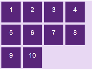
Properties of Flex Item
order
By default, items will display in order that appears in HTML, but with the order attribute , you can rearrange the placement of items.

Syntax:
.item {order: ; /* mặc định là 0 */}

flex-grow

The flex-grow attribute allows elements to expand according to the width of the container.
Syntax:
.item {flex-grow: ; /* mặc định là 0 */}
This attribute is a bit complicated, Tipsmake will illustrate some of the more common situations for you to imagine. For instance,, we set the items to be 100px wide.

The flex-grow attribute's default value is 0 , items will not automatically scale, leaving lots of space in the container.
When we increase flex-grow = 1, the item will automatically expand evenly to fit into the container frame.
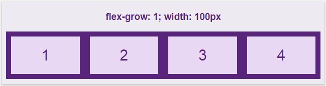
The flex-grow value is very flexible, when setting this attribute for all items with the same value , the items will have the same proportions and are evenly filled up the container. For instance,, if all of the flex-grow elements are 1, they will all be the same with the 1: 1 ratio, but the set of flex-grow is 100, then the end will still be the same with a 1: 1 ratio.
But the more interesting thing about the flex-grow is to apply it to each item. We have the default value of all elements, flex-grow = 0, changing the value of item2 to 1 separately, the results are as follows:
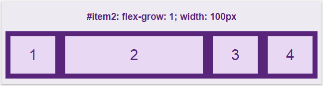
So here, setting the flex-grow to 1 then item2 will take the rest of the container into itself.
Now try for the elements to be flex-grow: 1 , but set the other 3-valued element separately:
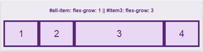
At this point all items are expanded to fill the empty part of the container, but item3 with flex-grow: 3 will inherit more empty than the remaining items with only flex-grow: 1, more specifically about 3 times. And as mentioned above, the flex-grow attribute makes elements proportional to each other. Suppose the items have flex-grow: 4 and item3 has the flex-grow: 12 attribute, it is similar to 1 with 3.
flex-shrink
The flex-shrink attribute is in contrast to the flex-grow attribute above, it does not expand but shrinks as we change the width of the container.
Syntax:
.item {flex-shrink: ; /* mặc định là 1 */}
The default value in flex-shrink is 1, allowing the particles to shrink even when the container width drops. If flex-shrink: 0, the item will not expand and take the value of the width / height attribute.
If you want item3 to shrink more than other items, increase its flex-shrink value.

Resize a small browser window, item3 shrinks more:

flex-basis
The flex-basis attribute helps determine the initial length of an item.
Syntax:
.item {flex-basis: | auto; /* mặc định là auto */}
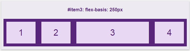
If you specify the overall length of the item item to be 100px, but customize item3 with flex-basis: 250px then we will get the following:
flex
Used flex properties to pool three flex-grow, flex-shrink and flex-basis attributes .
Syntax:
.item {flex: none | [ <'flex-grow'> <'flex-shrink'> || <'flex-basis'> ]}
Instead of using all three attributes:
.item {flex-grow: 1;flex-shrink: 3;flex-basis: 250px;}
You can use the flex attribute briefly:
flex: 1 3 250px;
The default value of flex is:
flex: 0 1 auto;
Note :
FAQ
What should readers know about What Is Flex CSS: Use the Flexbox Page Layout in CSS?
Start with the core concepts and examples in this guide. They provide the context needed to understand the topic accurately and apply the information with fewer mistakes.
Why is What Is Flex CSS: Use the Flexbox Page Layout in CSS important?
Understanding this topic helps readers make better technical decisions, recognize common problems, and choose safer or more efficient solutions.
How should beginners use this guide?
Work through each section in order, test unfamiliar steps in a safe environment, and keep a backup of important files or settings before making significant changes.
Related Articles
 Layout in HTML: What You Need to Know4 minutes read
 CSS Mastering Flexbox: Master CSS Flexbox in Just 5 Minutes6 minutes read
 Design Layout - Website Layout in CSS10 minutes read
 Word 2013 Complete Guide (Part 6): Aligning Page Layout6 minutes read
 Word 2016 Complete Guide (Part 10): Page Layout: Word Text Format5 minutes read
 How to Merge 2 Pages into 1 Page in Word3 minutes read
Reader Comments 0
Sign in with email or Google to join the discussion.