You often have to create Powerpoint presentation slides to present topics while studying or working. If you want each of your Powerpoint presentation slides to be beautiful and professional, let's invite you to learn the tips for creating beautiful PowerPoint slides that the article shares below.

Here are some tips to help you create beautiful, professional powerpoint presentation slides, invite you to follow along.
1. Do not use pre-existing Office templates
Many of you want to quickly create presentations, so use the built-in PowerPoint templates. So your presentation will easily duplicate the Slide template with other presentations, or using the existing PowerPoint slide templates will make your presentation very boring.

If you want your presentation to be impressive and unique, feel free to create and design a PowerPoint Slide template that fits your presentation theme.
You can refer to the PowerPoint Slide template here.
Insert helps me to link beautiful Powerpoint Theme post after uploading on the web
2. Use the right colors
Based on the topic of the presentation, the age at which the presentation viewer selected the colors appropriate for the Slide. You can choose the right colors to bring up the color palette to use.

For you to easily select the colors for your color palette, please refer to some websites:
https://www.colourlovers.com/
http://paletton.com/
http://www.colorhunter.com/
3. Font and font size
The font you should choose is a group of fonts without legs to make it easier to see, some fonts should be selected such as Helvetica, Arial, Calibri, Tahoma. You should not use too many fonts for Slide Powerpoint to avoid confusion and should not use all capital letters to make it difficult for viewers to read.
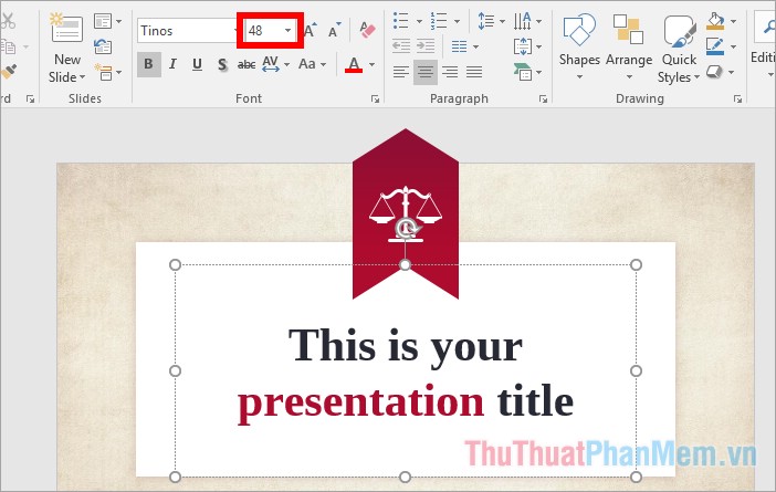
The font size for the content in PowerPoint slides is 24 pt (minimum is 18 pt), the font size is about 40pt - 50pt, the subtitle size is about 32pt.

4. Number of words on a slide and per line
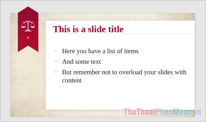
You should note that the content on the slide is just the main ideas, summarize, you need to understand the problem and topic on the slide and you should spend time preparing the content to speak instead of writing all the content on the slide and reading. for everyone to hear. So for everyone to focus on watching your presentation, write the least words on the slide, try to choose the shortest words and sentences if possible.

If the slide only has words, you should not write more than 5 lines on a slide, the number of letters per line (content font size from 18 -24pt).
5. Text color and background contrast
To make it easier for viewers to watch, the text color and background color should be contrasting, for example, a dark background with bright text, a dark background with a light background. Depending on the size of the room you show
The background color should generally be used for the slides

6. Should use charts, diagrams and photos
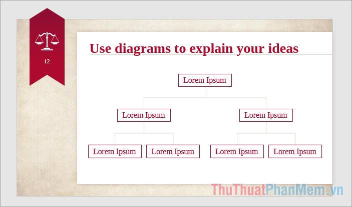
Instead of presenting words and tables on slides, you should use meaningful charts, diagrams or images suitable for the content instead. You should spend a lot of time converting relevant content to a chart, diagram or image if possible.

Animations make presentations more vivid, but you need to use them in the right and appropriate position, otherwise it will make it difficult for viewers to follow the main content of the slide.
Refer to inserting images into slides http://TipsMake.vn/chen-hinh-anh-vao-slide-trong-powerpoint/
7. Use the Slide Master
To help the slides seamlessly, the slides need to ensure consistency in font, color, font size, background color . You should use Slide Master to create consistency for the slide.
Learn more and how to use Slide Master here. (http://TipsMake.vn/su-dung-slide-master-trong-powerpoint/)
8. Create effects
Powerpoint provides many types of effects for each specific component such as creating text effects when it is necessary to emphasize certain text, creating effects for graphs, effects for images and slide transitions. You should apply it appropriately and when it's necessary to make your powerpoint slide more vivid. But it should not be so that using too much will make viewers more confused.
See more ways to create effects in Powerpoint here http://TipsMake.vn/huong-dan-tao-hieu-ung-trong-powerpoint/
Above the article has shared to you some tips for creating the most beautiful and professional PowerPoint slides. In the process of creating presentation slides, you should pay attention and apply the above tips to have a beautiful and scientific slide. Good luck!


 Steps to split slides in PowerPoint
  99+ Professional Slide Wallpaper
  How to insert a clock into PowerPoint
  How to make slides run automatically in PowerPoint
  How to make PowerPoint fireworks effect
  How to create bottom-up scrolling in PowerPoint?