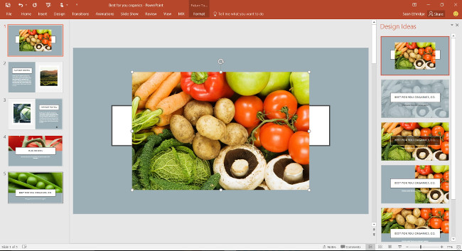
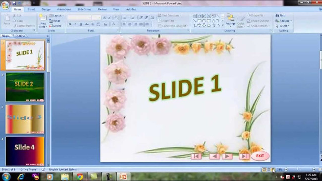
If you want a nice, easy-to-understand presentation slide, you need to keep in mind the following
To make your presentation more appealing and unique, the slide will be an effective support tool for you. Many people when presenting often give slides the effects and colors to attract viewers. But this is not necessary. For a fascinating and engaging presentation slide, just keep in mind the following
To make your presentation more appealing and unique, the slide will be an effective support tool for you. Many people when presenting often give slides the effects and colors to attract viewers. But this is not necessary. For a fascinating and engaging presentation slide, just keep in mind the following. Everything we share here, you can apply to any presentation software: PowerPoint, Google Slides, Apple Keynote, Prezi, or even just a Word file.
1. Why do slides need, what is the effect of slides?

Slide is not a talk. When making a slide you should not give anything to it, because the listener is not available to read. Besides, when you stand at the presentation, you cannot stare at the slide to read it, which will make the listener feel tired and sleepy, which will make people around you judge to be prepared. not good.
For a good presentation, it is best to see the slide as a tool to support you in presentations, something that will help listeners to easily understand the problem you are conveying.
Remember: the slide has an auxiliary effect, and how to make it useful for you and the listener and not on it. Make sure that even if you don't have a slide, your presentation will still work. And you're the center of the presentation, not the slide!
2. Things to put in the slide

- Headings, section names
- Key points in the keynote, major arguments and arguments
- Need to write briefly, do not write long sentences but only use keywords
- Only use about 3-4 dots of lines, do not use too much will distract the listener
- Each issue should only be within 10 drops, too long will distract the listener
3. Prioritize multiple images instead of letters

According to research by scientists, the human brain can absorb and understand the message that images convey faster than words, so today many new teaching methods focus on presenting problems with images to help learners learn more easily and memorize longer.
In the presentation is no exception, instead of giving multiple words, use images to make it easier for people to know what you're talking about instead of making them read through a lot of long words. For example, instead of saying 'today's phone is very developed', look for the image of a smartphone put on a slide. Or instead of saying 'Windows is the most popular operating system for PCs today', you just need to put the Windows logo in. Of course, you also need to study who the audience is to choose the image accordingly.
Add small tips for everyone: use the photo format * .png has a transparent background so that the slide does not get rough, Imagine your slide is using a black background and meets a picture with a white frame around it. vulgar and unprofessional. How to find png images with transparent background is easy, just Google
4. Please use the effect at the right time or may not need it

Many people who make slides often enjoy using effects, because they think these effects will help viewers feel excited and attract focus on their presentations. This is not wrong, but in fact it is not necessary, because your slide set is not a place to show off the effect. It must be a place that provides useful information for both you and your audience to know where you're talking, what to talk about, and the effect needs to be used carefully: at the right place, at the right time. The right place means that only slides need to be effective, and at the right time means that only when you need to emphasize to the audience about something, do you put the effect into it. Even a slide that doesn't need any effect can still accomplish its task well.
Some harmful effects of using too many effects:
- Makes viewers distract from the main content of the presentation and only focus on how your effect is
- It takes time to prepare you (because to set up all the effects it takes a lot of preparation time)
- Do not guarantee good compatibility when you need to project with another device (the school's computer, the meeting room can use a different version of Office than you do and do not have the same effects you are using)
- Make file worse
- Difficult to see on mobile devices (if you need to show your slide to others after you've finished the talk, or need to print out a paper for people to take notes, you'll get in trouble)
Only so much trouble will you consider, should I add unnecessary effects to my slide set?
5. Absolutely not overlap objects

The object here can be images, text or shapes, which are generally things you will put on a slide. For some reason, many people often make these objects overlap and add effects so that these objects gradually appear.
In fact, this is not necessary, because it will take a lot of your time to make the slide and find the object when you need to edit. It is also a disaster to print slides with many objects for others to note.
6. Take a lot of time to practice what you will say

Reading slides today is not about reading and reading to everyone, this is an extremely unprofessional act. When making a slide you have to understand the problem and the content and you want to convey it to the audience, so that they can understand and this also helps a lot when presenting, you will not be dependent on the text, when said will be more coherent, rich. If you often forget the main issues in the presentation, you can use the Note function of PowerPoint or Slides as a reminder tool (because when screened, a screen will show only the slide or screen. will show notes and counters for you).
Take the time to practice the presentation, you can stand in front of the mirror and practice, practice your pronunciation to make it clear, your style when standing in front of the crowd. When you say, please go to the main list then from the list that you express your style. Stay calm and do as if you are telling your friends, colleagues to hear about a good story you've just discovered, not doing a mandatory task. This is what attracts listeners and people also understand what you are sharing.
Hopefully this article will help people in their study or work.
Good luck!
See more:
- Summary of useful shortcuts in PowerPoint
- Instructions for installing and using Office 2016
- 5 tips for using professional PowerPoint
You've just finished reading the article "If you want a nice, easy-to-understand presentation slide, you need to keep in mind the following" edited by the TipsMake team. You can save if-you-want-a-nice-easytounderstand-presentation-slide-you-need-to-keep-in-mind-the-following.pdf to your computer here to read later or print it out. We hope this article has provided you with many useful tech tips and tricks. You can search for similar articles on tips and guides. Thank you for reading and for following us regularly.
- 7 pages of PowerPoint slide templates help your presentations 'sublimate'
- Powerpoint Thank You wallpapers, Thanks for the Slide ends
- Presenting slide shows in PowerPoint 2016
- 'Search' the slide while PowerPoint presentation is in progress
- How to Add a New Slide in PowerPoint
- 30 Slide the most beautiful thanks for PowerPoint