How to Do Trend Analysis in Excel
This wikiHow teaches you how to create a projection of a graph's data in Microsoft Excel. You can do this on both Windows and Mac computers. Open your Excel workbook. Double-click the Excel workbook document in which your data is stored..
Method 1 of 2:
On Windows
-
 Open your Excel workbook. Double-click the Excel workbook document in which your data is stored.
- If you don't have the data that you want to analyze in a spreadsheet yet, you'll instead open Excel and click Blank workbook to open a new workbook. You can then enter your data and create a graph from it.
-
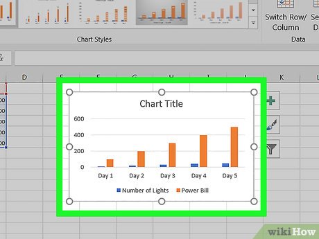 Select your graph. Click the graph to which you want to assign a trendline.
- If you haven't yet created a graph from your data, create one before continuing.
-
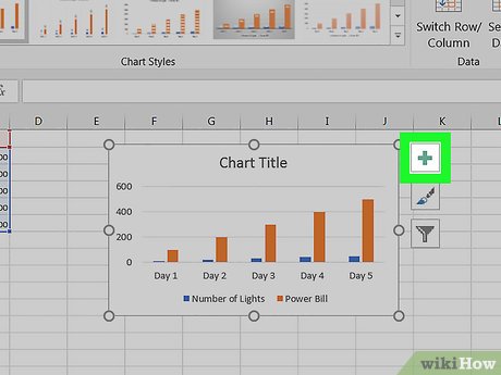 Click +. It's a green button next to the upper-right corner of the graph. A drop-down menu will appear.
 -
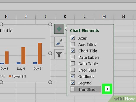 Click the arrow to the right of the "Trendline" box. You may need to hover your mouse over the far-right side of the "Trendline" box to prompt this arrow to appear. Clicking it brings up a second menu.
 -
 Select a trendline option. Depending on your preferences, click one of the following options
- Linear
- Exponential
- Linear Forecast
- Two Period Moving Average
- You can also click More Options... to bring up an advanced options panel after selecting data to analyze.
-
 Select data to analyze. Click a data series name (e.g., Series 1) in the pop-up window. If you named your data already, you'll click the data's name instead.
 -
 Click OK. It's at the bottom of the pop-up window. Doing so adds a trendline to your graph.
- If you clicked More Options... earlier, you'll have the option of naming your trendline or changing the trendline's persuasion on the right side of the window.
-
 Save your work. Press Ctrl+S to save your changes. If you've never saved this document before, you'll be prompted to select a save location and file name.
Method 2 of 2:
On Mac
-
 Open your Excel workbook. Double-click the Excel workbook document in which your data is stored.
- If you don't have the data that you want to analyze in your spreadsheet, you'll instead open Excel to create a new workbook. You can then enter your data and create a graph from it.
-
 Select the data in your graph. Click the series of data that you want to analyze to select it.
- If you haven't yet created a graph from your data, create one before continuing.
-
 Click the Chart Design tab. It's at the top of the Excel window.[1]
 -
 Click Add Chart Element. This option is on the far-left side of the Chart Design toolbar. Clicking it prompts a drop-down menu.
 -
 Select Trendline. It's at the bottom of the drop-down menu. A pop-out menu will appear.
 -
 Select a trendline option. Depending on your preferences, click one of the following options in the pop-out menu:[2]
- Linear
- Exponential
- Linear Forecast
- Moving Average
- You can also click More Trendline Options to bring up a window with advanced options (e.g., trendline name).
-
 Save your changes. Press ⌘ Command+Save, or click File and then click Save. If you've never saved this document before, you'll be prompted to select a save location and file name.