How to Make a Bar Graph in Excel
This wikiHow teaches you how to make a visual representation of your data in Microsoft Excel using a bar graph. Open Microsoft Excel. It resembles a white 'X' on a green background.
Table of Contents
Part 1 of 2:
Adding Data
-
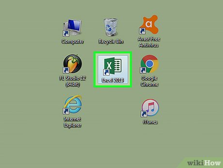 Open Microsoft Excel. It resembles a white "X" on a green background.
- If you want to create a graph from pre-existing data, instead double-click the Excel document that contains the data to open it and proceed to the next section.
-
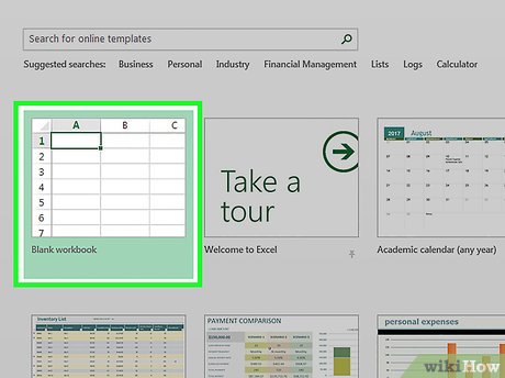 Click Blank workbook (PC) or Excel Workbook (Mac). It's in the top-left side of the template window.
 -
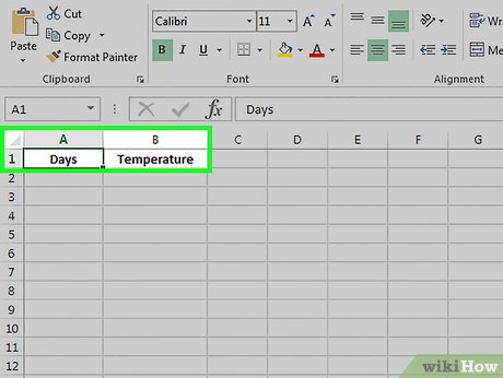 Add labels for the graph's X- and Y-axes. To do so, click the A1 cell (X-axis) and type in a label, then do the same for the B1 cell (Y-axis).
- For example, a graph measuring the temperature over a week's worth of days might have "Days" in A1 and "Temperature" in B1.
-
 Enter data for the graph's X- and Y-axes. To do this, you'll type a number or word into the A or B column to apply it to the X- or Y- axis, respectively.
- For example, typing "Monday" into the A2 cell and "70" into the B2 field might show that it was 70 degrees on Monday.
-
 Finish entering your data. Once your data entry is complete, you're ready to use the data to create a bar graph.
Part 2 of 2:
Creating a Graph
-
 Select all of your data. To do so, click the A1 cell, hold down ⇧ Shift, and then click the bottom value in the B column. This will select all of your data.
- If your graph uses different column letters, numbers, and so on, simply remember to click the top-left cell in your data group and then click the bottom-right while holding ⇧ Shift.
-
 Click the Insert tab. It's at the top of the Excel window, just right of the Home tab.
 -
 Click the "Bar chart" icon. This icon is in the "Charts" group below and to the right of the Insert tab; it resembles a series of three vertical bars.
 -
 Click a bar graph option. The templates available to you will vary depending on your operating system and whether or not you've purchased Excel, but some popular options include the following:
- 2-D Column - Represents your data with simple, vertical bars.
- 3-D Column - Presents three-dimensional, vertical bars.
- 2-D Bar - Presents a simple graph with horizontal bars instead of vertical ones.
- 3-D Bar - Presents three-dimensional, horizontal bars.
-
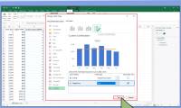
 Customize your graph's appearance. Once you decide on a graph format, you can use the "Design" section near the top of the Excel window to select a different template, change the colors used, or change the graph type entirely.
- The "Design" window only appears when your graph is selected. To select your graph, click it.
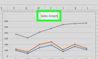
- You can also click the graph's title to select it and then type in a new title. The title is typically at the top of the graph's window.
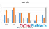
Sample Bar Graphs
 Sample Horizontal Bar Graph
 Sample Vertical Bar Graph
 Sample Stacked Bar Graph
Was this article helpful?
Your feedback helps us improve.
Related Articles
 Instructions on how to graph in Excel4 minutes read
 How to Make a Line Graph in Microsoft Excel4 minutes read
 Detailed instructions on how to graph in excel3 minutes read
 How to Add a Second Y Axis to a Graph in Microsoft Excel4 minutes read
 How to Import, Graph, and Label Excel Data in MATLAB5 minutes read
 How to graph functions in Excel4 minutes read
Reader Comments 0
Sign in with email or Google to join the discussion.