How to insert trendlines in Microsoft Excel
If you want to get a better overview of the data, it is logical to add a trendline.
Showing changes in data over time is one of the most common visualization tasks, and MS Excel makes it easy to create charts to do that.
Line charts and bar charts work pretty well for them in their own ways, but if you want to get a better overview of the data, it's a good idea to add a trendline. .
They come in a variety of styles, from basic linear to exponential and more specialized logarithms. However, adding and manipulating them is quite simple.
Create trend lines
If you use the latest version of Excel (2013, 2016, 2019), creating trendlines is extremely simple:
1. Select the chart you want to add the trendline to.
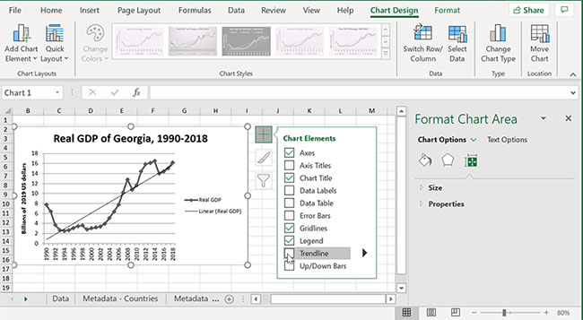
2. Click the + button at the top right of the chart - labeled 'Chart Elements' when you hover over it.
3. Check the box that says 'Trendline'.
4. By default, Excel inserts a linear trendline. If you want to change that, see below.
If you are still using Excel 2010 (support for this version will end in 2020), then there is a little difference:
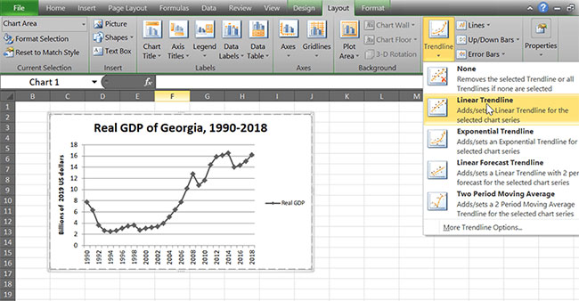
1. Select a chart. The toolbar title above will now say 'Chart Tools'.
2. Go to the Layout tab and find the 'Analysis' group on the right.
3. Use the Trendline button to add any type of road you want.
Types of trend lines
If you click on the small arrow that appears next to the Trendlines section in the Chart Elements menu , you will find that there are several different types available, as well as the 'More Options …' box. Clicking on it will show you all available trend lines.
Linear
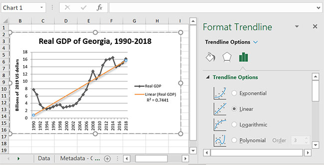
This is the basic option and probably the easiest way for someone to read the chart to understand. It only displays the most suitable line, or the rate at which something is increasing or decreasing. This option is best for data sets in which points more or less fall in a straight line.
Moving average
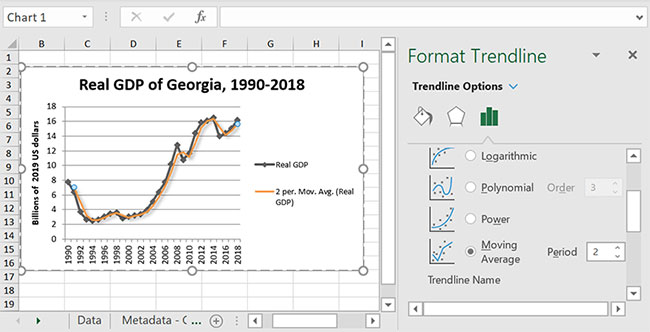
If you have some rather confusing data, consider using the 'Moving average' option to help you get a better picture of the overall trend. For best results, adjust time periods - the average number of Excel data points will determine where each position on the trendline is located. The default is 2, which means that Excel takes the average of two data points one. If it's still too much, just increase the average to smooth the trendline.
Exponential
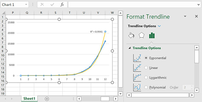
If the rate of change of your data increases as the value of x increases, an exponential trendline can help you better visualize what happens. This option is best suited for data that is growing or decreasing exponentially, as its name suggests.
Logarithmic
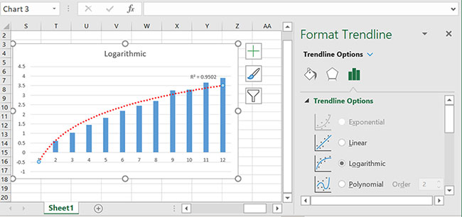
As the inverse of the exponential function, the logarithmic trendline is used for data types in which the rate of change decreases as the value of x increases. If something initially rises rapidly and then moves horizontally, a logarithmic trendline may be a good fit.
Polynomial
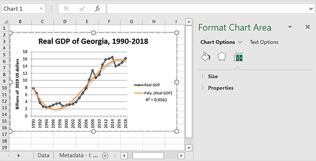
The polynomial trendline is a good choice for data moving up and down in wave form. You have to set up the order to do this job, but it's pretty easy: Just count the number of bends in the curve, by viewing the number of moves from high to low or vice versa. Basically, just tally the vertices and place that order.
Power
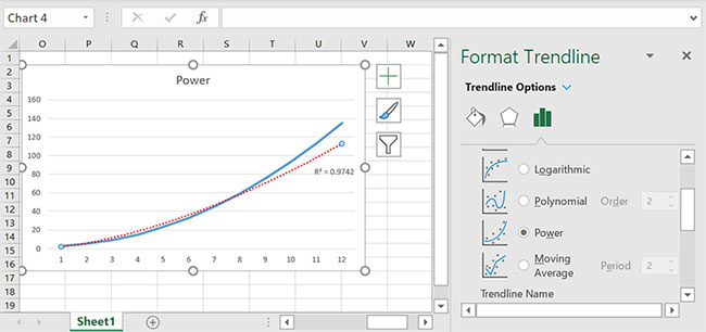
Trend lines of this type are best suited for situations where data is increasing at certain speeds, such as with acceleration.
How to choose the appropriate trend line: Check the value of R squared
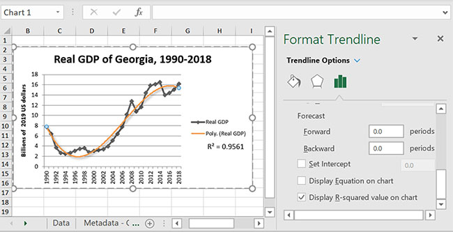
In the 'More Options' panel , there are many options for displaying the R-squared value, which is a measure of the distance from each point on the graph to the trendline. As a general rule, the closer the R value is to 1, the more consistent the trendline with the data. If you're not sure which trend line best fits your chart, try checking which option has the highest R-squared point.
Forecasting
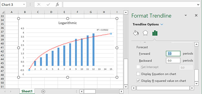
If you want Excel to predict where the current trend may take you, simply use the 'Forecasting' option to see its predictions for the future. Just put the number of future periods (tick the x axis) you want to see and it will extrapolate based on the trend line you choose.
Add more trend lines
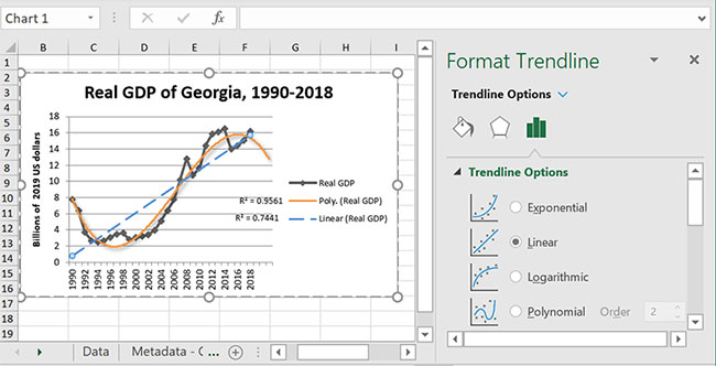
There are 2 cases you may want to have more than one trendline:
- Your chart is measuring many things and you want to see trends for all
- You want to see how different types of trendlines perform on the same data series
Either way, adding multiple trend lines is fairly simple.
1. Right-click on the data series you want to add the trendline. (If it's a line, click on that line; if it's a bar, click that bar; etc .)
2. Click 'Add trendline'.
3. Follow the steps above to make the chart look like you want.
Customize the trend line
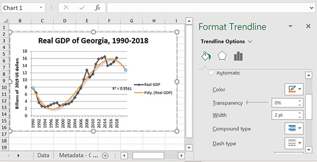
Having multiple trend lines with the same style and color is confusing, so you might want to make them look different or match the corresponding data series. Or maybe you just want to adorn your chart a bit. Either way, Excel has a lot of formatting options. The 'Fill and line' menu allows you to select the type, color and thickness of the line. The 'Effects' menu gives you the options for Shadow, Glow and Soft Edges.
Edit and delete the trend line
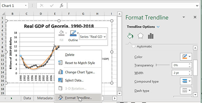
Changing or clearing trendlines after you complete them is no problem. Just right click on the line and select 'FormatTrendline' , the options menu will open. You can make changes there or just press the Delete button to remove the trend line. Creating trendlines is quick, so it doesn't take long to try several types or combine them together and see which option works best.
Hope you are succesful.
- How to Insert Hyperlinks in Microsoft Excel
- How to insert watermark, logo sink into Excel
- How to insert a batch image into Excel box
- Instructions for inserting a PDF file into Excel spreadsheet
- Insert line shortcut in Excel - Shortcut insert Excel
- How to mark products in Excel
- MS Excel 2007 - Lesson 9: Insert images and graphics into a spreadsheet
- MS Excel - Lesson 4: Working with lines, columns, sheets
- How to use the REDUCE function in Excel
- 5 Old Excel Functions You Should Stop Using
- How to use WEBSERVICE and FILTERXML functions to get data directly from the web and automatically update in Excel
- MAP function in Excel
- 5 Excel dashboard tricks that will save you hours when you're just starting out
- Why Row Zero is Superior to Excel
- How to Use Excel's Regex Function to Power Up Your Searches
- How to combine SCAN and REGEX functions in Excel to solve complex problems
- How to use IFS and LET functions instead of nested IF statements in Excel
- What is the CORREL function in Excel?


 How to use Trend Micro QR Scanner to avoid malicious QR codes
 How to use the TREND function in Excel
 Best Binary Options Trading Strategies 2023
 What is hot trend?
 Razer driver 'stick' virus
 Appearing fake email donated free iPhone 5S
-
 Application
-
Web Email
-
Website - Blog
-
Web browser
-
Support Download - Upload
-
Software conversion
-
Social Network
-
Simulator software
-
Online payment
-
Office information
-
Music Software
-
Map and Positioning
-
Installation - Uninstall
-
Graphic design
-
Free - Discount
-
Email reader
-
Edit video
-
Edit photo
-
Compress and Decompress
-
Chat, Text, Call
-
Archive - Share
-
-
System
-
Mac OS X
-
Hardware
-
Game
-
Tech info
-
Technology
-
Science
-
Life
-
Electric
-
Program
-
Mobile