MS Excel - Lesson 6: Four steps to create an Excel chart
Table creation is entirely natural in Microsoft Excel, but from the information in the table to produce a new analytical result is worth mentioning..
Table creation is entirely natural in Microsoft Excel, but from the information in the table to produce a new analytical result is worth mentioning. This tutorial will guide you 4 steps to creating an Excel chart based on the Wizard.
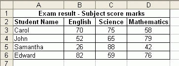
We use step by step in the Chart Wizard to create a chart that shows the results of student tests for English, Science and Mathematics subjects.
Step 1: Chart type
- Click on any data box that contains the information you want to include in the chart, or black out exactly the data to display in the chart.
- Click on the Chart Wizard icon on the Standar toolbar. The Chart Wizard dialog box displays:
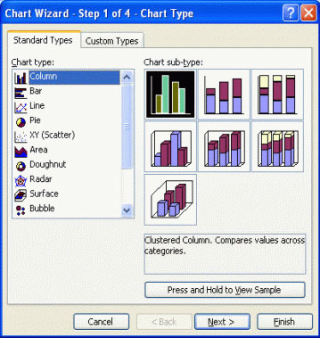
- From Chart type: Select the type of chart you want to create
- Then from Chart sub-type: Select the correct format you want to apply to the chart type
- To see how to select the chart, click Press and Hold to View Sample in the dialog box. In the above example, we choose which is the default
- Click Next to display the next page of the dialog box - Source Data Chart .
Step 2: Data source
- Data Range allows you to specify data correctly to display in the chart
- You can choose how to display Series in Rows or Columns . In the case of the data in the example above, two results are illustrated. Choose Series in Rows .
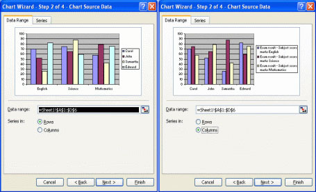
- Click the Next button, the Chart Options dialog box appears
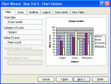
Step 3: Options for the chart
From the Chart Options dialog box, you can select Titles , Axes , Gridlines , Legend , Data Labels , Data Tables and create necessary changes.
Add chart title
- In the Chart title: section, name the chart (eg Exam results ).
- In Category (X) axis: enter title for X axis (eg Subject )
- In Category (Y) axis: enter title for Y axis (eg Mark score )
- The example above is illustrated as follows:
Adjust the chart axis
- From the Chart Options dialog box , click the Axes tab
- It allows you to adjust the display axis, you can select or not select the axis on the selection box to see the results on the chart
Adjust chart gridlines
- From the Chart Options dialog box , click the Gridlines tab
- You can choose to display large or small X and Y axes by clicking on the check box
Adjust chart captions
- From the Chart Options dialog box , click the Legend tab
- You can choose to display or not to display chart captions and position the annotations in the chart by clicking on the radio button.
Adjust labels for data
- From the Chart Options dialog box , click the Data Labels
- You can choose to display or not to display data labels by clicking on the radio button
Display table data
- From the Chart Options dialog box , click on the Data Table tab
- You can choose to display or not to display the chart data of the chart by clicking on the check box
- Click Next to continue, then the last page of the dialog box appears - Chart Location
Step 4: Position the chart
Locate chart
- You can choose to place the chart on a spreadsheet as an object, or place a chart on a new spreadsheet. There are two options:
-
As new sheet: The chart is placed in a new worksheet
-
As object in: The chart is placed in the current worksheet

- Click Finish to finish, then the created chart will look like the Chart Wizard.