Table of Contents

This practical guide explains how to graph trigonometric functions with excel with clear steps and useful context. It also covers common requirements, potential problems, and the details that can help you get better results.
All you need to do here is create a table of data with X values, then write an Excel formula to automatically calculate the values for column Y. When the data table is ready, you can create a chart. Excel to graph equations.
Now let's look at the example of plotting the equation y = (x.cos(x).sin(x))2 in Excel below so that it can be easily visualized how to do it.
1. Enter the Value X
A graph/chart always needs X and Y values. You can enter the domain you want to plot in the X value, then calculate the Y value using the formula in the next step. This is a good idea to create a data table because it allows you to run Excel's autofill feature.
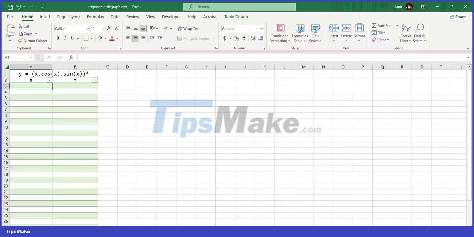
The smaller the increment between your X values, the more accurate your graph will be. We will increase each X value by 1/4 in this table. Here's how you can automatically enter X values:
1. Enter the first value in a cell. Here, enter -3 in cell A3 .
2. Select the box below. In the example is A4 .
3. In the formula bar, enter:=A3+1/4
4. Press Enter .
5. Drag the fill bar and drop it into the boxes below.
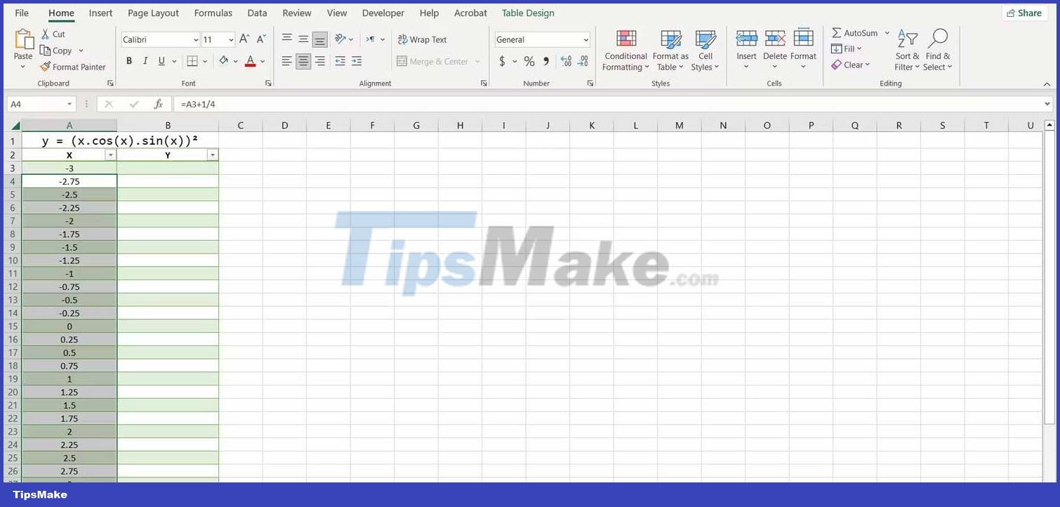
Excel will now fill in all other X values. The benefit of using formulas to enter values is that you can now quickly change them by editing the first value or editing the formula.
2. Create a Formula to Calculate the Value of Y
You can calculate the Y value by translating the trigonometric equation into the language of Excel.
When creating formulas, you can use carets to indicate powers. Use parentheses when necessary to indicate the order of operators.
1. Select the first cell where you want the Y value to be calculated. That's B3 in this case.
2. Go to the formula bar and enter:=(A3*COS(A3)*SIN(A3))^2
3. Press Enter .
Excel will now calculate all Y values in the table. Excel's trigonometric functions use angular units, so this formula will take it as the unit for X values. If you want the X axis to be in pi - radians, you can multiply the cell reference by the number pi. using the PI function in Excel.
=(A3*PI()*COS(A3*PI())*SIN(A3*PI()))^2This formula will output the Y value for the same trigonometric equation but the values will be in pi-radian measure.
3. Create a Scatter Chart
This is the best way to graph mathematical functions in Excel. Since you already have the X and Y values, you can plot the function with one click:
1. Select the table containing the X and Y values.
2. Go to the Insert tab.
3. In the Charts section, click Scatter , then select Scatter with Smooth Lines .
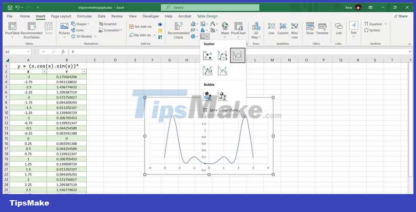
It's done! Now you can check the graph to better understand the meaning of the equation. This is the last step if you are looking for a quick visualization, but if you want to present it graphically, you can completely customize the Excel chart to plot the correct graph of the trigonometric equation.
Conclusion
Understanding Graphing Trigonometric Functions makes it easier to compare options, avoid common mistakes, and apply the information in this guide more effectively. Review the relevant requirements before making changes or choosing a solution.
FAQ
How do you graph trigonometric functions with excel?
Follow the steps in this guide in order, confirm the required settings or tools, and verify the result before making additional changes.
Is it safe to graph trigonometric functions with excel?
It is generally safe when you follow the recommended instructions, use trusted tools, and avoid changing settings you do not understand.
What should you do if the process does not work?
Recheck the requirements, restart the device or application when appropriate, and review each step for missed settings or compatibility issues.
Related Articles
 Summary of Trigonometric Functions in Excel6 minutes read
 Trigonometric Functions in Excel5 minutes read
 Create Excel Charts: How to Graph Functions in Excel4 minutes read
 How to Add Computers to Excel: Insert Computer into Excel3 minutes read
 How to Graph in Excel: Step-by-Step Guide5 minutes read
 Detailed How to Graph in Excel3 minutes read
Reader Comments 0
Sign in with email or Google to join the discussion.