JavaScript code to create OHLC and line chart combo chart template
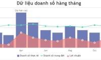
The example below illustrates a sample of the 2016 Lockheed Martin stock price chart with the number of shares by combining the OHLC and line graphs.
Table of Contents
You can also combine line charts with OHLC. Line charts/graphs in OHLC are used to show various parameters in financial analysis. You can also combine OHLC graphs with spline or area charts.
The example below illustrates a sample of the 2016 Lockheed Martin stock price chart with the number of shares by combining the OHLC and line graphs. It is made with JavaScript and you will see the source code below the screenshot.
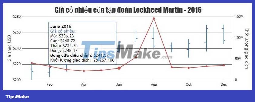
Source : CanvasJS
Chart customization
Like other chart templates created with JavaScript, you can also change properties in the source code to get the results you want. For example:
visible: Show/hide data serieslineColor: Customize the color of the linelineThickness: Line thicknesscolor: ColormarkerType: Marking style- …
Was this article helpful?
Your feedback helps us improve.
Related Articles
 JavaScript code to generate dynamic line graphs/charts1 minutes read
 JavaScript code to generate error line graph/graph1 minutes read
 JavaScript code to create box & whisker chart/graph templates with custom colors1 minutes read
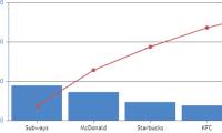 JavaScript code to create Pareto charts & graphs1 minutes read
 JavaScript code to create a chart/graph combining lines, areas, and columns.1 minutes read
 JavaScript code to create a zoomable chart with Zoom & Pan functionality.2 minutes read
Reader Comments 0
Sign in with email or Google to join the discussion.