How to Choose the Right Number of Slides for a Powerpoint Presentation
Whether you're a newbie at PowerPoint or a presentation professional, there's always one crucial question when developing your slideshow: how many slides should you include? Thinking about the amount of time you have and the rate at which...
Method 1 of 3:
Choosing the Right Number of Slides Based on Design Choices
-
 Provide the right amount of information. PowerPoint presentations are useful to provide an overview, a general description of a given topic. Your presentation should not be encyclopedic. Don't go overboard including every little detail, citation, or factoid which may inform the conversation on the issue you're presenting. Too much information will burn your audience out and you'll be left with a bunch of people more interested in lunch than in what you have to say.[1]
- Keep the presentation about you, not the slideshow.[2] The slides are there to support what you have to say. They should be just one part of your presentation, not the whole thing.
-
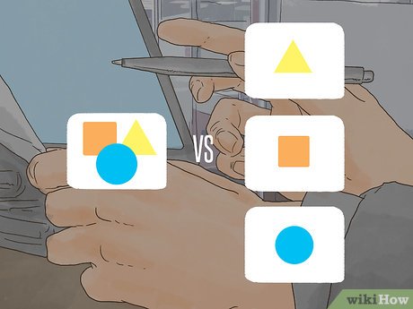
 Break complex slides down into several simple slides. PowerPoint presentations are at their most effective and powerful when they adopt a clean, minimalistic style.[3] For instance, if you have one slide whose heading is 'Habitats,' with three bullet points beneath reading 'Forest,' 'Desert,' and 'Ocean' with a description of each habitat following, you would do well to instead allocate three separate slides to the three different habitats, and include a summary and image of each on the appropriate slide.
 -
 Include audiovisual support only as needed.[4] Your PowerPoint slideshow should always be designed to reinforce your verbal explanations with visual images. Sometimes it works to put words on a screen, but generally, your text should be limited. Do you need the graphics as a starting point from which you will explain results, trends, predictions or specific outcomes? Are you using visuals merely to keep your audience engaged, to provide humor, and/or to accommodate diverse learning styles? These and other relevant questions should guide your decision-making process when settling on the right number of slides for your presentation.
- Go through your entire presentation and ask yourself if you really need a given slide. If the answer is no, or if you find you can deliver the info verbally instead, eliminate it.
Method 2 of 3:
Using Time to Determine the Right Number of Slides
-
 Practice your presentation in front of a mirror or a small audience of friends and family before you do it for real. If, during your practice run, you find that your time has elapsed before you could get through your whole presentation, you'll know that your presentation has too many slides.[5] Head back to the drawing board to edit it accordingly.
- If your presentation ended well before the time limit you've been given, try to extend the amount of time you spend on each slide, or add extra slides to expand on the info introduced in the presentation.
- Solicit advice from family and friends during your practice presentation. If they feel there are too many or too few slides, or if they feel certain sections of the presentation felt rushed or slow, adjust your presentation to correct these deficiencies.
-
 Think about the speed at which you speak. If you speak quite quickly, you will be able to get through a great number of slides. If, on the other hand, you speak more slowly, you'll probably require a smaller number of slides. Use your rate of speech to determine how many slides your presentation can accommodate.
 -
 Do not use too many slides. If you have ten minutes to present, you might need upwards of 60 slides. On the other hand, you might also need just ten slides. Whatever number you settle on, do not include more slides than you can get through in your allotted presentation time.
 -
 Do not use too few slides.[6] If you have a lot of info which would be of use in your PowerPoint, or have graphs, tables, or images available that could improve your presentation, use them. While you don't want to include so many slides that you can't get through them all in the allotted time, neither should you feel constrained to the point that you don't include valuable information or graphics in your slideshow.
Method 3 of 3:
Moving Beyond Formulaic Answers to Finding the Right Number of Slides
-
 Don't listen to the experts. Everyone seems to have their own idea of how many slides is enough.[7] Some people think five slides is enough for thirty minutes,[8] others think ten is enough for twenty minutes, and still others think ninety or more could be right for twenty minutes. In fact, each presentation is different, and needs to be approached on its own merits.
- One well-known formulation for PowerPoint presentations is the 10/20/30 rule. This rule dictates that you should use about ten slides for a twenty minute presentation, and each slide should utilize thirty point font. In other words, each slide should be about two minutes in length.[9] Perhaps the 10/20/30 rule works for you. If it does not, don't feel as if you're using the wrong number of slides.
- Others argue that an average slide should be onscreen for no more than two minutes, and can be onscreen for as little as 15 seconds.[10]
-
 Match the number of slides to the subject matter.[11] Some topics require a few slides and a lot of exposition. Other topics require many slides with only minimal explanation. For example, if your presentation is on a particular product or a single beautiful landscape, then many slides containing photographs may be more effective than a few slides featuring text. Think about how you can combine a number of text-based slides into a few image-based slides with some accompanying text, and vice versa.
 -
 Tailor your slideshow to your audience.[12] If you're presenting highly detailed or technical information to a group of people who are very familiar with the industry terms and metrics that you're presenting, you might include a lot of slides that you move through rather quickly, but which are necessary to provide supporting material and demonstrate that you know what you're talking about. If you're presenting the same data to a high-school business class, you might need to condense the slides you're presenting and edit the presentation so that you can explain each concept in language which the layman will understand.
 -
 Think about the venue you're presenting in.[13] If you're presenting in a large venue like an auditorium but you only have a small projection screen for your PowerPoint slides, you should minimize the importance and number of your slides and focus instead on the spoken aspect of your presentation. Similarly, if you're presenting outside or in a brightly-lit environment, you might want to consider keeping the number of slides in your presentation to a minimum since they might be too hard to see in the glare.
- If, on the other hand, you're in a more intimate environment and can control the lighting, you might be inclined to utilize a greater number of slides. As always, however, don't feel obligated to use many slides just because you can.
Similar Post
- Basic information about slides in PowerPoint 2016
- Create beautiful slides for PowerPoint presentations with 8 tips
- How to link slides in a PowerPoint presentation
- Fix 6 common errors on PowerPoint slides
- MS PowerPoint 2007 - Lesson 3: Create a slideshow
- How to add and print notes in PowerPoint slides









 How to merge 2 PowerPoint slides into one
  How to make slides run automatically in PowerPoint
  Free download of beautiful PowerPoint and Google Slides slides designed by Google
  MS PowerPoint 2007 - Lesson 3: Create a slideshow
  How to insert background for Google Slides
  Basic information about slides in PowerPoint 2016