How to Use Microsoft Office PowerPoint
Do you want to make your presentation one to remember? PowerPoint gives you the ability to create a powerful visual aid that can help make your presentation the best it can be. Getting the most out of PowerPoint takes some time, but with a...
Part 1 of 3:
Creating a Presentation
-
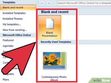
 Choose between a blank presentation and a template. When you start a new PowerPoint file, you can either create a blank presentation or a template. Blank presentations allow you to apply your own style, but this can be a time-consuming process. Templates can give your presentation a uniform style, but they may not suit your exact needs.
- You can edit any aspect of a template, so feel free to choose one that mostly matches your vision and tweak it as you see fit.
- You can apply themes to your project at a later time after you've added content. Click the Design tab and select a theme. It will be immediately applied to your project. You can either undo it (Ctrl + Z) or revert to a blank theme if you don't like it.
- You can access templates from the File tab. Click New and then browse the available templates. You can also download additional templates from a variety of resources online.
-
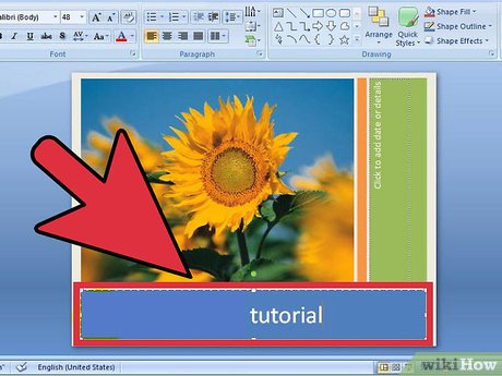
 Create your title slide. Your title is the first thing that your audience will see. It should be easy to read and give a basic overview about the topic of the presentation. Most presenters will include their or their group's name on the title as well.
 -
 Add new slides for content. Press Ctrl + M for a new slide. A blank slide will be added after the slide you are currently on. The slide will contain a title box and a text box. You can choose to use these or insert your own objects using the Insert tab.
- When adding a text box, you can click and drag to make it whatever size you'd like. You can then adjust this later by grabbing one of the corners with your cursor and then clicking and dragging again.
- You can click on any text box and start typing to begin adding text to your presentation. You can format text just as you would in Word, with formatting options available in the Home tab.
-
 Navigate your presentation. You can use the frame on the left side of the window to quickly scroll through your slides. Clicking any of them will open that slide so that you can edit it. You can click the Outline tab to see an outline tree of your presentation. Each slide will be labeled by the slide title.
 -
 Preview your presentation. You can get a basic feel for the flow of your presentation at this point by pressing F5 to start the slide show. Click the mouse to advance the slides. Use the preview slide show to get an idea of how long the presentation is and how well information flows from one slide to the next.
Part 2 of 3:
Jazzing It Up
-
 Add transitions between slides. Once you have some content in your slides, you can start adding some effects to help make it a bit more interesting for your audience. Select a slide and click the Transitions tab. You will see a list of the most common transitions. You can also click the arrow at the end of the list to open the full listing of available transitions.
- When you pick a transition, it will affect how that slide appears. For example, adding a transition to Slide 2 will affect how Slide 1 transitions into Slide 2. You will be able to see a preview in the slide editing window when you click each transition.
- Don't add too much transitions to your presentation. This can be distracting to the audience and keeps them from focusing on your what is the most important which is your content.
-
 Add backgrounds. Plain white is boring. If your presentation is standard text on a plain white background, half of your audience will be asleep before you reach the third slide. Use subtle backgrounds to add a little visual flair to your project.
- Right-click on a blank section of your slide and select "Format Background", or click the Design tab and the click the arrow icon next to "Background" on the far right.
- Choose your fill type. You can choose a solid color, a gradient fill, a picture background, or a pattern fill. Selecting each choice will display several options for it, such as fill color, picture location, gradient settings, and more. Experiment until you find the background that fits your presentation.
- By default, the background will only be applied to your active slide. Click the "Apply to All" button to apply your background choices to every slide.
- Make sure that your text is still easily readable with the background you choose.
-
 Add images. Adding pictures, diagrams, and other visual aids can help the audience grasp the ideas of your presentation and drive your point home. Images break up the monotony of text and help keep the audience from tuning out.
- Click the Insert tab. There will be a large number of options when it comes to inserting objects. Click the Picture button to insert a picture from a file on your computer. You can click the Photo Album button to insert an entire album of photos into the slide as well.
- Use the Charts button to insert easy-to-read charts that will help the audience understand your data. Once you choose your Chart type, Excel will open, allowing you to enter in your data or copy it from an existing spreadsheet.
- Use the Shapes button to insert pre-made shapes or dray your own. You can use the shapes to outline important text or create arrows and other visual indicators.
- Avoid drowning your presentation with pictures. If it looks too busy, the audience will have a hard time parsing your written information.
-
 Add links. You can add links to your slides that will allow you to quickly access websites or email addresses. This can be especially useful if you are distributing the presentation and want people to be able to easily view related webpages or send you an email.
- To add a link, place your cursor in a text box and then click the Hyperlink button on the Insert tab. You can choose to link to a file on your computer, a webpage, an email address, or even another slide in your presentation.
-
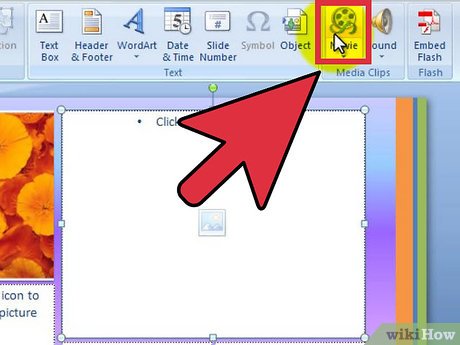
 Embed video. You can add video files to your slides. This can be useful for reports or any other video file that may relate to your presentation. The video file will play when the slide appears.[1]
- Click the Video button in the Insert tab. you will be able to browse your computer for video files.
- While it's not as straightforward, you can embed YouTube videos as well. See this guide to learn how.
Part 3 of 3:
Making It Memorable
-
 Keep the number of slides to a minimum. Extremely long presentations will bore your audience, even if they are obsessed with your subject matter. Extraneous slides with little to no content will also make the presentation drag and wear on the audience's interest. Try to keep your presentation short and sweet, and make sure you are using the space on each slide to it's maximum potential.
 -
 Choose a good font size. Presentations are designed to be read, otherwise it would just be a speech. Make sure that your audience will be able to easily read what you have written. A 10 point font may look okay when you're sitting at your computer, but when it's projected on the screen, people may be leaning forward in their seats straining to read.
- On a related note, make sure that your font choice is readable as well. Curvy and extravagant fonts may look cool, but they'll make your audience just stop caring if they can't read it.
-
 Apply a consistent, subtle style. The best presentations are those that have a consistent, deliberate style. use minimal amounts of color and stylistic accents to make your presentation stand out without being garish. When in doubt, use one of the templates for a guide.
 -
 Triple-check for spelling and grammar errors. If you misspell a word, you might not notice it, but someone in your audience will be sure to spot it. Spelling and grammar mistakes will lower your credibility, even subconsciously, so you'll want to work extra hard to ensure that everything is written clearly and correctly.[2]
- Get someone to help you proofread your presentation before you give it. A fresh set of eyes are much more likely to catch mistakes that you gloss over.
-
 Practice! The PowerPoint is only part of your presentation. The other part is you! Take some time and practice your talking points as well as moving through the slides. Work on your timing and ensure that each slide accurately sums up your talking points. Make your own notes or memorize your presentation; reading off of your slides while you are giving your presentation is a big no-no.
- See this guide for more information on giving a successful presentation, either in class or at the office.
Discover more
presentation slide click audienceShare by
Jessica Tanner
Update 05 March 2020
You should read it
- How to Add a New Slide in PowerPoint
- 'Search' the slide while PowerPoint presentation is in progress
- MS PowerPoint - Lesson 2: Creating a presentation slide ... Where to start?
- How to black out or whiten the PowerPoint presentation screen
- How to Prepare a Professional Presentation
- The Quiet Details That Make a Sports Betting Platform Feel Reliable
- Instructions on creating toy set images with ChatGPT AI
- How are AI agents changing the journalism industry?
- How to Cite Images in PowerPoint
- How to Add Background Graphics to Powerpoint
- How to Create a PowerPoint Presentation


