10 principles of text editing help you become more professional
In order for a document to be appreciated and looked good and impress readers, you need to pay attention to the following 10 basic principles.
Microsoft Word in particular, Microsoft Office is generally one of the best and most popular text editing tools available to office workers today. Although there are currently many other useful office applications that can be replaced, using MS Office is still one of the priority choices when it comes to drafting of office workers.
Typing, creating Word documents is not difficult, but how to make your text standard, good-looking and impressive for readers is not easy, especially for new people begin. However, if you want to be appreciated and professional, then keep in mind the following 10 principles for editing Word more professionally.
- Practice typing 10 fingers to speed up typing
0. No misspellings, no typing errors
Spelling errors when writing rails or when typing, make readers feel uncomfortable, especially for those who know the spelling, writing less mistakes, and typing wrongly. If you need a professional document, the first thing to note is to read your text over and over to avoid misspelling.
Another error that many people often make is violating the rules for using accents in text. Punctuation marks such as dots, colons, commas, question marks, exclamation points, semicolons, closing signs such as parentheses, close quotation marks, single quotes are always associated with characters standing in front of it, there is no space between the character and the sign. Open marks are like opening parentheses, double quotes open, double quotation marks will be followed by characters immediately after it.
This unsigned rule will help prevent the mark from being "dropped" alone on the line, ensuring the correctness of the accent and the text containing the accent.
1. Pay attention to simplicity, focusing on the focus

Unlike Excel or PowerPoint, Word documents use mostly text. Therefore, users should pay close attention to the topic, the main ideas and the focus of the lesson. You can use a few paragraphs to guide, but not too long and rambling.
Minimize interruptions, irrelevant between sentences and comments in the lesson. Using strict, concise and concise words to describe the maximum content, both short and easy to understand. Although it is simple to say, this is one of the most important rules of word processing on Word.
2. Choose fonts that match the context
- Use Times New Roman font in CV like 'wearing sports pants' to apply for a job
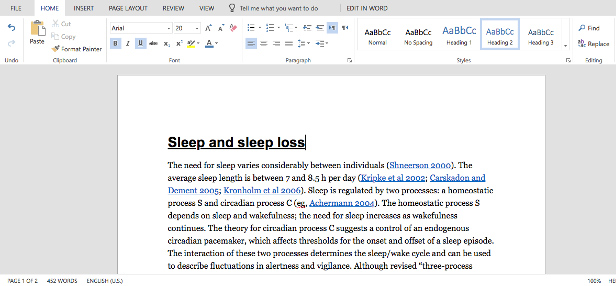
When presenting a document, it gives the first impression to the reader not the text but the text itself. Choosing a font that matches the content you are presenting will be a great plus to help you be more appreciated in the eyes of people.
Word fonts are very diverse, so there are different meanings in each font. Therefore, when choosing fonts in Work, you should note, because there are some types that will be suitable and only display well when printed on paper, but some will be viewed directly on the print, such as: Garamond, Georgia , Hoefler Text and Palatino . and there are also those that are only suitable for digital devices (Arial, Gill Sans, Helvetica and Lucida Sans .).
So, to bring the best effect, even if a small problem like using Vietnamese fonts is a problem.
3. Use standard fonts, sizes and colors
It can be seen that most of the documents presented on newspapers or networks of writers will use more than one font, even to help users pay more attention to the content that needs to be emphasized, people still use Add color, bold letters to create attraction for the reader.
However, the use of color on text to emphasize, attention to readers only works on digital devices, the rest if you bring that document to print on your normal printer types I only received a black-eyed text. Not to mention time consuming, but using colors sometimes costs money or distracts readers (if there are too many). If you want the viewer to pay attention to it, you can use bold, italic or even underlined text or capitalized formatting if you want.
4. Select the size and alignment according to the standard

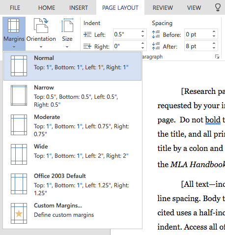
In addition to choosing the size and type of text, the form of presenting a document is also extremely important, which helps people evaluate the meticulousness, professionalism, and creativity of your work. By default, the office documents when printed will be equivalent to the standard A4 paper size (size 210mm x 297mm) and this is the only size that every printer is installed by default for each printing.
However, in some special cases, this margin and default layout may be changed to suit the user's criteria. At that time, depending on the purpose of the user, we will handle and select the distance, the new margin size accordingly.
Text page margin (A4 size):
- Upper margin: 20 - 25 mm from the upper edge;
- Lower margin: 20 - 25 mm from the lower edge;
- Left margin: 30 - 35 mm from the left edge;
- Right margin: 15 to 20 mm from the edge.
5. Aligning left is always the default

Some people when writing text often create their own text presentation. Depending on the content and different uses, but according to standard defaults and advice from experts, it's best to keep it left and keep it.
This may cause the end of each sentence (right margin) to be jagged and uneven. However, you will have the opportunity to create multiple indexes, design the top and bottom lines in the most scientific way.
6. Pay attention to the opening
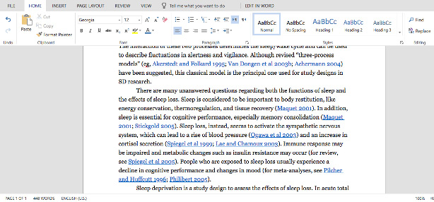
A perfect essay or document is a scientific, proper presentation and especially a content that must be coherent. That is the reason you always see at the beginning of each paragraph, the beginning, they are always the words, the push before the main content. Even use a special text format of Word to make the first letter of the line bigger than the rest.
And another small but also very important thing, is that the next paragraphs, always backed up a little to create focal points, easy to recognize.
7. Use images if needed
- How to insert images into Word 2007
- How to insert images into Word 2010 content
- How to insert text into images on Word
A piece of text that is too long will cause the reader to lie and feel reluctant to read. So, to make your article more lively and engaging, you can add some easy-to-understand illustrations that make it easier for the reader to visualize what you're describing.
When inserting images into Word, you should select images of moderate size, so put them in the middle of the lesson, which can be accompanied by comments below (if necessary). This both helps you present better, is not disturbed, the images and text still stand out and support each other. However, you should not overdo it, because sometimes it will counteract the effect you want.
8. Set appropriate line spacing

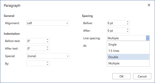
Many people when typing text, to save paper often choose a small font size or a line of this makes the text become confused, chattering words. On the contrary, there are those who want to spread the text to enough paper so that the font size is larger and stretch them out, which makes the print become fragmented and lacks aesthetics. So how much is the line spacing and font size appropriate? In fact, for documents that have specific requirements, we can leave a different distance. For normal documents, the most suitable and readable line spacing is about 120% - 150%.
9. Split text and title
With the report articles investigated in the press or the reports and seminars of businesses, the number of words is very large, it can be up to several tens or even several hundred pages. For these documents, if we do not type into individual sections and title these small items, it is difficult for the reader to fully understand the content of the text you write.
With such types of documents, can be divided into large sections, then smaller internal indexes. If necessary, a table of contents can be created at the beginning or end of the document for easy search. This approach is both scientific and easy to manage what we have written down.
10. Pay attention to the interrupted sections
Microsoft Word allows users to arbitrarily divide, break pages, number, column or title. There are several options for you to use:
- Next Page: Start the next section right away.
- Continuous: Start the next section at the current page (current page).
- Even Page: Start the next section right on the current page and the next page.
See more:
- You want to print text, data in Microsoft Excel. Not as simple as Word or PDF! Read the following article!
- How to type pages in Word 2007 from any page
- Useful Word tips you should not miss
Discover more
Word tips office computingShare by
Marvin FryYou should read it
- 7 perfect text typing applications for Mac, suitable for all levels
- Great tips for Word 2010's text test tool
- Practice typing 10 fingers to speed up typing
- Typing, fast typing in Word
- Instructions for typing text with 10 fingers
- The Quiet Details That Make a Sports Betting Platform Feel Reliable
- Instructions on creating toy set images with ChatGPT AI
- How are AI agents changing the journalism industry?
- How to fix Vietnamese typing errors in Word, Excel
- How to fix Vietnamese errors in PowerPoint
- A guide to the full Excel 2016 (Part 12): Page formatting and spreadsheet printing