9 principles of slide design in PowerPoint
Properly applying the principles of presentation design will be much more professional and precise. Click to see 9 principles of slide design in PowerPoint!
Table of Contents
Anyone can create slide designs in PowerPoint , but if you apply the right design principles, your presentation will be much more professional and well-organized. Here are 9 principles of PowerPoint slide design, let's find out now!
Rule 1 - Try to be simple
Too many details on the same slide will make the content on the slide confusing, distracting the attention of the audience because they do not know what is the main content the author wants to convey. Removing unnecessary elements on the slide, keeping the core things in the presentation is a way to help you create a highlight for a presentation.
For example: A simple slide should only contain 3-5 main ideas (do not contain long rambling content, the content you should prepare in mind for a smoother presentation). Similarly, the inserted image should not have more than 3 images, because too many images will also disperse the content, not knowing what the message needs to be conveyed quickly.
Rule 2 - Limit words on slides
When following a presentation, people often prefer to absorb information through the presenter instead of reading slides. Therefore, instead of trying to detail content on slides, summarize them into keywords and explain in words during the presentation. Putting too many bullets in the slide also makes the slide lose its aesthetic, so don't overdo it.
For example: The following slide summarizes new techniques in modern knowledge into 3 big ideas to help the slide content be more concise, if the designer adds all the content of each idea to the slide, the slide will be full of text, just right. unsightly and does not highlight the main idea.
Rule 3 - Choose the right font and color
Fonts and colors are two factors that greatly determine the appearance and aesthetics of a presentation. Many slide designers often think that a simple font will make the slide monotonous, a sophisticated font will make the slide confusing, but really, as long as you choose the right font for the content and information you are conveying, Whether the font is simple or sophisticated, it will be effective.
Color is the highlight for the slide and also has a great impact on the perception of the audience. Too colorful colors is a minus point in PowerPoint slide design because it will distract users and not focus on the content conveyed. In a presentation, you should only use a maximum of 3 fonts.
For example: The design uses 2 fonts and 2 colors black and orange as the main color quite suitable.

Rule 4 - Minimum font size is 28px
Your presentation will usually be played on the big screen for everyone to see. No matter how well you design, but the viewer cannot read the text because the font size is too small will be a very bad thing. Therefore, you should set the minimum font size for your presentation to be 28px.
For example: The smallest text in the following slide is 23px, the font size is too small for viewers from afar to see clearly.

Rule 5 - Professional Rule 6x6
The 6x6 professional rule is the rule that shows the maximum number of lines and words on the same slide. In this guideline, your slide should have a maximum of 6 lines and a maximum of 6 words per line. Leaving a lot of space on the slide makes the slide easier to see, and it is also easier for viewers to focus and follow the content.
Example: Design applies the 6x6 professional principle.
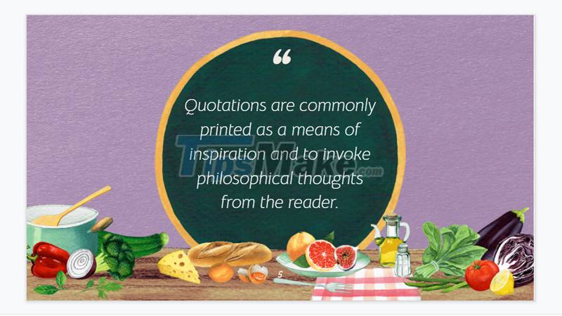
Principle 6 - Good illustrations, good image sizes
The presentation will attract more people when presented in a visual and vivid way. Should choose illustrations related to the content you want to convey and arrange the layout for them in a reasonable way, not too abusive. At the same time, pay attention to the image size, do not zoom in so that the image is blurry, broken, and do not shrink to the point of confusing details. Good image quality will show the correctness for the presentation.
Example: Use images related to the presentation theme.
Principle 7 - Impress by running effects
Effects applied to the presentation in a reasonable and not too abusive way will make the slide more flexible and less boring. For example, in a slide presenting the content of a multiple-choice question, you apply a circle effect to the answer.
For example, the Animations section in Powerpoint will help you create motion effects for the text, the Transitions section will support you to add transition effects to the slides.

Principle 8 - Objects are all aligned
Objects in the design that are not properly aligned can easily create discomfort for the viewer. Therefore, you need to arrange and align the layout and all details on the slide to make the design more scientific and harmonious.
To do this: Hold Shift + Select all the objects that you want to align, then select the Arrange option, and apply the Alignment Type.

Example: Text and objects in this design are all properly aligned.
Principle 9 - Principle of 5 colors
Color is a huge determinant of the aesthetic and stylistic elements of a presentation. You should choose colors according to the color wheel principles that designers often use and should only use up to 5 dominant colors in your entire slide.
Example: The design uses 4 main colors: pink, yellow and blue black.
Summary: Thus, when starting to design a slide show, you need to pay attention to Simplicity - Balance - Emphasis - Consistency for objects, images and content appearing on the slide. Presentations that focus on these elements will have a beautiful layout, impressive colors, attractiveness, and reasonable content. The slide you create will be much more professional, organized and aesthetic.
Just now are 9 principles of slide design in PowerPoint, wish you success!
Was this article helpful?
Your feedback helps us improve.
Related Articles
 Design your own slide in PowerPoint2 minutes read
 MS PowerPoint - Lesson 7: PowerPoint design template3 minutes read
 PowerPoint 2019 (Part 8): Managing Slides5 minutes read
 Download the most beautiful Slide PowerPoint template 20212 minutes read
 Instructions to resize Slide pages in PowerPoint3 minutes read
 99+ Professional Slide Wallpaper2 minutes read
Reader Comments 0
Sign in with email or Google to join the discussion.